Eight Ways to be Creative with a Shallow Depth of Field
Your camera’s aperture has the ability to (mostly) control your depth of field – which is a powerful creative tool that many photographers use to evoke depth, mystery, and intrigue.
Not only is it one of the key components in creating bokeh, but your aperture has the power to transform the ordinary into an abstract….creating a surreal interpretation of what we normally see.
1. Isolation
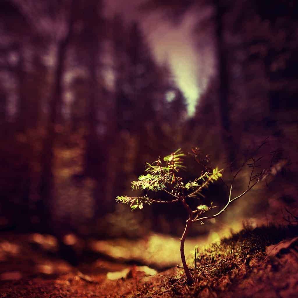
The ability to quiet the distractions of your scene and isolate your focal point is a dynamic creative method. Beyond the visual attractiveness of a shallow depth of field, you can direct your audience to focus on elements that you find important in your landscape – whether it be the texture of a tree, small bits of foliage, or a field of wildflowers.
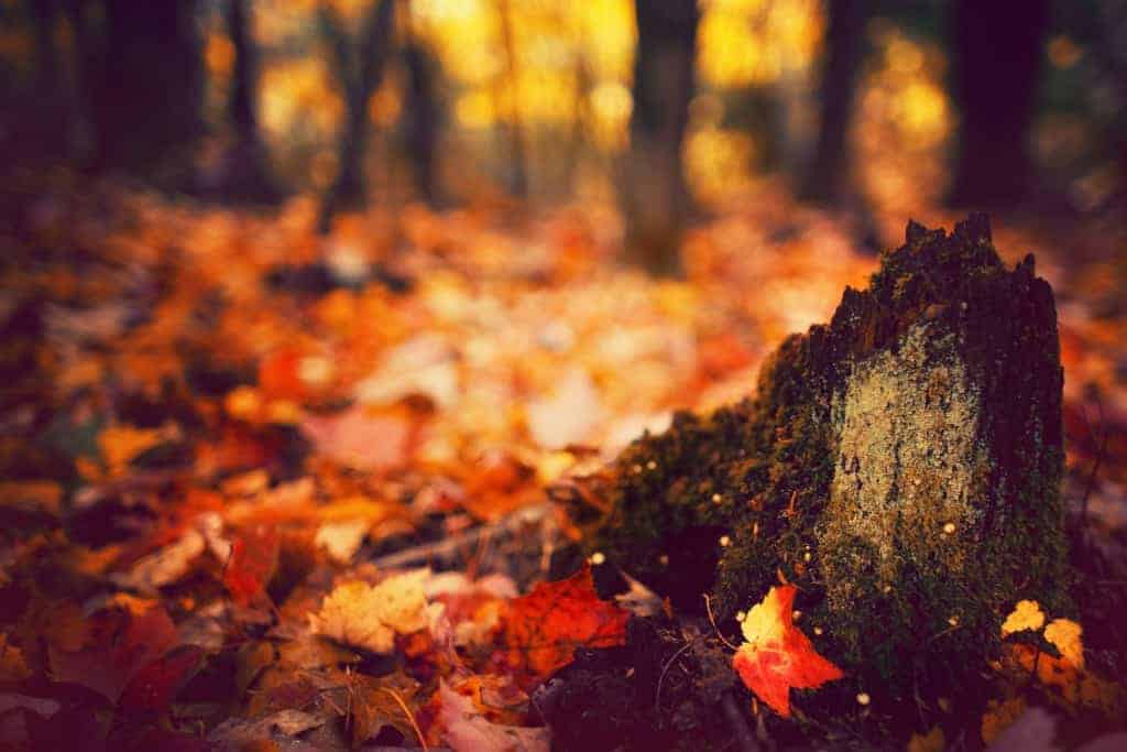
When working wide open, even the smallest adjustment of your focus can completely change your focal point, and thus the overall mood and interpretation of your image.
2. Balance
Another way to think of “balance” is to think of weight – what parts of your image are heavy, and which ones are light?
What draws the eyes in first, and do your eyes want to stay there?
Are there other elements that call for your attention?
The ability to adjust your depth by moving your slice of focus is a powerful tool, one that allows you manipulate the weight of your image and redistribute it for a more balanced (or unbalanced) composition.
Whichever you choose, your aperture can help you alter the weight of focal points and transform the flow of your landscape.
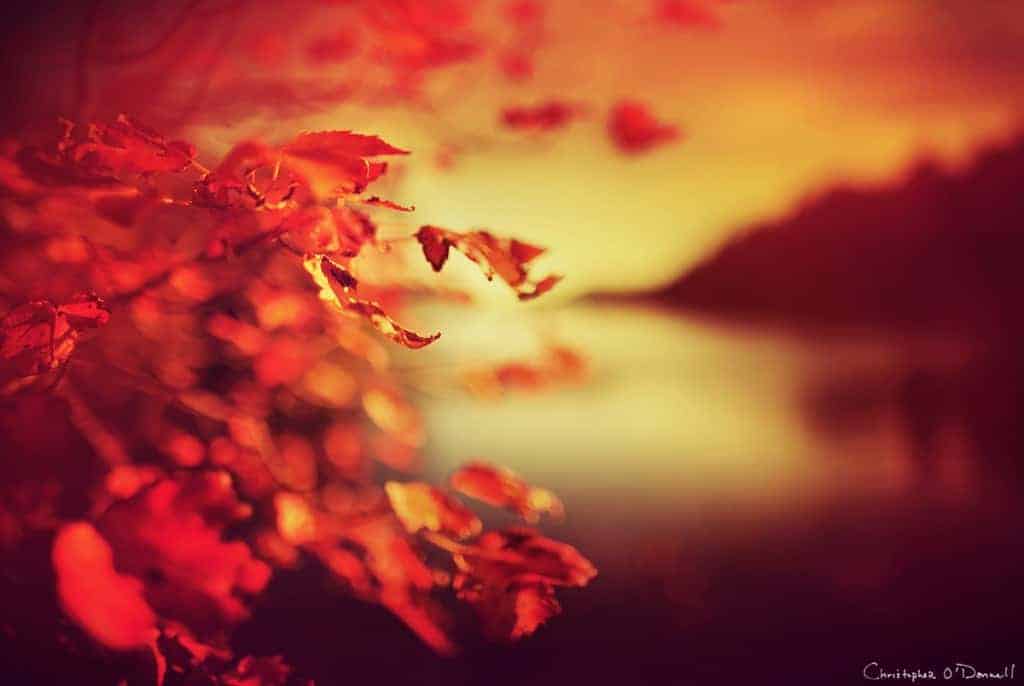
In the example above, I wanted to balance out the heaviness of the distant coastline and make the colorful foliage my main focal point. By using a very shallow depth of field (24mm @ f1.4), I shifted the weight onto the leaves, which would have been lost if I had used a deep depth of field.
3. Depth
Photographs are two-dimensional, so we rely on elements in the landscape to act as reference points for depth.
When an image is taken with a wide aperture, you can heighten the depth by moving your slice of focus in from your immediate foreground. This will create a shallow focus in front and behind your focal point – a layered effect that adds depth to your photo, giving the viewer a more “three-dimensional” experience.
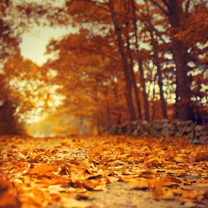
For this image, I pushed the slice of focus back a bit from the immediate foreground, adding depth by blurring the areas in front of as well as behind my focal point.
4. Minimalism
The depth of your image can change a busy, complicated scene into a minimal composition with only a small portion in focus. A wide aperture can expand your creative boundaries for any location by allowing you to quiet the detail and bring out the inner serenity of a landscape.
A sharp focus and deep depth of field can capture much detail, but widening your aperture can create an entirely different mood. Minimalism photography is possible with a wide aperture, transforming any scene into a simple and mysterious creation.
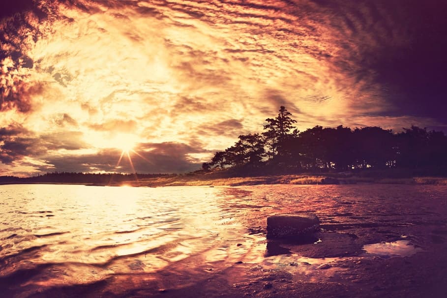
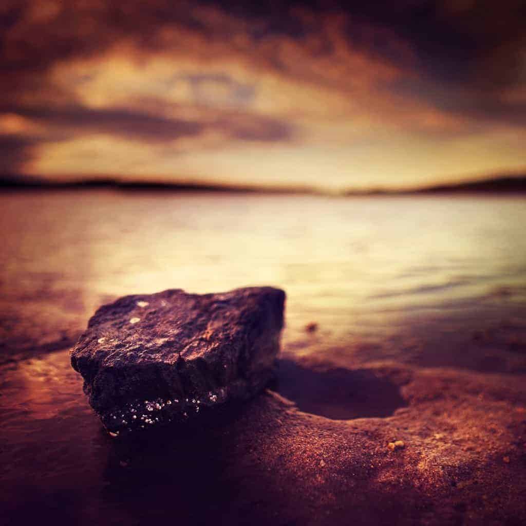
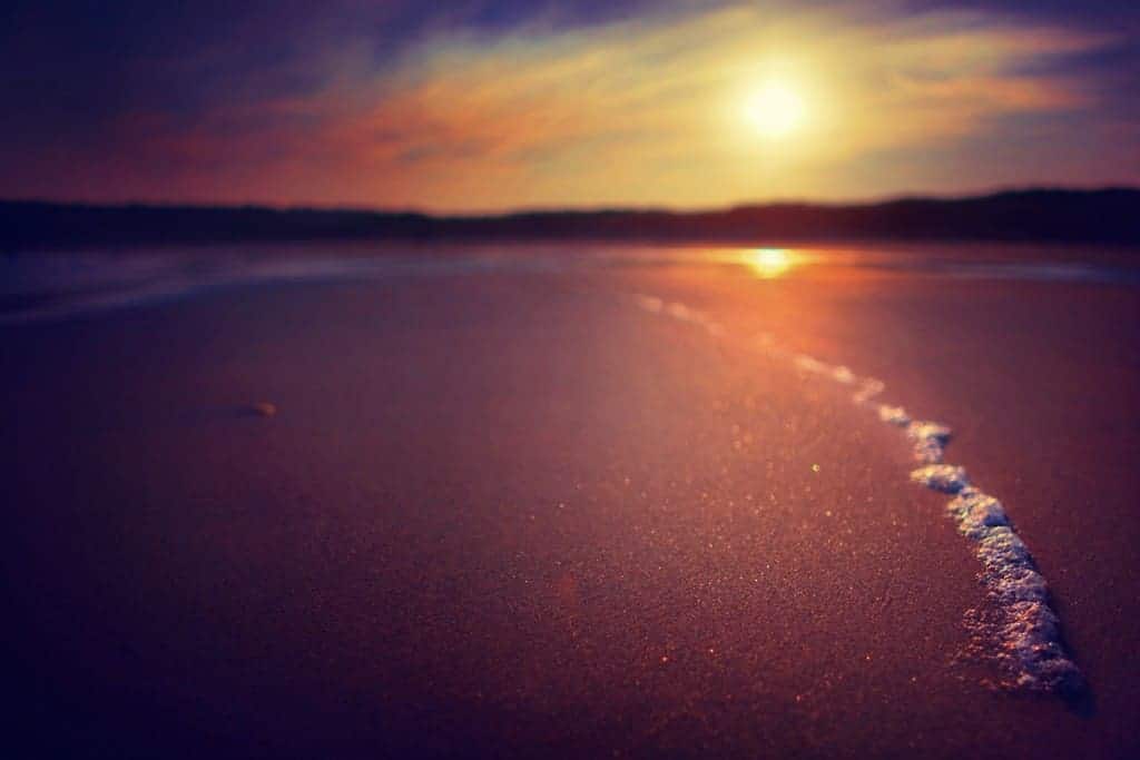
The two images above were taken of the same tidal pool during the same evening, but resulted in two completely different moods by a simple adjustment in my depth of field and composition. By tightening my frame and widening my aperture, I was able to minimize the detail of the sunset sky and create a starker, simpler photo.
5. Transforming Light
If you know how to create bokeh in your landscapes, you know that wide apertures have the unique ability to transform your light sources (either direct or reflected) into defined, coarse shapes which can add layers of interest.
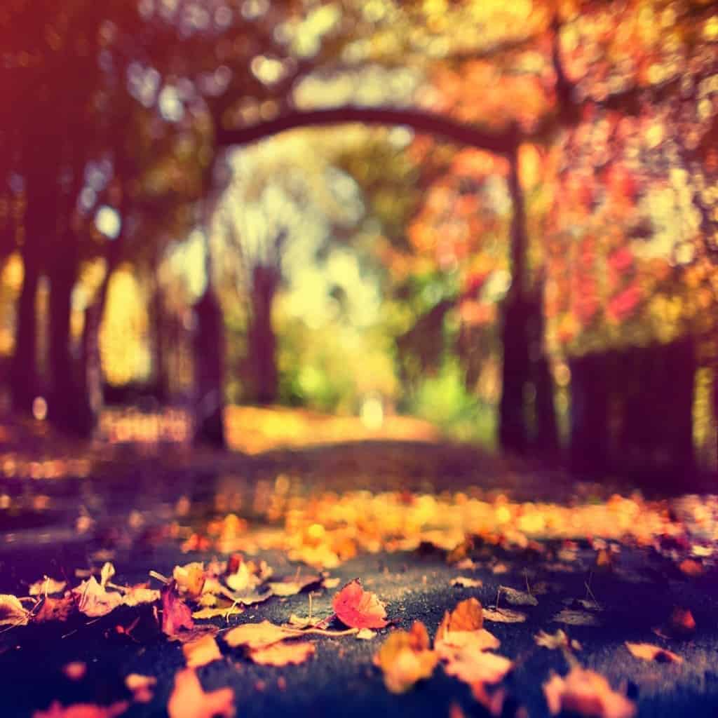
For overcast days or other situations where light sources are not visible in your frame, a shallow depth of field produces a different effect for your landscape. A dream-like, painterly quality is applied where the colors and tones wash together, much like a watercolor painting.
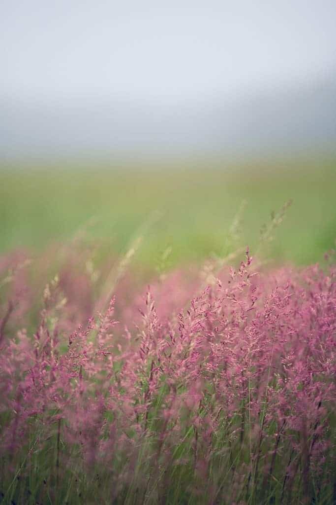
So the type of light you are photographing – whether overcast and soft, or direct and intense – can greatly change how it is interpreted by your aperture before it hits your sensor.
6. Leading Lines
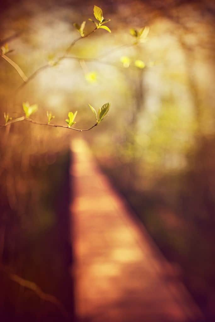
Another fantastic way to use your aperture to create is to frame your image around prominent lines – such as boardwalks, trees, or any other line that travels across your frame – and allow them to lead the eye through your landscape.
A thin slice of focus can soften the appearance of these lines, but still render them as a forceful component to your image – now with added intrigue from their abstract nature.
7. Structures
Shooting wide open allows you to lighten the weight of “heavy” subjects, which you can use to compliment your landscape.
I will often frame my image with a small and unnoticeable subject in sharp focus, and use my aperture to throw a well-defined, prominent structure – one that would otherwise overpower my focal point – into obscurity.
Strong, isolated structures like bridges, buildings, and trees work well for this method.
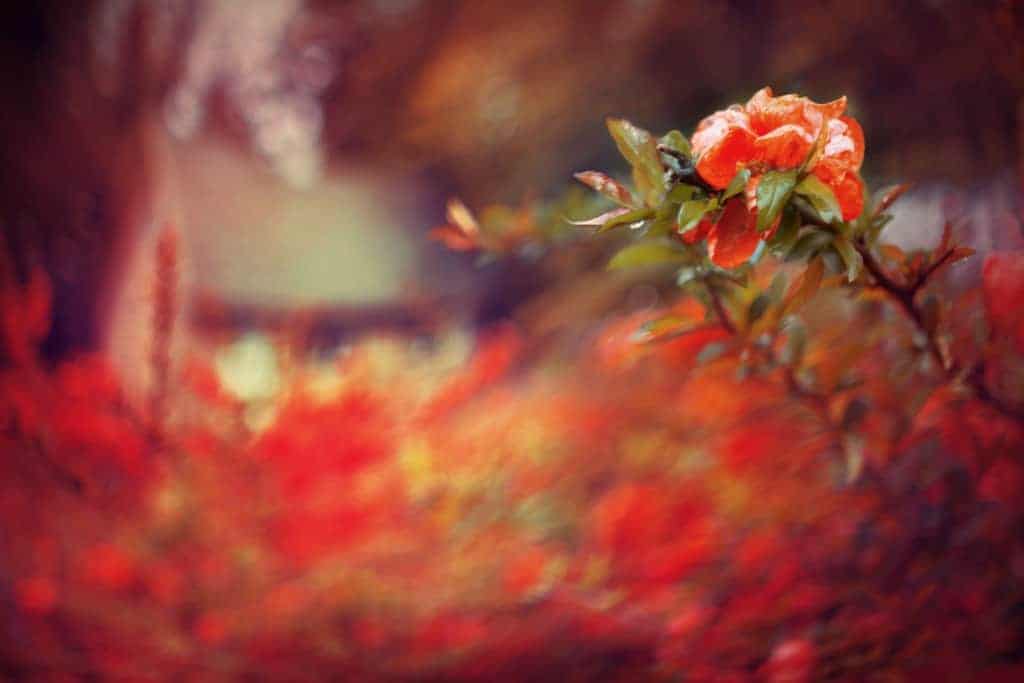
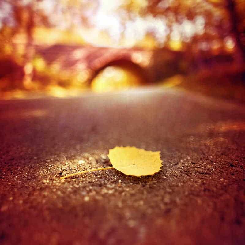
Not only does this help to balance out the weight of your photo, but it creates a surreal image by softening the appearance of a subject just enough to make it painterly, but still be able to identify it based on the shape.
8. Framing
When shooting wide, you can frame your image with elements thrown completely out of focus – such as bits of foliage surrounding your lens. This can add interest, filter out distractions, and create depth and intrigue by framing your image with soft, saturated colors.
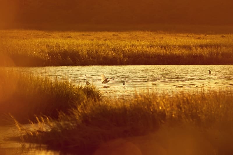
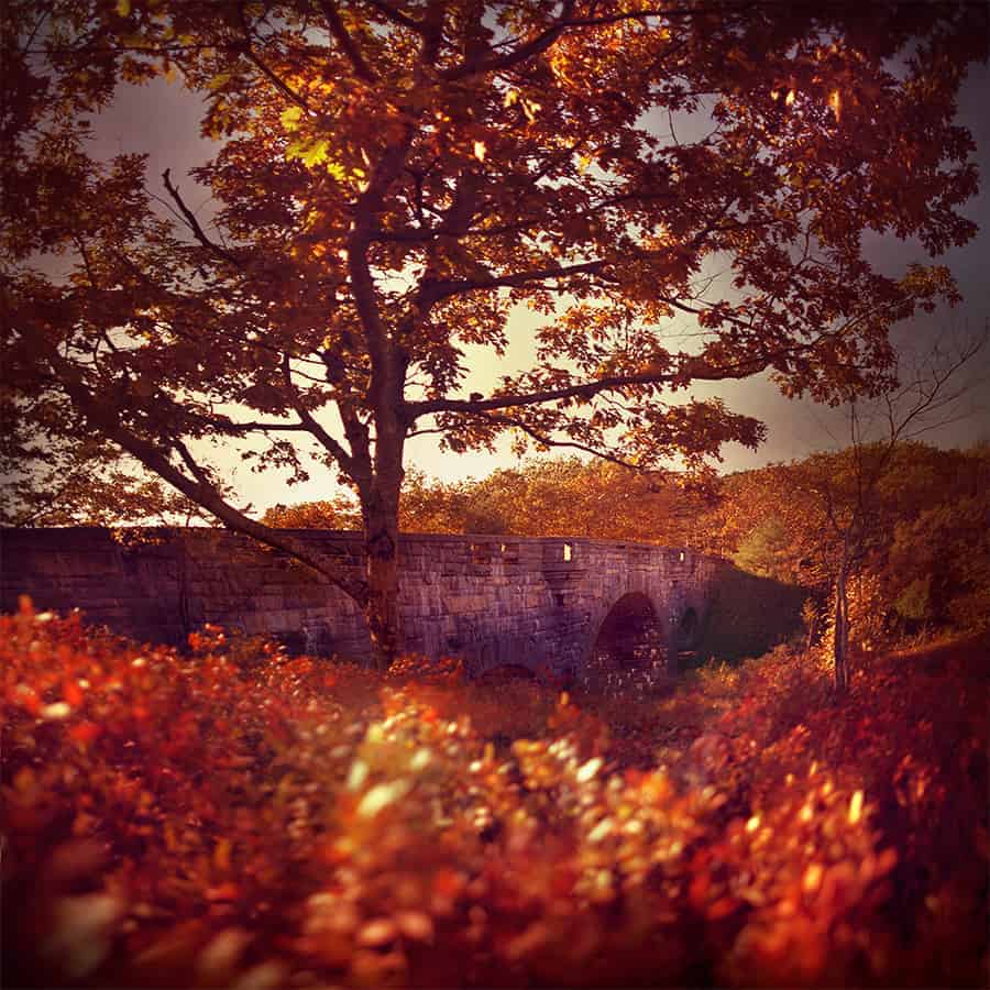
By pushing your focus to the background and composing your image with foliage (or other elements) overlapping the foreground, you can capture your landscape with a natural, complementary frame.
And sometimes, you don’t need a specific plan or workflow when shooting with a wide aperture…and will find much enjoyment with experimenting to see what creations you can come up with. The key is to shoot often, keep pursuing the methods you enjoy, and discard the ones that do not compliment your creative style.
My Guide to Using Lightroom and Photoshop Together
There is often much debate in the landscape photography world centralized around Lightroom vs. Photoshop: which processing program is better? Am I making the right choice for me? Benefits and downfalls are weighed, and a careful decision has to be made about which program is the best fit for you.
Many landscape photographers end up choosing Lightroom initially, and it’s easy to see why: a friendlier user interface, less complicated tools, and it’s a program that was specifically designed for photographers…all within the protective boundaries of a non-destructive workflow. It’s a total win-win all around when you’re working through your first awkward stages in the digital darkroom.
I’m here to tell you that there’s another alternative to this debate, a third option that not many consider at first…and that is using BOTH programs together as part of one cohesive workflow.
You can cherry-pick the very best features of Lightroom and Photoshop and fuse them together to create your own streamlined, customized and extremely powerful workflow.
While you’ll find many tutorials out there that focus on either Lightroom or Photoshop, the truth is that many professional landscape photographers are already using both programs together to organize, manage, and edit their images. It’s not a matter of either/or anymore…it’s about which program is better suited for a certain technique, and being able to easily jump between both Lightroom and Photoshop for efficient and precise editing.
And most importantly…you’ll have a creatively FUN processing experience when editing roadblocks are dismantled by this powerful and synergistic workflow.
Now you’ve heard me talk a LOT about Lightroom and how fantastic this program is for landscape photographers, but I know many of you have asked my opinion on using Photoshop as well.

I’m a HEAVY Photoshop user and absolutely love how much value and creative freedom this program has brought to my landscape photography.
So for this very comprehensive guide, I’ll be discussing (in great detail) the unique strengths of Photoshop and the incredible benefits it has to your workflow that Lightroom simply can not offer.
Seriously, you should probably sit down and grab a snack for this one; it’s over 6,000 words. I did not set out to make this article so thorough, but I am convinced that Photoshop has incredible value that many of you are missing out on….so I wanted to make sure this article covers all the important bases and is chock-full of Photoshop goodness. 🙂
Also, I’m a firm believer in over-delivering and providing top-notch value in my articles; quality over quantity. So while I may only post every couple of weeks (or months), I strive to make it worth the wait for you.
A word before we start…
Before we get started, I first want to congratulate you!
By sitting down to read this, you’re taking an important step to expand your creative knowledge and advance your processing skills. It means you’ve decided that there’s room in your workflow for Photoshop (or are at least entertaining the idea), which is a huge hurdle.
Photoshop is an intimidating program to learn, and many photographers have spent hours stumbling around the program only to make very little advancement…which leads them to give up and find other alternatives.
While at first the interface may look intimidating, it’s actually a very simple program to master. All you need is a bit of practice and someone to offer expert guidance (I’m raising my hand here).
I’ll be explaining the program in total layman’s terms, making it easily relatable and simple to understand…while guiding you down the correct path towards a superior workflow.
Trust me: you will not be disappointed with the amount of creative control that is only possible with Photoshop. You’re going to love it!
FAIR WARNING: This article is NOT your average fluff piece that you can casually read during your coffee. It’s written for you landscape photographers who are serious about advancing your processing skills and improving your image quality.
It’s going to take a bit of time to read, but it will be well worth it as you’ll finally have a solid understanding of how beneficial Photoshop is to your workflow (with a lot of specific examples).
The big-picture difference between Lightroom and Photoshop can be broken down into two simple words: simplicity and versatility.
You’ve probably heard once or twice that Photoshop is a more powerful program than Lightroom. This is true in a technical sense, but whether or not YOU find it more powerful is entirely subjective to your workflow and what you want to achieve.
Before we get into deep thoughts here, let’s decipher what exactly is Lightroom, and what is Photoshop?
SIMPLICITY: Lightroom is designed for photographers who want to perform basic changes to a large number of photos.
VERSATILITY: Photoshop is designed for photographers who want to perform significant changes to one photo at a time.
While this statement is a huge generalization, it’s a good starting point to explore the differences of these two fantastic programs.
Lightroom excels at simplicity – and that’s a good thing.
Lightroom was specifically designed for photographers, so the interface is incredibly user-friendly for processing photos quickly and efficiently. It allows you to perform the most popular raw edits to one (or many) photos in a completely non-destructive environment (meaning that anything you do to your photo is not permanent and 100% reversible), making it the perfect program for those who are new to the digital darkroom.
Many film converts find Lightroom to be intuitive to the photographers mind, and offers the most streamlined approach to making basic photo enhancements.
One reason why Lightroom has become so incredibly popular (and a welcomed alternative to Photoshop) is that it’s a simple program, allowing you to spend more time on actually processing your photo than figuring out how to navigate the workspace. It offers a quick route to see vast improvements to your landscape images without having to learn the Photoshop language.
If you’re new to the digital darkroom, it can be quite confusing to open up Photoshop for the first time…and Lightroom is a welcomed respite from that overwhelm.
It’s like trying to build a house on your first day as a carpenter. With enough perseverance, guidance, and a truckload of mistakes…you could probably figure out how to do it. But it’s going to take a long time to get there, and not before frustration (and failure) settles in first.
And the end result will probably leave something to be desired. Jumping into Photoshop without any prior experience can be just as intimidating to a photographer, even if you have a high level of computer literacy.
On the other hand: we have Lightroom! A simple, straightforward program that clearly lays out the most popular tools so you can recover, enhance, and tweak your landscape photos with much success.
Going back to the carpenter analogy: this is like learning how to build a simple porch instead of that house. It’s an easy challenge with a limited amount of tools needed, and a crucial stepping stone that will lead to bigger, more complicated projects.
However…Lightroom is not a silver bullet for creative processing.
At some point this simplicity will begin to limit your creative pursuits. You can’t do everything in Lightroom – and that’s good, because there’s no point using a flamethrower when all you want to do is light a candle. However, as you continue to develop your workflow and push the creative limits of Lightroom, you’re going to find yourself being able to accomplish less and less. When you hit that creative ceiling, it’s time to call in Photoshop to save the day.
You’ll be removing noise from an image and decide the end result could be less grainy and more sharp. Perhaps you love using the curves tool but want to apply it locally instead of to your entire photo. Maybe you just bracketed off an intense landscape with lots of busy detail…and the HDR merge feature is not blending those frames together seamlessly.
These are just a few of the many, MANY roadblocks you’re going to run into when your workflow is restricted to Lightroom.
The more proficient you become with this program, the more that the “simplicity” will feel like a ball and chain around your creativity. This bottleneck in your workflow leads to frustration in a different way: the inability to express your creative vision clearly because the tools you are using are inadequate.
In other words, the Lightroom training wheels need to come off and you’re ready to hit the open road…and that is where Photoshop comes in.
Photoshop is for the Perfectionist.
At some point, we all become artistic perfectionists when it comes to our landscape photography. When you start to look at your images under a magnifying glass and try to make important finishing touches, you’re going to notice that Lightroom’s abilities begin to disintegrate.
If you process a handful of landscape images, inspect them carefully, and are concerned with outputting the highest quality print…Photoshop will get you there by picking up the slack that Lightroom left.
Later in this article I’ll name some specific strengths that Photoshop has over Lightroom, but I want to preface that first with some “big picture” points on how Photoshop is the perfect tool for the creative mind.
Lightroom is where I recover an image (recover blown highlights/crushed shadows, adjust the white balance, remove chromatic aberration, and other important raw edits)…it’s where I prime the canvas and clean it up for a better processing experience in Photoshop.
When I’m working in Lightroom, the soul of my image hasn’t been infused yet; the visual story I want to tell has only been partially created. That is because Photoshop is where I create. It’s where I transfer over that unique experience and connection I absorbed in the field.
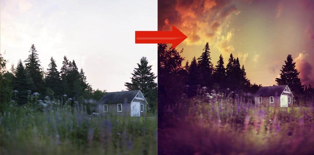
Color grading, dodging and burning, intense tonal shifts, profound perspective changes…these are just a few examples of what I use the precise tools of Photoshop for. Many use Photoshop simply for those final touches or unique circumstances which require heavier lifting than what Lightroom can provide…but Photoshop excels at so much more than that.
The “before” on the left is the original raw file, and the “after” on the right is the result of exposure blending, panoramic stitching, and extensive color grading only possible in Photoshop.
Photoshop is for the patient and the confident.
Photoshop is designed for patient creators; those who have the necessary foresight to envision the finished image. It can take a lot of time to successfully convey the creative message you want to express in your photography – and that’s okay. Developing an image that satisfies you creatively is not a race.
When you first step into the world of Photoshop, your creative journey can have a lot of twists and turns…and even some major detours. You may start down a path that becomes increasingly disconnected from your intended result, so you decide to double-back and start over from scratch. That’s okay too, because creative growth still takes place.
Processing an image in Photoshop grants you an incredible amount of power to strip your image down to its bare bones and rebuild the foundation. Depending on the intensity of your processing, this requires a lot of patience and foresight. It can take a while for your intended result to present itself, and your path may not always be direct.
Going back to the carpentry analogy: it’s a lot like looking at an unfinished home you’re renovating. The foundation is solid, the house is built well…and you can envision the final result, but the route you take to get there is not always clear, and you may not have any visual reassurances until the very end. All you can rely on is your patience and confidence in your skills.
Photoshop is not much different in this respect when looking at your raw file (below). I can spend a few hours processing an image without any evidence that I’m working closer to my final image, but I know that the work I am doing is correct; I have confidence in my skills and the patience required to follow through. I know that each edit brings me one step closer to the final image.
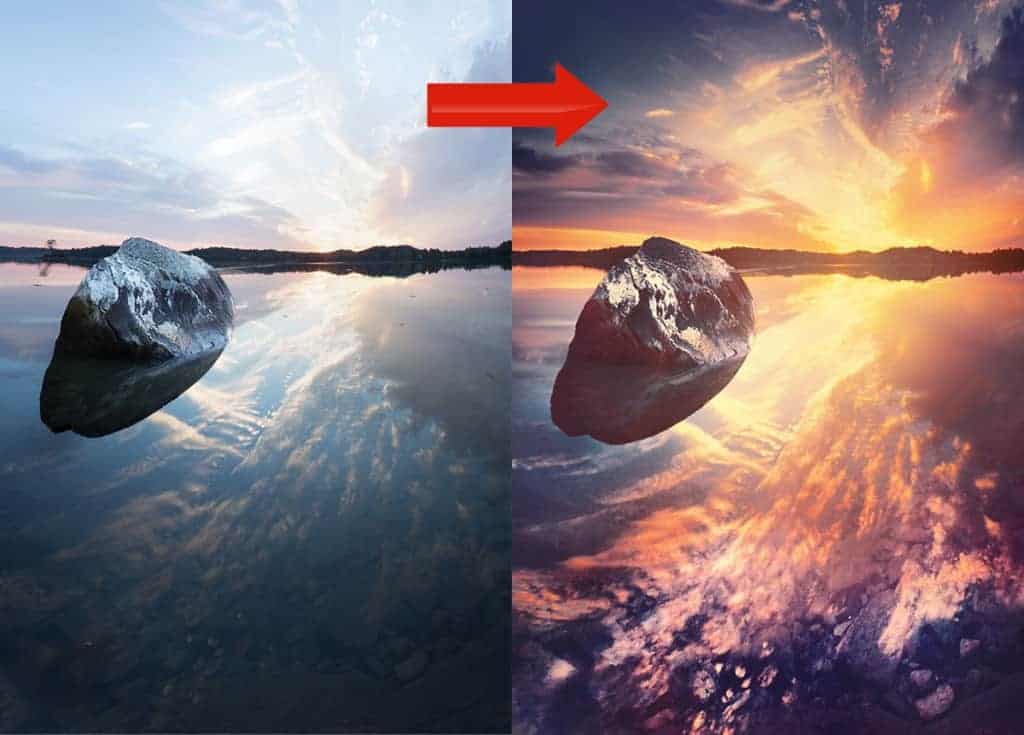
The “before” image on the left was the result of intricate stitching and heavy exposure blending, which required a lot of work before seeing the final result on the right. Only during the very last stages in my processing did my image begin to come together, so patience and confidence were needed as I worked on my tones.
That necessary confidence will help you move through Photoshop with ease, and can be strengthened through practice and expert guidance (that’s what I’m here for).
So why not just use Photoshop for everything?
The scope of your processing is entirely dependent on the tools you use, and Photoshop has a much larger toolbox than Lightroom…so why even use Lightroom at all?
Contrary to what you may think, a bigger toolbox is not always beneficial – and in fact, can hinder your creative development and steer you way off course with a damaging detour.
I obviously love analogies so let’s use the carpenter one again. When you set out to be a carpenter, you first learn the correct way to do your craft…and then you can be creative with it. You need to build a solid foundation of basic knowledge through practice and mentorship. Otherwise, your creations are built on shaky footing just waiting to crumble, no matter how aesthetically pleasing they appear.
Photography is no different: if you don’t have a strong understanding of how to process a photo in the digital darkroom, the image you create will be built on a shaky foundation.
A lack of understanding the principles of processing can result in many unwanted side effects…such as over-sharpening, lost detail in the highlights and shadows, muddy colors, unharmonious hues and tones, and other easily avoidable mistakes that stem from poor processing choices.
When you’re just starting out in the digital darkroom, Lightroom is a much better choice than Photoshop to comprehend the basics of successful processing. It’s the perfect beginner’s program: the interface is intuitive, the develop module is visually responsive, and your editing tools are laid out in a way that just makes sense. Confusion and overwhelm are at a minimum.
Simply put: it’s much easier to comprehend the basics of non-destructive editing when working within the protective boundaries of Lightroom.
It’s literally impossible to permanently damage your image here, and this program provides the much-needed protective boundaries while you work your way through understanding the basics of proper editing.
Are you 100% comfortable with your Lightroom workflow and can’t find any reason to incorporate Photoshop? That’s fine! As long as you’re not stifling your creative vision, go for it.
You’ll know when it’s time to expand your creative capabilities and move onto Photoshop (if ever). If you can’t do it in Lightroom, then it’s time to call in Photoshop.
How to decide when to use Lightroom or Photoshop.
Lightroom and Photoshop are not mutually exclusive – in fact, quite the opposite. You’re going to find a lot of the same tools in Photoshop as you do in Lightroom. They key to a successful processing workflow is not knowing which program to use, but knowing which program is better suited for your intended result.
In other words: knowing when to use the right tool for the job.
Let’s take the Develop module in Lightroom as an example. You can achieve the same exact result in Photoshop by using ACR (Adobe Camera Raw), which shares the very same tools as the Develop module – both are powerful raw processors, and the workspaces share the very same tools.
However, Lightroom has a friendlier user interface, the tools are laid out more sensibly, and it’s easier to transfer over your edits from one photo to another. This means you’ll be spending less time with basic raw processing in Lightroom, and will probably have more fun with it compared to using ACR.
Another area that Lightroom excels at is image intake (importing) and organization. You could use Adobe Bridge in Photoshop to achieve roughly the same level of organization…but collections (specifically smart collections) and folders in Lightroom absolutely shine, and is near-perfect in my mind. The Library module makes it incredibly easy and logical to import, organize, find, and keyword images.
Now this doesn’t mean that you CAN’T organize your image library in Photoshop using Bridge; you absolutely can. It’s just going to be more frustrating and take more time.
If you want to sharpen 20 photos quickly for web display, Lightroom is your program. However, if you want to sharpen one photo for large-scale printing, the specialized tools in Photoshop is better suited for highly-controlled and precise adjustments.
Both programs have their unique strengths and weaknesses, and choosing which program to use for a specific technique is entirely subjective to your photo.
It’s about knowing which tool is right FOR THE JOB, not which tool is stronger. And this knowledge will come from a combination of personal experience and expert guidance.
What are some general recommendations for using Lightroom and Photoshop?
Generally, you would want to do all of your importing, image organization and that initial pass of raw editing in Lightroom – those corrective edits that I cover in the “Refine” stage in the creativeRAW membership courses.
Things like exposure and tonal corrections, some initial cropping, white balance adjustments, chromatic aberration removal…all the steps you take to purify your canvas so you can create on it better in Photoshop.
Now for more specific or advanced color and tonal adjustments, also known as the “creative” stage I discussed above…you COULD continue to work in Lightroom. It’s perfectly fine to create there, and many landscape photographers do.
However, you have many more creative possibilities when working in Photoshop. Not only can you do more creatively, but you have the professional tools to process images of a higher quality.
This means you’ll develop photographs with less noise, better tonal and detail recovery, more precise color and tonal shifts, etc….which all contribute to a premium and professional final image.
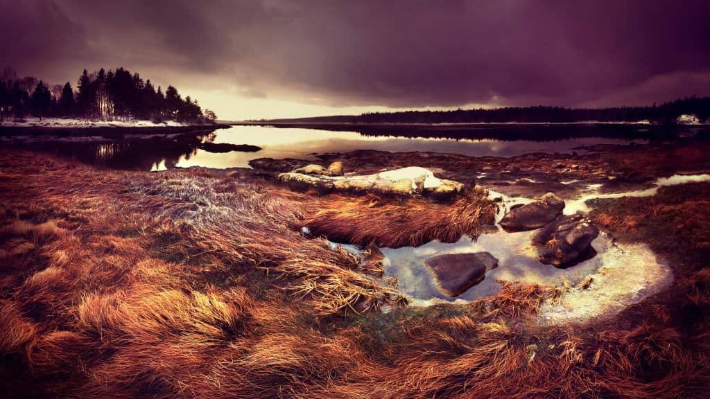
Let’s continue on!
What does Photoshop excel at specifically?
Let’s delve deeper into some (but certainly not all) of the unique benefits that Photoshop has in store for landscape photographers:
LUMINOSITY MASKING
One of the most powerful features of Photoshop is the ability to create tailor-made selections using luminosity masks.
In short, luminosity masks allow you to automatically create custom selections based on the unique tonal ranges of your image. You can isolate your brightest highlights all the way down to your darkest shadows, with varying groups of tones in between.
By grouping similar tones of your image together, you can perform truly customized adjustments with very little effort.
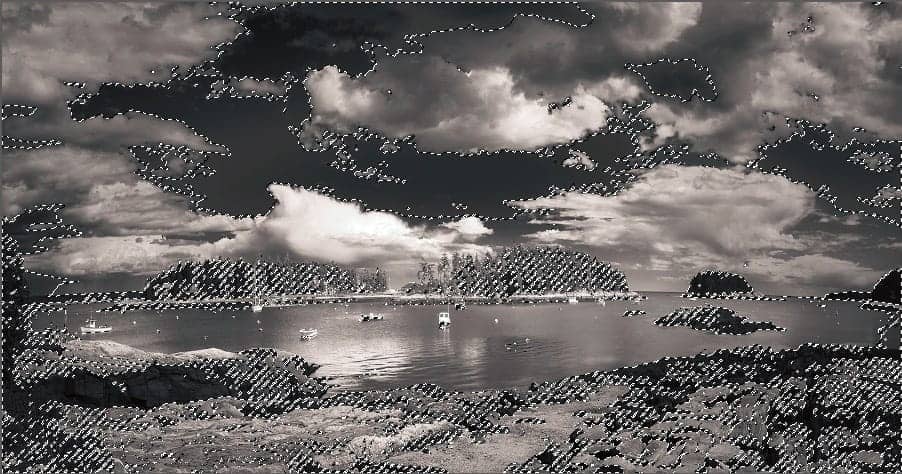
In the image above, you can see that the “marching ants” are surrounding the darker tones in the photograph only. This custom selection was automatically generated with luminosity masks, and will allow me to perform numerous types of non-destructive adjustments to my photograph….targeted to specific groups of tones (hence the word “luminosity”).
This kind of power would be extremely difficult and tedious to achieve using other methods.
It is absolutely one of the greatest strengths that Photoshop has over Lightroom for landscape photographers.
For example, you can automatically select your brightest tones and manually blend in a shorter exposure bracket with just a few clicks (also known as exposure blending). It’s much better quality than adjusting the exposure of a single raw file, but without all the hassle and unwanted side effects of HDR merging in Lightroom.
Another example of using luminosity masks: Let’s say you want to adjust the hue/saturation of a blue sky, but not affect the clouds or other parts of your image. With luminosity masks, you can automatically create this selection that is completely custom to your sky – like in the image above.
If you weren’t using luminosity masks, you would have to painstakingly paint your selection manually with your brush tool, trying to select the sky without overlapping into the clouds.
Another poor alternative would be to use sloppy and unrefined selection tools that give subpar results.
Either method above translates to more work and less accuracy than using luminosity masks.
Also note that luminosity mask selections are feathered (tapered), which means the effect you choose to apply to these selections will not have a hard transition line and will look very natural. This gives you much more leeway in how far you can push those pixels for passionate (extreme) processing.
Luminosity masks are awesomely powerful, and are the foundation for many other Photoshop techniques that professional landscape photographers use frequently.
PRECISE COLOR GRADING
In Lightroom, you can adjust the hue and luminosity of certain color groups…but the tools are rudimentary and creatively limiting. If you want to have true, unadulterated control over your color shifts, then Photoshop is the program you want.
Photoshop has many special tools and techniques that allow you to refine your color intensely without damaging your photo. You can completely alter the mood and atmosphere and successfully express your unique creative vision without having an “overcooked”, pixelated look that more automated programs are known for.
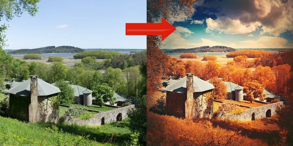
You really do have the best of both worlds with Photoshop – extreme processing without any cringe-worthy side effects.
TARGETED CURVES
Curves are an incredibly powerful tool for color and tonal adjustments, but they become exponentially more powerful when you can apply them locally (targeted to certain tonal and color groups).
When you apply a curves adjustment in Lightroom, it affects your entire frame. While this might be okay for very basic edits, you’ll want more precise control over curves for powerful (yet easy to implement) shifts in your hues and tones. Targeted curves in Photoshop grants you this indispensable power.
EXPERT DODGING AND BURNING
Dodging and burning is a film darkroom technique that allows you to selectively control the intensity of your tonal value. Depending on your intent, you can greatly soften the tonal range or intensify it…while also directing how the eyes move across your composition.
While you can do basic dodging and burning in Lightroom, Photoshop will grant you much more creative control and leniency with how intense you can push your pixels without damage.
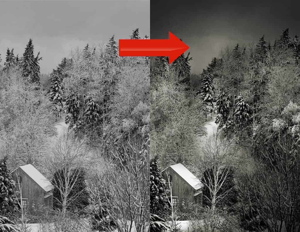
While this is actually a lighter application of my dodging and burning technique than I usually perform, it gives you a nice visual of what is possible in Photoshop.
INTENSE PERSPECTIVE WARPING
The transform and warp tool is one feature I rely on the most in Photoshop since I create a lot of panoramics. And when I say “panoramic” I’m not simply talking about the traditional 180 degree view, but any kind of stitching to expand the confines of your composition – even if it’s only two frames.
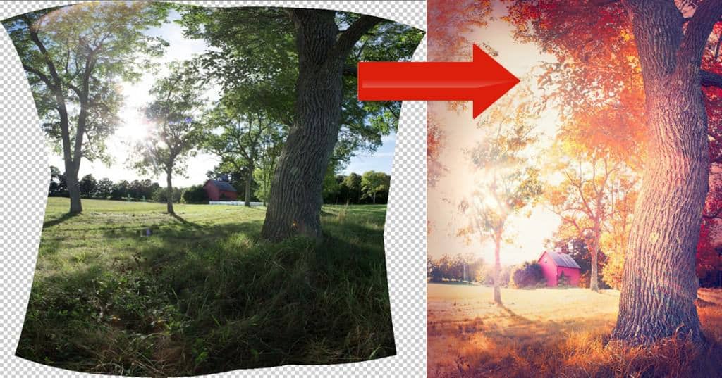
When you create a panoramic in Lightroom using the panoramic merge feature, you don’t have many tools to correct perspective distortion. There’s a few sliders that you can use to counteract the exaggerations, but you can only push these sliders so far before you hit a wall…and these perspective adjustments have to be linear. This can severely limit your creative abilities.
In Photoshop, you can greatly alter the perspective of your scene – like in the image above. This panoramic stitch with a wide angle lens really altered my perspective and depth. By using the warp tool in Photoshop, I was able to recapture the original perspective without wide angle distortion, and create a more balanced composition. This kind of correction is much too complicated for Lightroom to handle.
Perspective warping in Photoshop is not just for extreme cases like above, but also very simple (yet targeted) corrections.
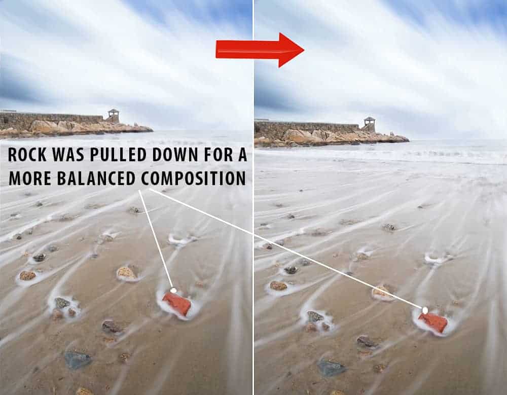
In the image above, I was able to redistribute my foreground focal point (the red rock) without any ugly distortion or pixel softening. I was following the rule of thirds and my foreground focal point was annoyingly off-balance. I could have cropped the bottom of my frame, but then I would lose some of that great foreground texture in the sand.
By using the warp tool in Photoshop to gently pull that rock down towards center, I was able to target just the rock area and create a well balanced frame – something that Lightroom simply can not handle.
The warp tool in Photoshop is amazingly powerful, and opens up a world of creative opportunities!
FOCUS STACKING
For those who like to photograph with wide angle lenses and use a deep depth of field (very popular technique with landscape photographers), focus stacking is a fantastic workflow for creating total front-to-back sharp focus.
By using layers in Photoshop (I’ll touch on layers towards the end of this article), you’re able to focus-bracket a scene and combine the sharpest points of multiple frames together into one, and achieve a level of total sharp focus simply not possible with one exposure.
For example….in the image below, I first set my focus on the foreground rock, then the middle ground, and finally the sky and combined those three images together to create a tack-sharp image.
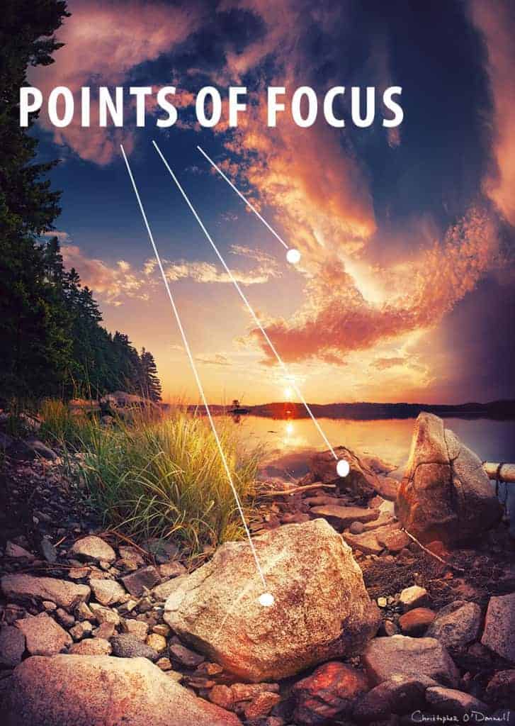
Here I was in a situation that often produces a soft focus despite a small aperture: using a wide angle lens and being extremely close to my foreground focal point. By focus blending, I was able to overcome the limitations of my camera and retain stellar front-to-back sharpness.
EXPOSURE BLENDING/HDR
Lightroom now has a fantastic HDR merge feature which allows you to exposure blend with ease, and without the need for clunky third-party programs or plugins. For basic blending, the result is usually good at expanding the dynamic range and pulling in more raw detail.
However, complicated scenes with lots of intricate detail to match up (tree branches and other foliage with very thin profiles are notoriously difficult to line up) or subjects which move slightly from frame-to frame tend to produce subpar results in Lightroom.
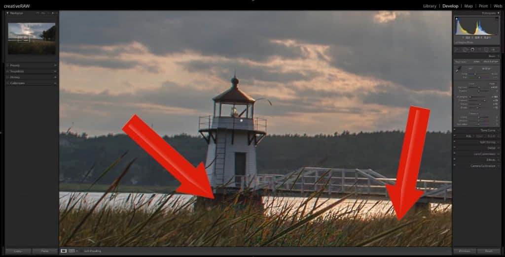
In the screenshot above, you can see that this HDR blend in Lightroom produced some bad side effects. There are blotchy areas of high noise which would be impossible to remove fully, and some of the blades of grass are partially transparent.
Complicated blends like this is a common occurrence in nature/landscape photography since we rarely have control over our scene, and will have to compensate in the digital darkroom for inconsistencies between exposures…such as moving clouds and water, wind blowing through foliage, etc.
By using luminosity masks mentioned above, you can automatically generate intricate masks that hug every contour of your skyline, allowing for easy blending of exposures in Photoshop.
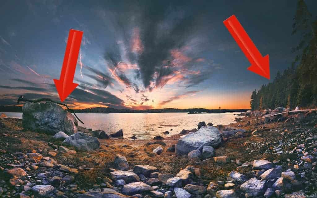
This image was carefully blended in Photoshop with luminosity masks, and you can see the great results. Seemingly difficult areas (such as between the driftwood and foreground rock, and the intricate tree line) were blended perfectly, and with great ease!
Exposure blending is not just for sky/ground merges like in the above image; any situation where blown highlights/ crushed shadows need to be recovered can be easily fixed in Photoshop with this workflow.
Blending detail from a different exposure taken in the field is of much higher quality than adjusting the exposure a single raw file, despite what you may hear otherwise.
I don’t want to take this article on an HDR detour here…but if you would like to learn more about the great benefits of autobracketing in the field (including my step-by-step camera walkthrough), download my free HDR field guide.
SHARPENING
Photoshop simply dominates at both local sharpening and your final sharpening pass for printing.
Your image can be softened by your camera’s anti-aliasing filter or the lens itself, so “import sharpening” needs to be applied to counteract this. Lightroom and ACR can handle this initial pass of global sharpening very well; in fact, probably the best I’ve seen. I personally still apply a light sharpening bump as part of my importing workflow in Lightroom and would recommend the same for you.
However, there are usually parts to your image that need to sharpened further. This is especially true for shallow depths of field where you do not want to over-sharpen your soft-focus areas…which will do nothing for detail and instead just add noise/pixelation.
You COULD use the adjustment brush in Lightroom to paint over the areas you want to sharpen further, but your options to tailor the sharpening to your photo are extremely limited and will rarely produce a decent result.
Photoshop has highly customizable controls for both global and local sharpening, and provide you with several fantastic workflows to use depending on your image and needs….full sharpening control!
Most landscape photographers also make a “print sharpening” pass before sending their image off to the printer. Photoshop is the clear winner here for true control over enhancing the finer details without a harsh, over-sharpened appearance.
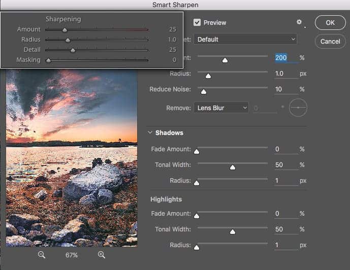
In the image above, you can see that Photoshop (background) grants much more control over your sharpening than Lightroom (inset).
Now image sharpening in post processing will only enhance the detail that’s already in your image; it’s not a magic recovery tool for soft focus. The most degradation in sharpness comes from a poor camera/lens combination, and/or poor field execution to avoid camera shake and misfocus.
But if you’re a sharpness nut like me, then you’ll want to use Photoshop to pull as much detail out of your image as possible. If you’ve invested in a high-quality lens, then you’re doing yourself and your gear a great service by fine-tuning your sharpness the right way in processing.
STRONGER CLONING AND SPOT REMOVAL
Photoshop has a substantial lead over Lightroom when it comes to retouching the impurities of your photo, and that is because Photoshop has content-aware fill. Photoshop will automatically analyze the surrounding area of an object you want to remove, and replace it with similar information for a seamless blend without much effort.
While this doesn’t work perfectly 100% of the time, it does a surprisingly good job and only requires a little tweaking every so often for difficult areas.
When working with larger areas that you want to remove beyond simple dust spot removal (think of telephone poles, people, buildings, etc.), then content-aware fill in Photoshop will give you much better results than Lightroom.
COMPOSITES
Photo compositing (transferring elements from one photo into another) is only possible in Photoshop, and grants you unlimited creative freedom. While there are varying degrees of compositing complexity ranging from simple corrections to intense manipulation, Photoshop makes it incredibly easy to isolate your subjects and blend them together in a natural, authentic-looking way.
By using the expert tools at your disposal, you can match lighting and adjust color balance for a smooth and seamless result.
Compositing is a large umbrella in Photoshop and defines many types of photo manipulation. Composites aren’t always about completely altering your photo and creating a surreal image; it can be as simple as planting in trees from a different exposure that are not moving from the wind, blending in a sunstar that is a better defined with a smaller aperture, or simply blending in subjects that may have moved a bit off point.
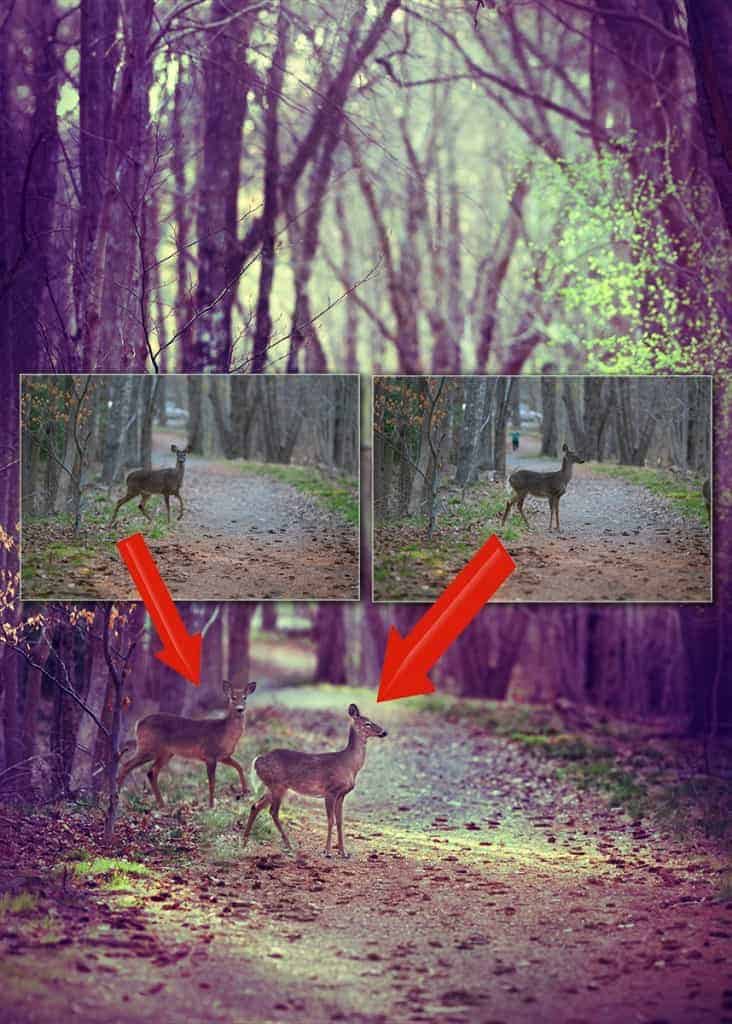
In the example above, I had to use Photoshop to composite the two deer closer together. Both deer were together at that location, however they came out of the woods one-by-one and I was not able to capture both in the same frame. By compositing two different exposures here, I was able to put both deer into the same frame and create the image I wanted to.
NOTE: All of the Photoshop workflows mentioned above will be covered in current and future creativeRAW lessons. If you’d like to learn more about my processing courses included in your creativeRAW membership, click here.
Myth: Lightroom is non-destructive, but Photoshop is.
This common thought is simply NOT true. While natively, Photoshop is a pixel-based editor and your images CAN be edited in a destructive way (unlike Lightroom which is a virtual editor), there are certain precautions you can take to make sure your workflow is entirely non-destructive and 100% reversible.
This is why having EXPERT guidance is so important…because when you stumble around a program as advanced as Photoshop without any sort of prior learning, then you can inadvertently (and permanently) damage your photo.
Unfortunately, there are tutorials out there which do not offer the best advice and could recommend destructive workflows. Being a beginner in Photoshop, it’s difficult to weed out the good advice from the bad.
In my creativeRAW membership courses, I walk you through step-by-step how to establish a completely non-destructive workflow in Photoshop by teaching the workflow I’ve used for many years…which is surprisingly simple to do.
So just to clarify: Yes it is POSSIBLE damage your photo in Photoshop, but there are ways to preserve a non-destructive workflow.
Don’t forget the most important Photoshop tool: Layers!
In order to do any kind of editing in Photoshop and retain a completely nondestructive workflow, you need to learn how to use layers the right way (because there are PLENTY of wrong ways to use them).
The layers palette is your processing control station for Photoshop, and easily the biggest benefit of Photoshop over Lightroom.
Layers allow you to compartmentalize your editing techniques into separate zones, or “layers”. Why is this good? By isolating your editing techniques from your photo, you can change, move, delete, and duplicate very small (or large) steps in your processing workflow WITHOUT affecting the raw file itself…or influence your other editing choices.
Layers are insanely powerful and are absolute KEY to getting the most out of Photoshop…and they’re one of the top reasons why photographers eventually incorporate Photoshop into their processing workflow.
Now everything we have gone over in this article has been in the abstract, so I am sure you’d like some hands-on, step-by-step Photoshop learning as well 🙂 Don’t worry – I got you covered!
The concept of layers is a difficult one to grasp, and is a bottleneck for many photographers who are new to the program. It takes an expert guide (that’s me!) and some step-by-step guidance to truly understand layers and be able to implement them into your processing workflow with ease.
This is why I created a free mini-course called Complete Guide to Layers in Photoshop, a totally FREE step-by-step guide to understanding layers.
Using Lightroom and Photoshop together provides the best processing experience.
To summarize…the Lightroom/Photoshop workflow has proven to be extremely beneficial to not only myself, but to many other landscape photographers who want the best of both worlds: the simplicity of Lightroom combined with the versatility of Photoshop.
For me personally, it’s editing in Lightroom (purifying the canvas) and processing in Photoshop (the creative stage). I absolutely love this workflow and is something I’ve been able to develop and refine over many years.
I’ve been processing photographs with both programs since 2008 and have absolutely no regrets, even when both programs did not integrate as cohesively as they do now…and when you had to purchase them separately.
Thanks for reading!
Five Steps to Dramatic Black & White Landscapes in Lightroom
Here’s an in-depth tutorial that I’ve been wanting to create for quite some time…my complete, step-by-step Lightroom workflow for processing black and white landscapes. I love to help other photographers achieve their creative goals, which is why I’ve spent some extra time to make sure this guide is super helpful and easy to follow.
NOTE: You can achieve the same exact result in Photoshop using ACR…same tools, just in different places than Lightroom.
Many photographers find black and white format to be a bit of a challenge to master in Lightroom, and understandably so. When you convert your image to black and white, the results are usually lackluster and disappointing: flat, uninteresting tones which elicit a low-impact, boring reaction (like in the before image below).

Just like when you process a color image, some specialized Lightroom techniques are required when working in black and white format. A bottleneck in your workflow develops when you don’t know which techniques to perform, or how to use the Lightroom tools to create the image you want.
Not to worry! I’m here to demystify the black and white workflow (it’s actually pretty simple). All you need is a little direction, and this tutorial is packed with my best Lightroom tips and tricks for creating extraordinary, wall-worthy black and white landscape photographs.
I’m going to roll out the blueprints and walk you through my entire black and white workflow step-by-step, so you can better understand how easy and fun it is to create in Lightroom.
What you need to get started
In order to follow along with this tutorial, only some very basic knowledge of Lightroom is needed. I walk you through how to perform each technique step-by-step, so if you can open Lightroom, import a photo, and switch to the Develop module….you’re good to go 🙂
Now let’s get to the tutorial! Whether you prefer to watch or read, I’ve got you covered below.
STEP 1: Basic Adjustments
Note: Remember, if you want to use the example image yourself and follow along with this tutorial step-by-step, download the practice pack by clicking here.
This first step you want to do is to convert your image to black and white format. There are several ways to go about this in Lightroom, but I prefer to select the “Black & White” icon in the Treatment heading, right under the word “Basic” in the panel.
Next, I want to even out my exposure a bit by performing some initial slider shifts. I typically do not adjust my entire exposure (via the exposure slider) unless the entire image is grossly under or overexposed. Instead, I make more targeted tonal adjustments with the Whites & Blacks, and Shadows & Highlights.
HIGHLIGHTS -79
SHADOWS +20
WHITES -32
BLACKS +20
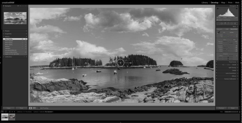
STEP 2: Enhance the sky with the Black & White Mixer.
I love using the Black and White Mixer panel (click on the word “B&W”under the HSL/Color/B&W panel) as this is where you can greatly control your highlights and shadows. The sliders here allow you to isolate specific color channels and adjust their luminosity (or tonality) with great control…which is extremely powerful for a black and white image.
What I want to do here is bring down the blues quite dramatically to darken these tones, which will make the sky really stand out from the white clouds. Select the target adjustment tool and hover over the sky so your blue slider is highlighted in the panel. Then, click and drag your mouse down all the way to – 100.
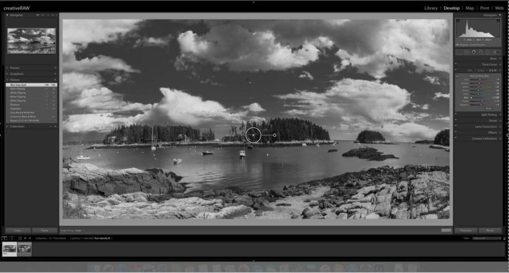
With just this one adjustment in the Black & White Mixer, I’ve already made a dramatic difference to the tonal range…the sky is so much more interesting now!
STEP 3: Add texture to the water.
The next step here calls for the adjustment brush, which will allow me to enhance the texture of just the water. To me, it looks a bit flat and uninteresting in its current state…which definitely was not the case in person.
Select a brush size that is big enough to cover the water, but small enough to get into the crevices of the coastline (11), and set Feathering at 50 and Flow at 100.
Begin to paint the water (turn on your overlay so you can see exactly where you are painting). For this adjustment, you don’t have to worry about “coloring outside of the lines” too much, but try to make a conscious effort to keep your painting contained. We’re not aiming for perfection here, just the general idea.
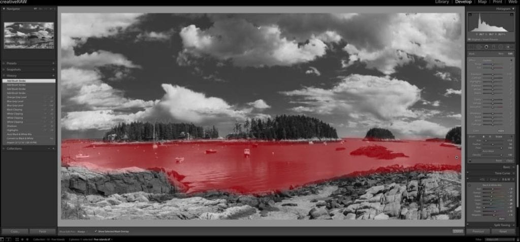
After you’re done painting, go over to your adjustment brush panel and make the following shifts to your sliders:
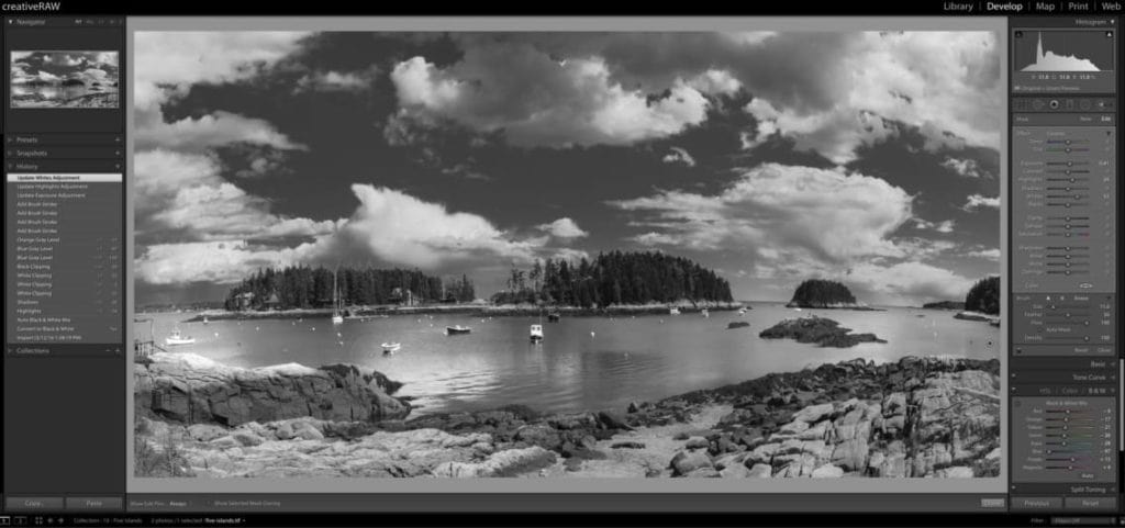
EXPOSURE: +0.41
HIGHLIGHTS: +24
WHITES +52
Your practice image should look something like the screenshot below…much more interest than that boring midtone grey.
STEP 4: Creating a custom vignette
Here’s one of my most favorite steps in my photo processing workflow: adding a vignette that is 100% custom to the image.
This powerful technique can dramatically alter the atmosphere and overall impact of your landscape, especially in black and white format….giving you great control over the flow and balance of your composition. For this image, I’m going to first add a global post-crop vignette in the Effects panel…but I’m not going to stop there.
To further customize this effect and greatly enhance the light and shadow balance, I’ll then selectively add a few radial filters to emphasize the stronger focal points.
This is the best way to apply a vignette in Lightroom that is not distracting and overbearing, but rather gently redirects the focus exactly where you want it to be. These subtle shifts can make an extraordinary difference in your processing success, and can truly be the difference between a snap shot and a work of art.
For a better visual of this process, make sure to watch the tutorial video above or download the practice pack below and watch offline (which also includes the practice image so you can process along with me).
Click here to download the Practice Pack
Let’s go over to the Effects panel and jump down to Post-Crop Vignetting. Select Highlight Priority as your vignette style, then enter the following values:
AMOUNT: -47
MIDPOINT: 0
ROUNDNESS: +20
FEATHER: 69
HIGHLIGHTS: 83
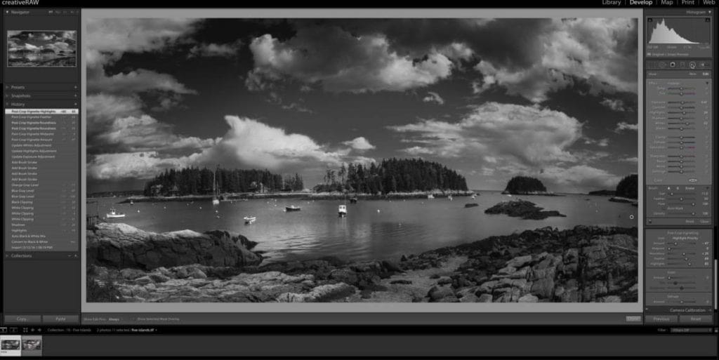
Now, this is looking much more dramatic and moody, but I’ve lost some important detail in certain focal points. You can see that the center of the photo was also affected by this heavy vignette, which is a common side effect of the global post-crop vignette tool.
Not to worry! To counteract this, I’ll add some radial filters to make these important areas pop again.
Let’s go over to the radial filter tool and click + drag a big oval over the center of my photo. Make sure that “invert mask” is selected, and feathering is up to 100. The goal here is to brighten up the center focal points (the cluster of boats, islands, and a bit of the foreground rock) which will redirect the focus back to center.
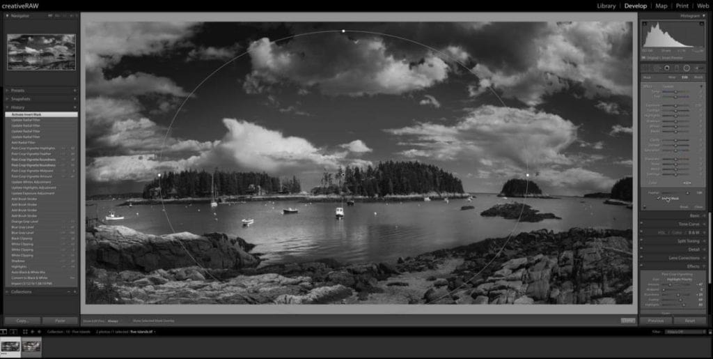
Your radial filter should look something like the image above. Once you’ve got your radial filter placed, make the following adjustments in the radial filter panel:
EXPOSURE: +0.44
SHADOWS: +30
WHITES: +42
These targeted adjustments allow me to brighten up the image without losing all that great contrast and tonal range. Your image will look so much better when you fine tune these sliders to the unique tonal values of the affected area (for this case, inside of the radial filter) as opposed to just pumping up the exposure alone.
Now another area which is bothering me a bit is the dark clouds in the top portion of the frame; I find it to be too distracting. Instead of adjusting the post-crop vignette we added earlier (which would affect the entire frame and change areas I like), I’m going to isolate these clouds by adding a targeted radial filter.
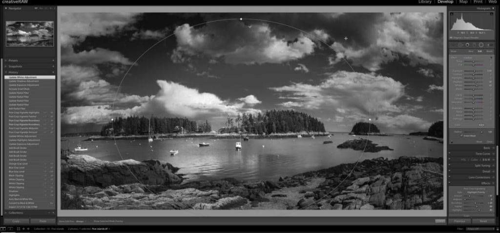
Select New in the radial filter panel and click + drag to create an oval shape just over these clouds, and increase the overall exposure by 1.29 stops.
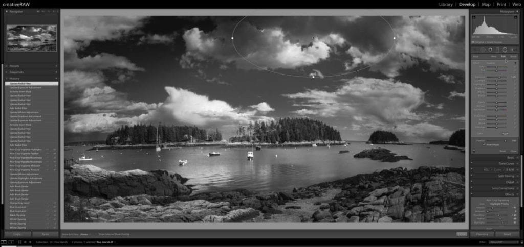
And finally, I’m going to add one more radial filter to the bottom of my frame. The post-crop vignette was a little too heavy here and I lost all that interesting rock texture, so I want to reverse that. However, I don’t want the entire bottom of my frame to be affected, so I will taper this radial filter by making sure that feathering is set to 100.
Click + drag a very shallow and wide radial filter, covering most of the rocks. Since feathering is set to 100, the effect will be very light towards the edges of the radial filter, but heavy in the middle….soft and subtle.
Make sure invert mask is selected so you are affecting the inside of this filter and not the outside, and make the following adjustments in the radial filter panel:
EXPOSURE: +0.53
HIGHLIGHTS: +42
WHITES: +38
BLACKS: -15
STEP 5: Add the finishing touches.
As I do with most of my black and white images, I add a very subtle glaze with the split toning panel, which ties the entire image together nicely. Subtly is the key here, because a little goes a very long way when working in black and white format.
Let’s open up the split toning panel and make the following adjustments:
HUE: 37
SATURATION: 13
BALANCE: +22
SHADOWS: 236
SATURATION: 5
Now to finalize this photo, let’s go up to the Basic panel again and increase the clarity to +24.
I like adjusting the global clarity as a finishing touch because I don’t want it to influence my processing choices. Clarity is quite powerful, so it’s better to apply it lightly at the end instead of heavy at the start.
Now when you add clarity, it can decrease the overall exposure…so let’s fix that by increasing the exposure by 0.30 stops.
There you have it! Let’s take another look at the before and after to see how dramatic this change is.
We’ve managed to take an average landscape scene taken in unflattering noontime light, and transform it into a high-impact, dramatic black and white photograph.
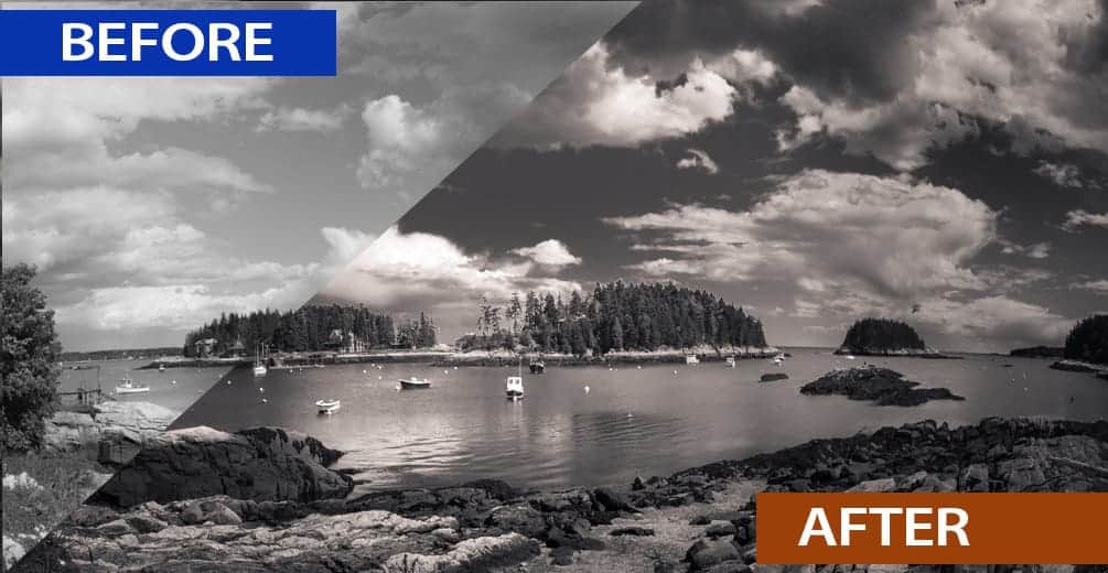
Now if you downloaded the practice image, you can see this change for yourself by toggling the backslash key (\). As a true start-to-finish comparison, let’s show the color image and final black and white side-by-side.
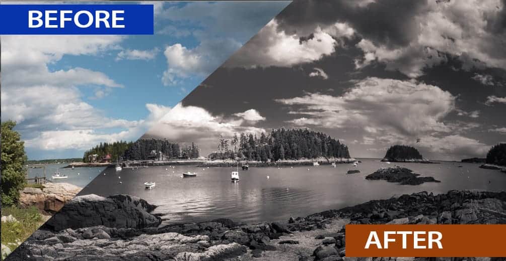
Processing black and white landscapes can seem a little intimidating in Lightroom…but really it’s quite simple and straightforward once you learn the tools.
I hope that by explaining my Lightroom workflow, you were able to pick up a few helpful tips and tricks to make your processing a bit more fun 🙂
One more tip before you go: The reason why this image is so successful is because I completely customized my processing techniques to the content of the photograph itself. This is very important!
In other words…the radial filters and fine-tune basic adjustments were 100% tailor made to the tonal range and detail of this particular image. The shadows in the clouds, the texture in the rocks, my focal points…all of these details were taken into consideration when I was deciding which techniques I wanted to perform, and exactly how I wanted to adjust my sliders.
This is the key difference between knowledgable processing and blindly slapping on presets and filters. I could have taken the shortcut here and just pumped up my contrast and clarity for that instant wow factor. It takes about 10 seconds to do:
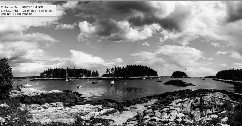
However, this strategy very rarely gives you a truly remarkable image. Upon closer look, you can see that this technique has produced some large areas of lost detail in both the shadows and highlights.
These areas of blown out highlights and crushed shadows have not only damaged the photo, but have inadvertently become our focal points – and not good ones.
More importantly, processing an image like this gives you a very shallow and unfulfilling creative experience in Lightroom. Not fun at all.
Thanks for reading! And make sure to download the practice pack (which includes the image file, tutorial video, and a PDF of this article) so you can try this out for yourself!
Easy Steps to Prevent (and Reverse) Camera Condensation
Condensation forms on your lens when you have dramatic temperature and/or humidity changes and your camera is not protected from the elements. When your gear hits that dramatic change of air, condensation forms while the temperature regulates….which can definitely be worrisome on your expensive gear.
Don’t panic! A few rounds of condensation won’t ruin your camera, nor will your lens fogging up cause any permanent damage. However, you should definitely take some easy steps to prevent this from becoming a habit. Too many cycles can begin to wear on your gear, especially on the internal mechanisms.
During the summer months, condensation forms most often when your bring your camera from a cold and dry environment (an air-conditioned house or car) and out to the hot and humid air. That’s a huge environmental change and will introduce moisture quickly!
I live in New England, so winter is when I experience condensation the most. If I bring my camera inside to a warm and toasty house after a day of shooting in freezing temperatures, the lens will fog up almost instantaneously.
Acclimation is your friend!
The goal here is to introduce these dramatic temperature/humidity changes slowly, and to make sure this air does not hit your glass directly. It’s incredibly easy to prevent condensation; it just takes a little patience.
Before entering an environment that is drastically different from the one you’re in, make sure your gear is securely in your camera bag and all zippers are closed. That’s it!
Most camera bags are padded quite well to protect your gear. This padding also acts as insulation, which helps to regulate sharp changes to the air and allows your gear to acclimate slowly to the new environment.
Depending on the temperature differences and how substantial your gear is (think 50mm prime lens vs. a 400mm telephoto), you may need to leave your gear in the bag for several hours to fully acclimate. However, it’s the sure-fire way to prevent any condensation from building up – and incredibly easy to remember.
For extra protection, you can place your camera inside of a plastic ziploc bag and then place that into your camera bag – do this BEFORE stepping into your new environment. This will provide another layer of protection and prevent the new air temperature from hitting your camera directly.
Too late! My camera is already foggy.
If you have condensation on your camera already, follow these steps:
- Don’t wipe the lens! This will do nothing but give you streaks you will have to remove from your glass or filter. The condensation is already there, you just have to let it dissipate naturally.
- Don’t detach the lens if it’s already attached – leave your camera be. You do not want to introduce more condensation to the other end of your lens or the internals of your camera.
- Put it in an airtight bag and get as much air out of it as you can. It would also help to put something in the bag to wick moisture away – such as a towel or preferably uncooked rice.
- Wait until the camera comes up to temperature and all condensation has dissipated.
For severe cases where your camera is still taking foggy-looking photos, you may have to work on this for several days. Instead of a towel, it would be better to place silica gel packs in the plastic bag to help dry out all the interior components. Make sure you keep the bag airtight though so that the gel packs wick the moisture from the camera and not the air itself.
It’s best to avoid condensation altogether, but it’s only the most severe cases where much moisture and water has entered the camera will there be any permanent damage – so don’t fret if your camera fogs up a few times. If your camera is still working, you should be fine – just try to avoid future cycles of condensation.
It’s also important to note that some camera companies will not do warranty repairs to your gear due to condensation damage (as they consider it water damage), so that’s another reason to take a few easy steps and prevent condensation altogether!
Speed Up Your Lightroom Import
Lightroom is known for its easy to use interface and seamless workflow capabilities, but it may not seem that way when you begin your import. The window is a bit intimidating, and those important shortcuts to a smoother import aren’t exactly highlighted with neon signs.
Automation is the KEY to a streamlined workflow in LR. The entire program was designed to automate those redundant tasks you perform over and over, and Lightroom has some fantastic tools for performing those repetitive steps you do at each import.
I’d like to share some tips that I find to streamline my imports so I can get to my images as quickly as possible, while also shaving some time off spent in the Library and Develop module.
And if you have an import question of your own, feel free to leave a comment here or jump over to the creativeRAW Facebook group and ask away!
1. Cull your images during import.
Why import images you know you will NEVER use? It’s habit for most of us to just import the entire memory card and cull them in the Library module, but the import window has a handy grid view for you to use – which makes it easy to decide which images belong in the trash bin.
Don’t spend too much time deciding; that’s what the Library module is for. When culling images during import, only discard those that you KNOW will serve you no purpose: test shots, misfires, duplicates, out of focus, and so on. This is not the place for more subjective decisions like composition, orientation, depth of field, etc.
2. Import from your memory card first.
By importing your images directly from your memory card and onto your computer (or hopefully your external drive) BEFORE jumping into Lightroom, the import will go faster.
Using the Lightroom importing window to simultaneously add your images to the LR catalog AND copy those raw files to another location can take a lot of time, so best to segment this process into two steps so that you can move through the Lightroom importing process a bit quicker….and avoid freezing up.
It also gives you the chance to check that your raw files have been copied over from your memory card properly before deleting them.
3. Develop Presets: They’re not just for color processing.
When we hear the words “Lightroom presets” we typically think of color grading automations named “Mountain Mist” or some other creative technique.
However, presets can do MUCH more than adjust our hues and tones. They’re the key to a super-streamlined workflow, from import to export.
Applying your develop presets right in the import window an save you a LOT of time performing repetitive steps in the Develop module. Think about your own workflow and the adjustments you do over and over again once you jump over to process an image: lens corrections and chromatic aberration are big ones for me.
With the Apply During Import panel, you can assign a specific preset to be applied as you import, saving you the annoying task of applying it later. Also, it’s nice to see your images in the Library module with some basic corrective edits already applied.
Of course, if you need to tweak these adjustments later on, you can always do that too.
Remember: Lightroom is completely non-destructive, which means you can do pretty much anything to your photos and will always have the option to adjust and/or remove your changes without affecting the original raw file.
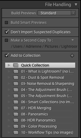
4. Add Images to a Collection
If you use regular collections and know that you are putting all of your images into an existing collection, simply choose it from the dropdown menu under the File Handling panel.
You can also create a new collection from this window by pressing the + sign next to the “Add to Collection” checkbox, saving you yet another step in your organization workflow.
5. Create an Import Preset
After you’re done tailoring your import and it’s time to bring those images into Lightroom, save yourself some future headaches and create an import preset. Lightroom is full of these “hidden” presets where you can automate so many redundant tasks, and I find myself constantly using import presets to automate.
Even if you deter from the exact import workflow here, chances are most of your options will remain the same. When you load an import preset, you can always customize it to your current group of images.
Need to save your raw files to a new location or want to apply a different develop preset? Simply load your standard import preset and just change the options you need to; it’s still much easier and faster than selecting all of your options over again.
If your import workflow is COMPLETELY different this time, just create another preset (you can create as many as you want). Creating these presets as you go along will definitely save you a LOT of time in the future. It has for me.
Like with most things in life, a bit of prep now can save you countless hours of unnecessary work in the future. Lightroom is no exception to this rule; in fact, LR embraces it. You’ll find many of these time-saving features throughout every module, with each one designed to automate those boring tasks that don’t require your unique touch.
Hope these tips help! Still have questions about the Lightroom importing process? Head on over to the creativeRAW Facebook group where you’ll find some very helpful folks (including me) to answer your LR questions.
Not on Facebook? No worries! Simply reply to this post…or if you’re a Lightroom for Landscapes member, comment on a course lesson and I’ll get right back to you.
Thanks for reading!
Chris
Welcome to The Darkroom for Landscapes!
Congratulations on making the first step towards creating photographs that represent who you are. I can’t wait to learn more about you and help you achieve your photography goals. I promise that this will be one of the best investments you will ever make in your craft.
Step 1: Accessing your account.
The Darkroom delivers your courses using a brand-new membership system specifically designed for easy navigation, so you can flow in and out of your lessons with great ease. To access your courses, you’ll need to log in using your email address and password.
>> Check your email for your login information <<
NOTE: If there is no password in your email, then you’re already set up with a creativeRAW account and can log in using your existing password.
To log in, click the “LOGIN” button in the top-right corner of any page.
After successfully entering your email and password, the LOGIN button will change to MY ACCOUNT. Click on this to access the program.
If you have any trouble logging in, please let me know by replying to that email or sending a message to support [at] creativeraw [dot] com and I will get you sorted 🙂
Step 2: Watch the introduction video.
After you log in for the first time, at the very top of your list of courses will be a “Getting Started” module. These videos will give you an idea of what to expect in the program, how to set yourself up for the best learning environment, and how to navigate the website.
NOTE: The website and course navigation video was created before I updated the website, so things will look a bit different. However, the general process of jumping in and out of your lessons still applies.
Step 3: Say “Hello” in the Darkroom Circle!
Make sure to drop by the private discussion forum and introduce yourself! Instructions on how to set up your forum account are right at the top of your Darkroom for Landscapes list of courses. I may be a bit biased, but there’s a fantastic group of fellow landscape photographers in there 🙂
Remember: Part of your membership is unlimited one-on-one support for all your Lightroom + Photoshop questions.
Write me directly and let me know what you’re struggling with the most, and I’ll point you in the right direction.
Also, check your email tomorrow for your creative assessment, which will help both of us design a path to darkroom mastery that is 100% custom to you.
Here’s to your darkroom success, and I’m looking forward to getting to know you better!
Best,
Chris
