Contrast, Luminosity, and Color
Table of Contents
| 3:50 | The Definition of Luminosity |
| 7:40 | Using the Histogram to Evaluate Contrast |
| 10:05 | Global vs. Local Contrast (Micro-Contrast) |
| 17:27 | Contrast and Depth Perception |
| 21:05 | How Local Contrast is the Foundation of an Image |
| 24:35 | How Texture Contrast Influences your Composition |
| 27:13 | The Luminosity of Color |
| 31:04 | Brightness vs. Lightness |
| 36:27 | Perceived Brightness and the Computer Screen |
| 41:41 | How Hue and Saturation Affects Value |
| 43:53 | How Contrast, Luminosity, and Color Influence One Another |
| 47:43 | Lesson Recap |
Contrast, Luminosity, and Color…
These three qualities are often thought of independently, but share a very special relationship as they directly influence one another to comprise the structure of your photograph.
I’ve found that many photographers haven’t fully wrapped their heads around the differences between luminance and luminosity, lightness and brightness, global and local contrast…and will often use the terms interchangeably.
So I wanted to dig deep here with a video lesson and unpack the relationship between contrast, luminosity, and color…
Because once you understand how they influence one another, you can process your detail with more precision for a higher-quality final image.
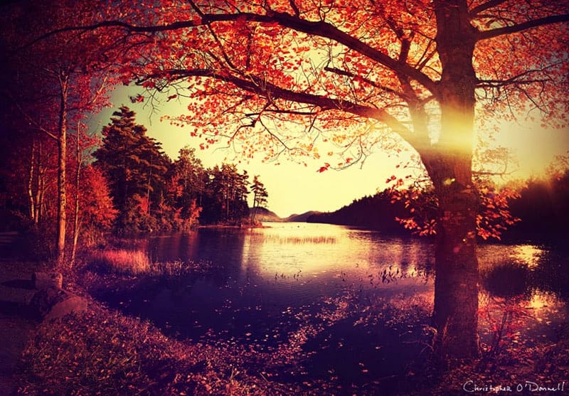
My Best Tips for Creative Autumn Photography
Autumn is, by far, my favorite season to photograph. The first piece of foliage signals the beginning of an ethereal journey through nature as I watch it transform into vibrant hues of red, orange, and gold. Scenes that I have become familiar with morph into a mosaic of colors and tones, and the cooler air and unsettled weather contribute to the creation of a dreamscape playground.
Since autumn photography is a personal pursuit of mine, I wanted to create a list of fall foliage tips to help you navigate through this otherworldly season and harness your creative expression.
1. NATURAL LIGHT AND FOLIAGE
Landscape photographers are well aware of how important the quality of light is to an image, but it plays a particularly important role during the fall foliage season. Light creates the atmosphere and enhances the overall experience. Different types of light have particular strengths, and knowing what those advantages are will lead to a more fulfilling experience during this short window of opportunity.
Diffused Light
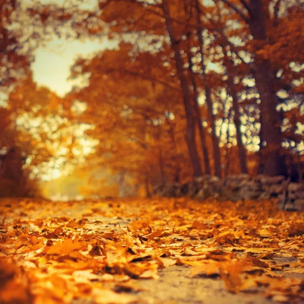
If your goal is to amplify the natural color of foliage, then you will find much success with the soft, diffused light of overcast days. Colors appear more saturated without the interference of direct sunlight, which can expand your creative horizons during a drizzly autumn morning. Water has the ability to amplify color as well, so foliage that has been recently dampened by a passing shower or still wet from melted frost will explode with color.
One of my favorite times to photograph the autumn foliage is on overcast, damp days as I can spend hours creating without being dictated by the angle of the sun. The mood is thick with suspense, and I find this experience to have great influence on my work as I tend to seek out moody and mysterious compositions.

Remember: you can download a PDF of this article for later viewing by clicking the button above (or just click right here).
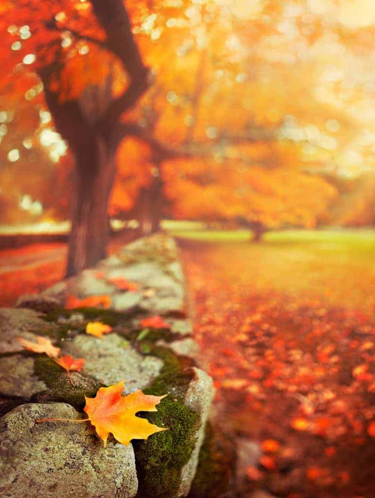
Direct Sunlight
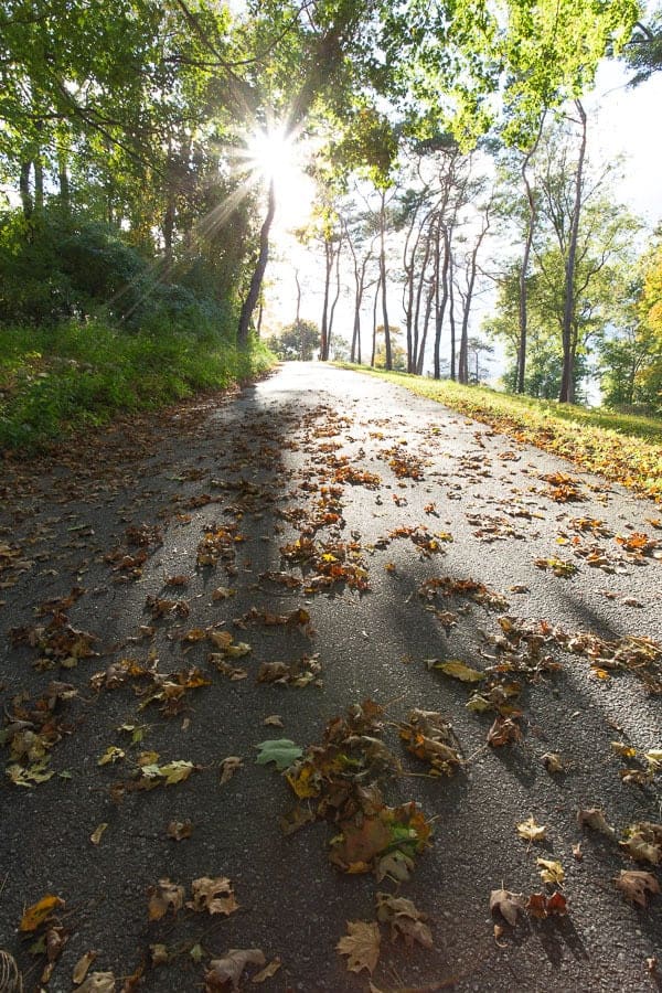
As the season turns to autumn, the sun moves lower in the sky which results in a more pleasant light when compared to the summer months. Shadows are lengthened and highlights are intensified, and previously uninspiring scenes are now exploding with texture and depth. The image below was taken three hours before the official sunset time, but notice how low in the sky the sun is placed. Your window of textured light is expanded during the autumn months, allowing for more opportunities to create during the foliage season.
Golden Hour Light
The golden hour light has the ability to add intense warmth and pleasing light to your scene, amplifying a sensation of comfort and happiness. Texture and depth are prime during the sunrise and sunset hours; highlights and shadows dominate the landscape, creating a mosaic of deep autumn hues and strong tones.
The golden hours are coveted by landscape photographers, and this unique light requires a specialized workflow to compensate for the intense highlights and shadows. Exposure blending is often needed to recover the full tonal range, and there are particular requirements in order to successfully photograph this phenomenal light.
Which is why I created an exposure blending eCourse for the creativeRAW lifetime membership program, which you can read more about right here.
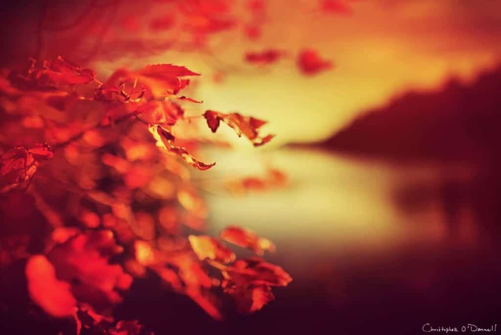
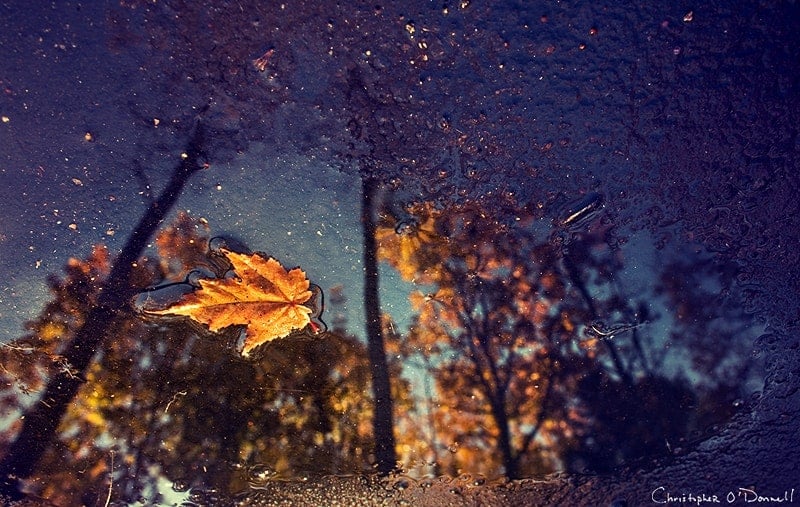
Moonlight
Photographing the autumn foliage at night can prove to be just as fruitful as any daylight composition. Remember: soft, diffused light can amplify colors, so the moonlight filtered through clouds can be a prime opportunity to capture vibrant hues with a soft atmosphere.
This late-night photograph was a 300 second exposure taken at f/1.4, with the moonlight filtered by a very thin layer of clouds after a passing rain shower. Water increases the saturation of color, and when combined with the diffused moonlight, it can create an exemplary stage for intense autumn colors.
There was another reason for photographing this scene at night. Since foliage begins to lose its color as soon as it drops from the tree, I knew that these leaves would be less vibrant if I waited until morning. Additionally, the recent rain shower would cause the leaves to dry up and crumble, thus losing the wonderful texture and detail at this vantage point.
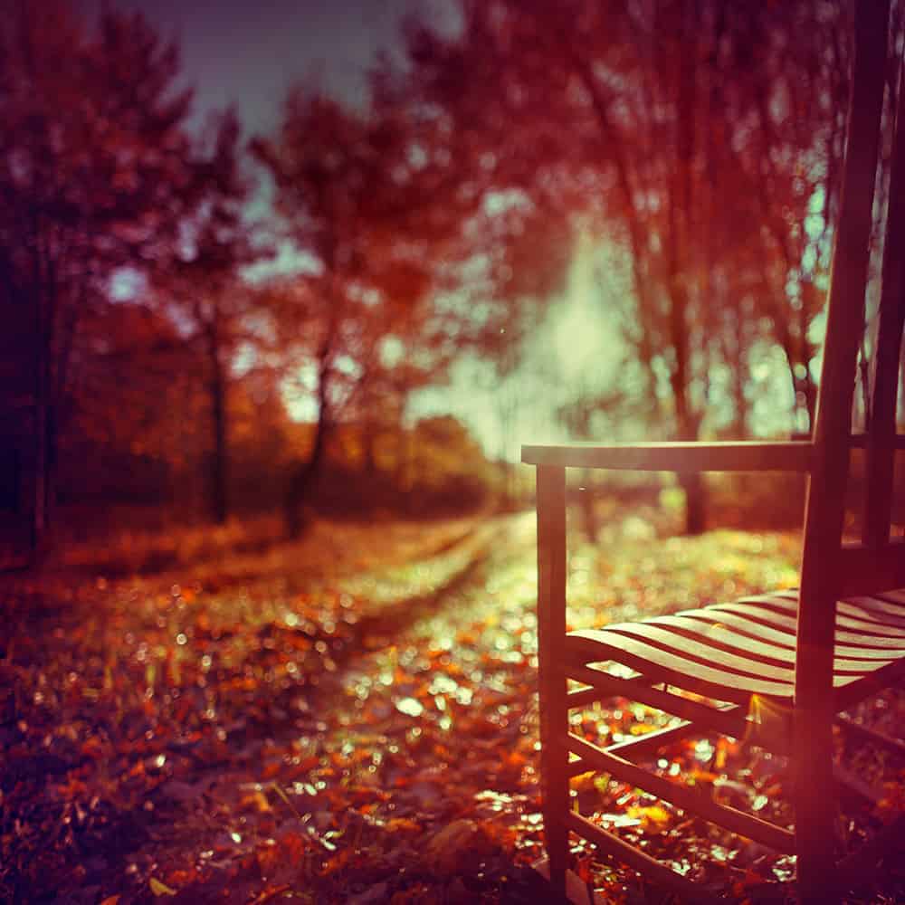
2. AUTUMN PERSPECTIVES
Changing your vantage point can produce stellar results, especially with fallen foliage. A simple shift in perspective can create a more captivating and versatile autumn portfolio, one that will grasp attention and satisfy your creative need for expression.
Height
It’s natural to photograph your scene at standing height, and this perspective may produce a perfectly respectable autumn photograph. However, you can instantly transform your atmosphere and add depth by shooting at a lower vantage point. I find laying flat-out to be especially successful in adding layers to an otherwise flat image, with foliage being my foreground subject. I can easily find a strong focal point during autumn, and I tend to take full advantage of the vibrant colors and textures which nature provides.
Focal Length
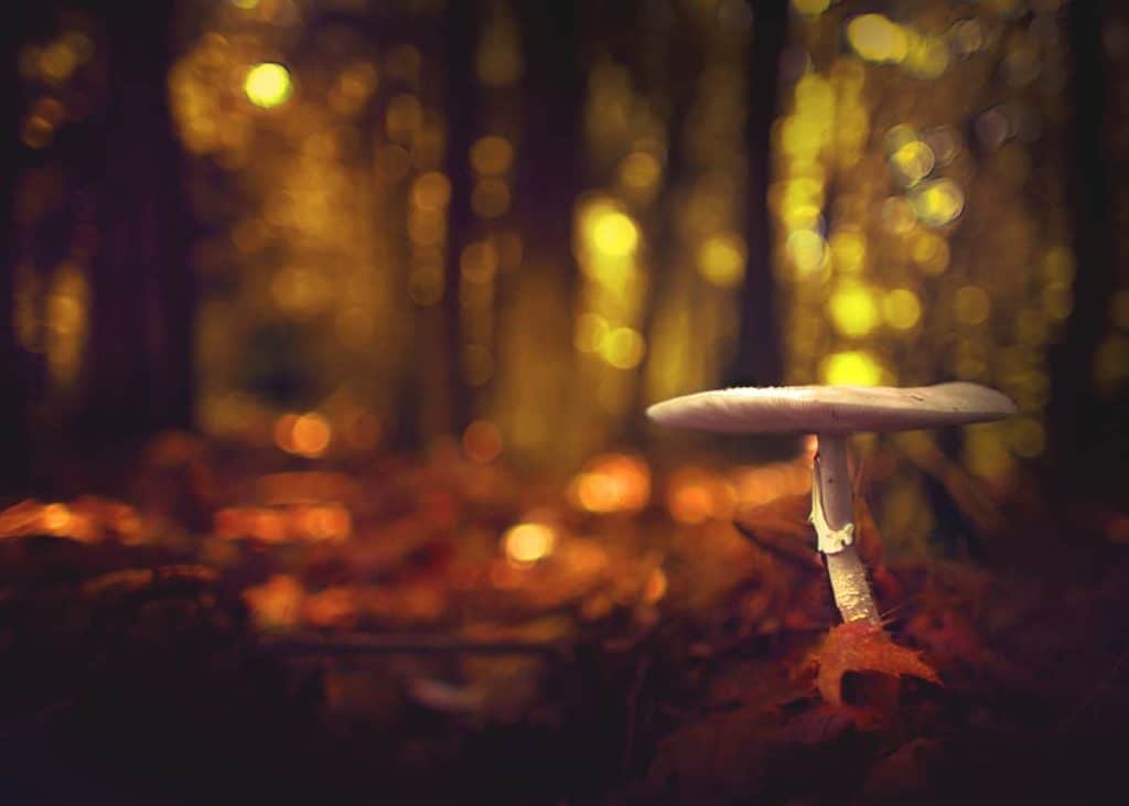
Selecting a focal length for fall foliage should be a deliberate choice. Wide focal lengths add depth and a sense of otherworldliness by exaggerating distances between elements in your frame. I’m particularly fond of combining a low vantage point with a wide angle lens. Autumn is an ethereal time of year, and I find this effect to enhance the dreamlike atmosphere.
With my 24mm lens at ground level, I was able to dramatically change my perspective and add substantial depth to this mushroom that would not be possible if my camera was just 6 inches higher.
In contrast, long focal lengths will compact your distances, allowing you to bring forth those background elements that would be rendered indistinguishable with a wider length. The background trees and foliage in my image below were much further away than they appear. However, the reach of my 85mm lens was able to render them as having a more dominant presence.
Aperture and Depth of Field
Controlling your depth of field can greatly enhance the autumn atmosphere you wish to create. While more traditional images tend to adopt a deep depth of field, I find much success with a more shallow experience. For me, it amplifies the ethereal experience of autumn and can add layers of depth to an otherwise flat, unimaginative scene.
With a shallow depth of field, you can easily isolate pieces of foliage that you find particularly interesting or powerful, allowing you to direct attention onto a subject that would otherwise be overpowered by the surrounding environment.
One method I use frequently during the autumn season is to deliberately adjust my plane of focus to fall over the background or foreground; both methods provide intriguing results, and the method you use depends on your intent and creative vision.
Let’s continue on!
Foreground Point of Focus
Selecting a foreground element as your point of focus can help to redistribute the weight and balance of your frame that is altered by a shallow depth of field. Small, unnoticeable focal points (such as a fallen leaf) that would otherwise be lost in a deep depth of field now take center stage in your composition.
Background Point of Focus
If you find yourself selecting a background element as your main subject, you don’t have to limit yourself to a deep depth of field to compensate. Instead, push your plane of focus back to your subject while obscuring your foreground. A background focal point with a shallow depth of field adds depth and layers, creating an atmosphere thick with a sense of discovery and exploration.
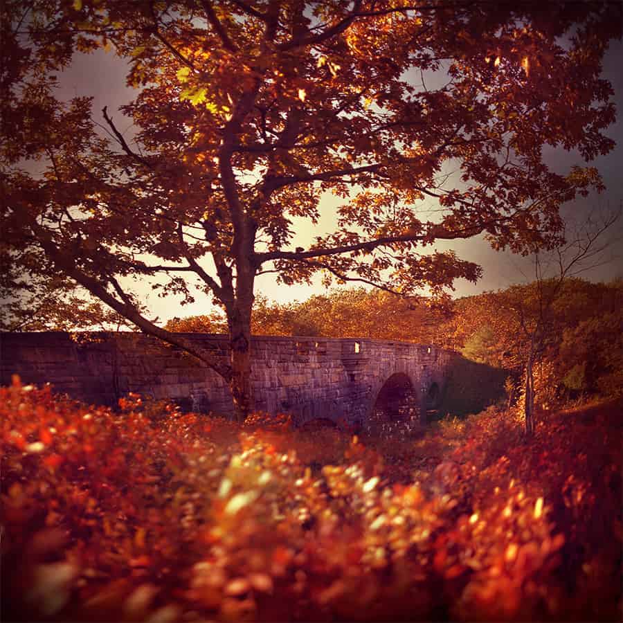
In my image here of Duck Brook Bridge in Acadia National Park, the shrub foliage in the foreground acts as a simple atmospheric enhancement to my main subject, enveloping the bridge without distracting too much attention away from it.
Shallow depths grant you greater control over the flow of your frame, which is highly successful for those awkward compositions that need a better balance between focal points. There are several factors beyond a wide aperture that contribute to creating bokeh and a shallow depth of field, such as distances between subjects and the quality of light. In my eBook Bokeh, I explain this process in great detail.
Bokeh: Creating with Shallow Depths is a free eBook that you can download right here.
3. LONG EXPOSURES
I’ve always been drawn to the ethereal quality of long exposures, and the surreal colors of autumn provide a unique opportunity to develop stellar imagery. The unsettled autumnal winds can create painterly textures and colors as it blows through the foliage, and extended shutter speeds can create an incredible atmosphere.
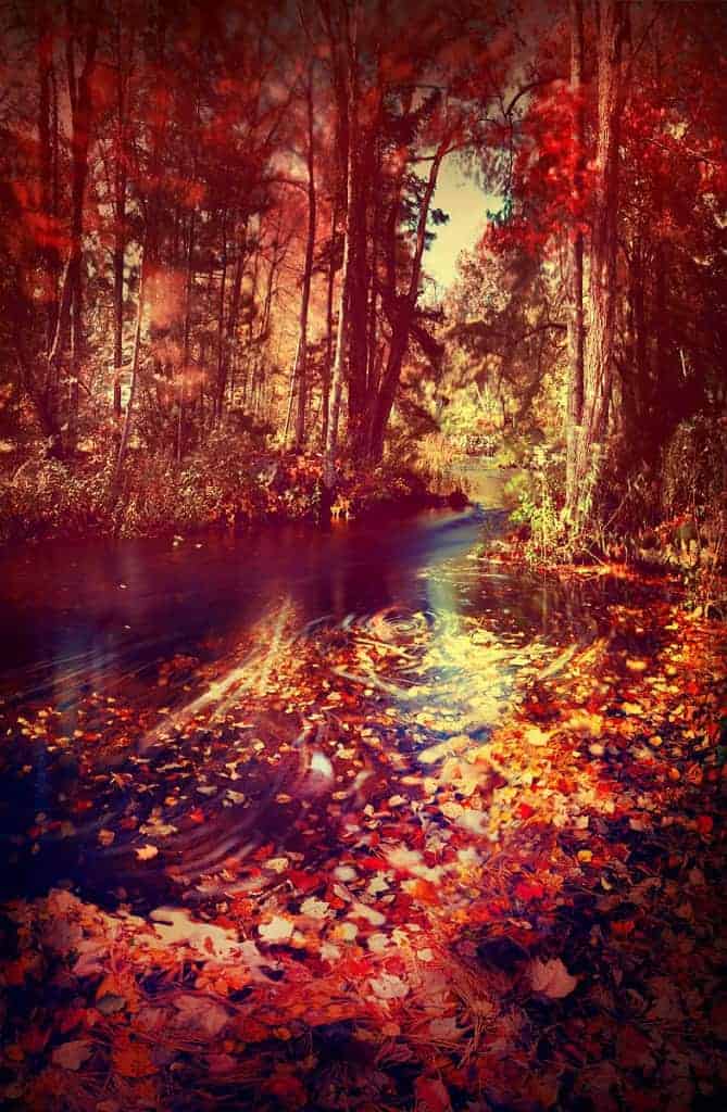
With a shutter speed of two full seconds, I was able to track the movement of fallen leaves floating downstream, rendered as the streaks you see in the water.
I frequently combine my shallow depth work with long exposures, usually with an aperture of f/1.4, which allows for a substantial amount of light to hit my sensor. To compensate, I require some intense ND filters to slow down the shutter enough to capture the windswept movement.
With two ND400 filters stacked, I was able to reduce my exposure by 18 full stops and attain a shutter speed of 52 seconds at f/1.4. The autumnal winds softened my bokeh for an ethereal rendering.
Polarizing Filters
Many photographers use polarizing filters in their landscape photography, and these filters are especially beneficial for autumn foliage. Not only will one saturate the colors of your landscape, but it will reduce any color-washing glare from light reflecting off of leaves and water.
I’ve found polarizing filters to be very helpful for those unsettled autumn mornings where the sun is out but the foliage is damp from melting frost, eliminating any reflective glare. Lens flare and sun reflections have the ability to desaturate your hues, so reducing this effect on foliage is a welcomed benefit.
It’s important to note that polarizing filters will typically reduce your exposure by 1 to 2 full stops. When combined with a small aperture, this can slow down your shutter speed enough to cause camera shake and blur. As always, I recommend using a tripod and to employ a typical long exposure workflow.
When is “peak” foliage?
From a photography perspective, the foliage season is actually quite longer than what many consider to be peak color. From the first sign of autumn hues to the last fallen leaf, opportunities to create are plentiful before, during, and after the height of color. The rusty gold oak trees hang onto their color a bit longer than the more attractive reds and oranges.
Although this scene below was taken weeks after the end of peak foliage, I was still able to create one of my favorite autumn images by focusing on the scene I had in front of me rather than what I had already missed.
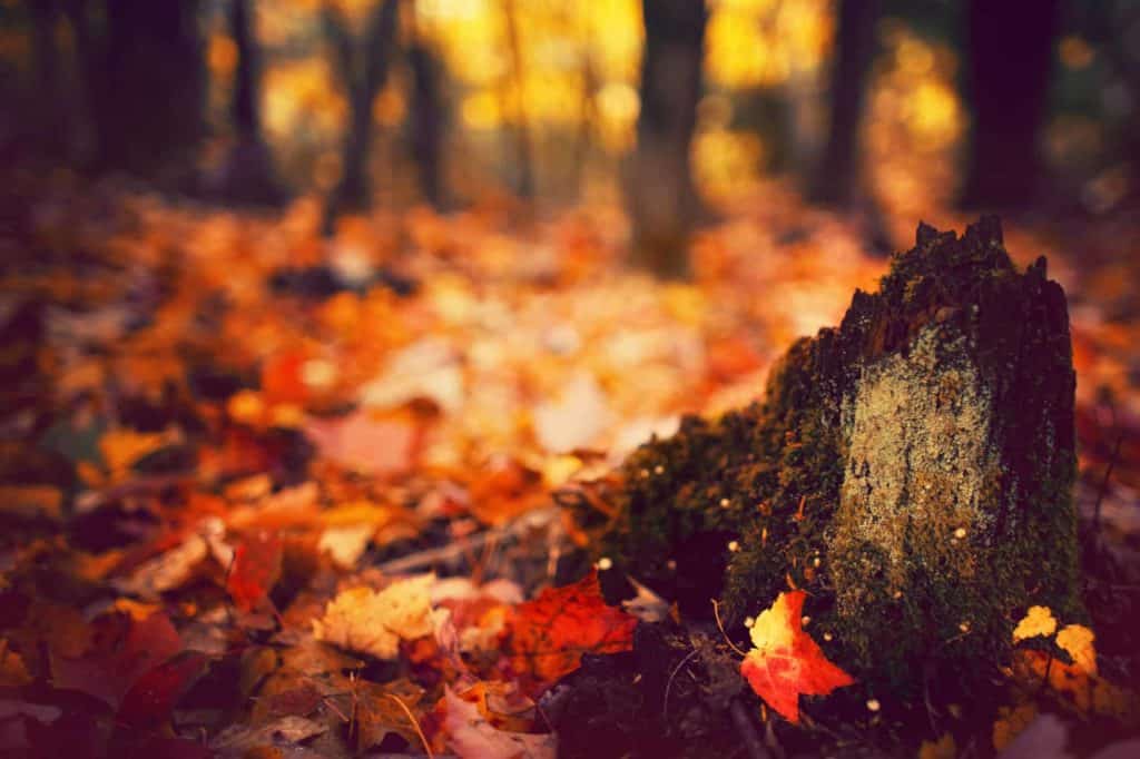
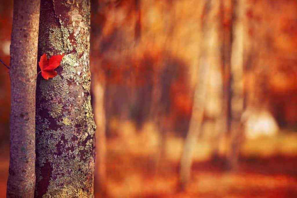
It’s never too early to begin your autumn photography once you spot foliage. The early turners are often some of the most vibrant, and there are methods you can use to isolate your subject and obscure the predominantly green environment.
By using a shallow depth of field on this leaf below, I was able to focus solely on the bit of color I found, highlighting the more delicate details of autumn.
Look Beyond the Foliage
The siren-like quality of autumn vistas may dominate your attention in the field, but try to explore other subjects – you may be pleasantly surprised with your results.
Cooler temperatures and drier air bring vibrant, crisp colors and textures in the sky, especially during the golden hours. I’ve found that my most visually intriguing sunsets were captured during the autumn months.
A dynamic autumn portfolio is possible simply by being aware of your environment and knowing how you want to translate it. Night or day, diffused or golden hour light, vistas or minimalistic, peak color or long past – the opportunity to create powerful autumn photographs are plentiful.
Nature determines the environment we find ourselves in, and foliage begins to fade as soon as it falls from the tree. Don’t wait for “better light”. Instead, use it as an opportunity to acclimate to the unpredictability of nature by exploring new creative methods.
Thanks for reading! And remember: if you want to save and download this article to read later, click the link below!
How to Create Crisp Sunstars and Sun Rays
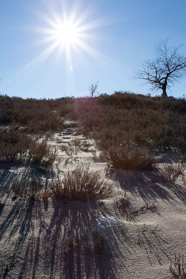
Us landscape photographers have little control over the environment we photograph…so we often rely on our camera skills to create the image we want by manipulating how the scene is rendered. One powerful way to enhance interest and create a compelling focal point is to transform light sources (usually the sun) into a “sunstar”.
Sunstars (sometimes called “starbursts”) refer to when you can literally see rays of light emanating from the sun (like in the image above).
Actually, any light source can potentially become a sunstar…the moon, street lights, and even reflected light, and is a technique often used to add another dimension of interest in night photography since there are so many potential light sources.
Unfortunately, creating a sunstar is not as simple as flipping a switch. Just like most techniques in our craft, there are certain conditions that need to met in order to produce this wonderful effect…both environmental and technical. Even if you’re able to create a sunstar, sometimes the rays are blurry with lots of flare…making it more of an eyesore than an enhancement.
The good news is that it’s quite simple to create a crisp sunstar…you just have to know the proper steps to enhance the clarity, sharpness and “pointiness” of those magical rays of light.
What Causes the Sunstar Effect?
To improve the quality of your sunstars, you need to know how your camera creates them in the first place.
Here’s the short version: the points of light you see are created by the aperture blades in your lens. When photographing light sources that are significantly brighter than the surrounding areas (such as the sun vs. a deep blue sky), the light that passes through where the blades intersect and create an angle will be rendered as a point. This is where diffraction comes into play (how light is altered as it passes through a small opening) and the light spreads out to create these “rays”, giving your light source a sunstar effect.
However, not every lens is created equal…some will produce spectacular sunstars, while others will be soft and weak. So let’s dive a bit deeper as to how your aperture manipulates light.
Since a sunstar is the effect of light diffraction as it passes through where your aperture blades intersect, the shape of your blades control how your sunstar looks…particularly, how sharp the angle is where the aperture blades intersect.
Smaller apertures will produce stronger sunstars since they meet at a sharper angle than wider apertures. When your aperture opens, the blades spread out and create a rounder opening to let more light in….but that means they intersect at a lower angle and will produce softer points of light.
Let’s take a look at the difference:
This image was taken at f/16, which rendered the sunstar quite distinctly despite being partially hidden by the clouds.
Here, my aperture was set to f/1.4, which is far too wide to create those points of light. Even though my focus is set on the foreground, the result would be quite similar here if I pushed the slice of focus to the back.
Using the smallest aperture will not give you the best sunstar though…
Following the above logic, a higher f/stop should give you the pointiest sunstar. However, shooting at f/32 is not a good idea since the light diffraction will degrade the overall quality of your photograph.
Lenses are typically their sharpest between f/8 and f/16…each lens has their own “sweet spot” so you’ll have to do your research and testing. When your f/stop goes outside of this range, the overall sharpness and clarity will drop off. This is more apparent when you use smaller apertures (higher f/stop number) as opposed to wider apertures.
This is when your personal taste and creative freedom comes into play: how sharp do you want your sunstar in exchange for image quality? Is a slightly softer image worth those crispy points?
Your decision here entirely depends on how big of a role the sunstar plays in your overall composition, and also the quality of your lens….but generally, I would not go smaller than f/22 as you’ll lose too much sharpness. Knowing your lens and how it performs at different apertures will greatly help you in setting your limit.
Keep in mind that smaller apertures will prolong your shutter speed, so make sure to use a tripod and follow the typical stabilization workflow to ensure a tack-sharp image. My guide here on stabilizing your camera will show you how.
TIP: When using a tripod, turn any “image stabilization” or “vibration reduction” off – this is only useful when your camera is handheld and can actually do more bad than good if you’re using a tripod.
So now that you know how sunstars are created, let’s go over a few important tips that will greatly improve the clarity and quality of your light.
1. Your Lens Matters – a Lot
Personally, I’m not that big of a gear nut. I only buy a new lens when I absolutely need it to achieve a certain look…and sunstars will definitely benefit from a higher-quality lens.
One way to produce crisper sunstars is to reduce the amount of lens flaring since that will soften detail and wash out color and contrast…which makes your sunstar appear soft and hazy.
Of course, you could remove flares in post-processing, but that still will not give you sharper points of light.
Higher quality lenses tend to have multi-coatings and overall better glass to reduce flaring at the source, which will give you crisper, cleaner sunstars.
The internal components of your lens will also control how many points of light are created.
Each lens has a specific number of aperture blades (typically 5 to 8) which directly correlate to how many spikes of light your image will have.
However, more aperture blades do not necessarily mean more spikes…
As we learned earlier, sunstars are created where the blades intersect (or overlap) as they open and close to control how much light is let into your camera. When you have an even number of aperture blades, the diffraction spikes are directly across from one another and cancel each other out. So a six-blade aperture produces only six points – not very good for a strong sunstar.
However, when you have an odd number of aperture blades, the diffraction points do not line up perfectly and will produce double the number spikes per aperture blade. A 5 blade aperture produces 10 spikes, and a 7 blade aperture will produce 14 spikes.
Let’s look at a few examples:
This lens has an even number of aperture blades (8), so only eight points of light in this sunstar.
This sunstar looks quite different with the additional sun rays. My lens here had a lower amount of aperture blades (7), but since that is an odd number, the diffraction points do not line up perfectly. This translates into 14 sun rays for a more powerful focal point.
Most camera retailers will list the number of aperture blades for each lens so you can make an educated decision before a purchase. You can also do a quick Google search for a particular lens to see what kind of sunstars it will produce.
This was one consideration I had when I bought my new Canon 17-40mm wide angle lens. Aside from its wide-angle capabilities and overall better quality glass, I wanted an odd number of aperture blades to produce sunstars with more diffraction spikes.
The shape of your aperture blades can also affect how your sunstar is rendered. Straight blades will give you sharper sunstars than rounder ones.
This article here compares several popular lenses and goes into more technical detail of the aperture/sunstar relationship.
2. Remove your Filters and Clean your Glass
As light passes through filters and hits the glass of your lens, additional flares and overall softening of the light source can happen…so it’s best to remove any filter (including UV filters) prior to composing your image.
Additionally, a dirty lens and/or sensor can give you a lot of extra flare removal work in Photoshop. This is especially true when working with small apertures, so make sure your glass is smudge free.
3. Compose with Contrast
There’s a reason why sunstars tend to look better at night or during the golden hours: when the contrast is stronger between the bright light source and surrounding detail, the more prominent your sunstar will be the longer your spikes will appear.
If, however, you’re photographing the sun against a bright white-ish sky (or slightly overexposing your frame), your sunstar will appear softer and smaller.
I’ll often photograph during the golden hours when the sun is close to the horizon, so strong sunstars are much easier to create. Deep blue skies will also give you more robust sunstars as opposed to those hazy white summer days.
4. Search for Hard Edges
Another way to increase the contrast between your light source and environment (thus producing a crisper sunstar) is to compose around a hard edge…such as a tree, building, or the horizon line. This tends to elongate the rays of light and make the sunstar appear more prominent.
In this image, notice how the sunstar appears much stronger and crisper on the bottom than the top, although the actual sun rays are very similar in size and quality. The contrast against the horizon line helps the sun rays stand out.
You can also use hard edges to control the “weight” of your sunstar, which can often overpower your composition. Light sources are generally very strong focal points that can be difficult to counterbalance…and when you add the interest of a sunstar, they can completely overhwelm the rest of your frame.
I typically use a full-on sunstar when I need to dramatically shift the balance in my composition, like when the sky is completely empty against an interesting foreground (as seen in the image above). This helps to pull some weight towards the top of my frame. However, the sky is not always empty…so we need to think of other ways to reduce the power of a sunstar when needed.
Instead, you can compose your image so that the light source is partially hidden by a tree, horizon, or any other hard edge….which will make it less alluring to the eyes.
In the image above, I waited until a dark cloud moved in to partially obscure the sun.
You can also use high-contrast edges to elongate rays of light across your frame. When you compose your image so that one side of the sun is against a dark foreground (like trees), the points of light tend to stretch across those darker elements…but in a very soft, complimentary way as opposed to being an eyesore.
In this image, you can see that the sun is lined up behind a hard edge (the tree). The sun rays on the right-hand side are nearly non-existent because the background sky is quite bright. However, the sun rays on the left side are elongated and soft, which provides some needed interest against the textured foreground. The diffraction points are more prominent on the left side because the light is cascading across a darker background.
5. Widen your Frame for Better Balance
Sunstars are fantastic for when you want to create a strong focal point and greatly enhance the interest…but this can be a dual-edged sword. Oftentimes, the power of a full sunstar can overwhelm pull all of the attention away from the rest of your composition. This is especially true when photographing the sun full on.
In the image above, the size and strength of the sun star is too great and completely overpowers the rest of the frame, despite the foreground being incredibly busy.
When you can’t partially mask the sun to filter out some of the strength (as seen above), simply widen your frame to render the sun smaller in your overall composition. Your sunstar will still be a prominent focal point, but not as overwhelming.
This will also help to convey depth in the image, especially when photographing multiple light sources (such as a city at night): sunstars in the foreground will be larger than those further in the background.
Wider focal lengths also tend to produce better sunstars; the larger your light source is rendered, the hazier and “broken up” the diffraction points will appear. Smaller light sources tend to give you cleaner and crisper rays of light.
In the image above, the very large sunstar is quite streaky and soft, despite photographing against a nice blue sky and following the above-mentioned tips (i.e. small aperture, high-quality lens, etc.).
However, the photo below has the sun thrown quite a ways in the distance….which resulted in a crisper sunstar (despite a little interference from the slightly hazy sky).
You can use a wider angle lens to exaggerate your distances and make the sun seem further in the distance…but this does not always work for the rest of your composition as it rebalances everything. Instead, what I often do is turn my image into a panorama.. capturing a few frames around my main subject and stitching them together later (like in the image above).
6. Focus Blending for Cleaner Sunstars
Focus blending is a fantastic way to overcome any variations in image sharpness…and is especially beneficial in landscape photography when we often work with wide-angle lenses and deep depths of field. By taking multiple frames of the same scene with the point of focus set on different subjects (usually one frame for the foreground, middle ground, and background), you can ensure that your image is tack-sharp from front to back.
As mentioned earlier…the smaller the f/stop, the sharper and cleaner your sunstar will appear. This often means shooting at f/22, which can also soften your entire frame due to the diffraction of light. With focus blending, you can overcome this compromise by capturing one frame for the sunstar at f/22, and blend that together with another frame set at your “sweet spot” aperture for ultimate sharpness (usually f/8 or f/11).
Just make sure to compensate for the wider aperture by increasing your shutter speed in order to match the exposure for the sunstar.
In my membership courses, I show you exactly how to blend multiple exposures together using luminosity masks…which provide the cleanest (and easiest) results.
8. Photograph Under Clear Skies (if possible)
No matter how small your aperture is, a sunstar can be completely eliminated if there are any atmospheric elements at play…such as fog, humidity, or a thin layer of clouds. The photograph below was taken at f/16, but the thin layer of clouds affected the sunstar considerably.
9. Use Live View (if possible)
It can take a few moments to accurately compose and set your focus on the sun, so it’s best to not look through your viewfinder….make sure to use your camera’s live view function instead. This will also give you a general idea of what your sunstar will look like if you’re using a depth of field preview as well.
Is photographing the sun bad for my sensor?
Many have heard that exposing your sensor to the sun for long periods can burn it out, but that’s not typically an issue in landscape photography. The sun is quite small compared to the rest of your frame (especially when using wide-angle lenses), so it makes little difference.
However, if you use a telephoto lens and fill your entire frame with the sun (such as photographing an eclipse), that can certainly burn out your sensor.
Can I produce sun stars at night?
Absolutely! The sunstar effect is just as popular for night photographers (especially night cityscapes) since there are so many light sources to photograph…and the darker environment makes those points of light even stronger.
Additionally, longer shutter speeds tend to produce crisper, larger rays of light…so night photography is the perfect environment for sunstars and can add much interest to an otherwise boring scene.
Bonus tip: Don’t forget about reflected light sources!
Any light source can produce a sunstar…even reflected light. Macro photographers will often incorporate sunstars in their images by composing at an angle where the sun is reflected by dew drops, producing a sea of mini-sunstars throughout the frame that simply compliments the image rather than being a powerful focal point.
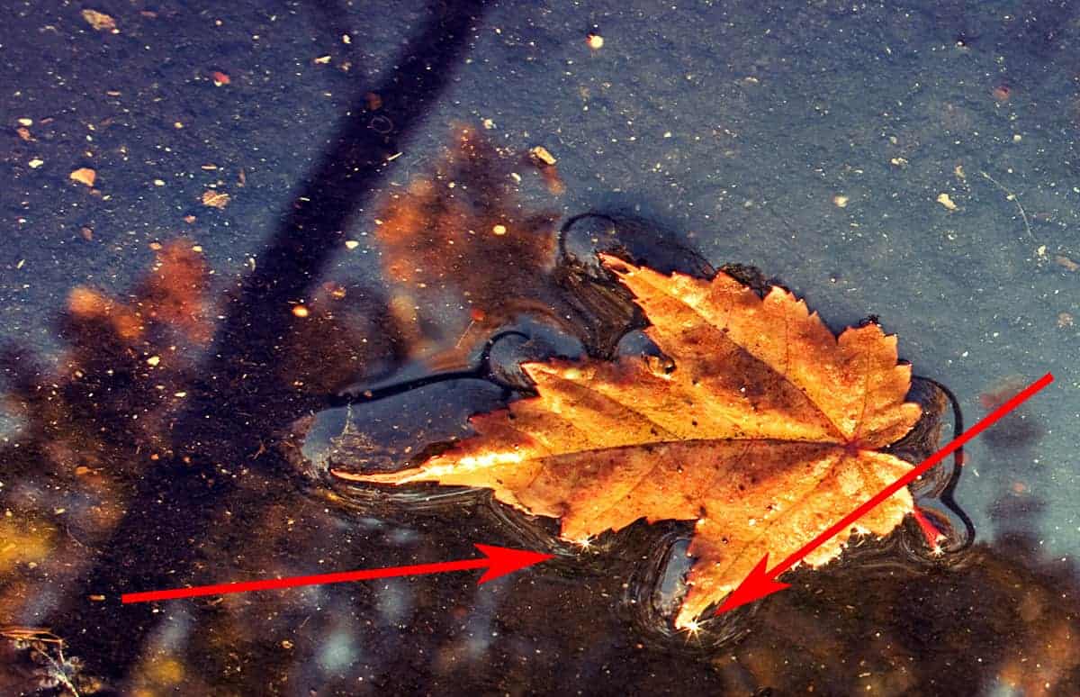
In this image here, the small sunstars reflected in the water are barely noticeable by themselves, but provide some additional interest and enhance the overall atmosphere. This is quite different than the earlier images where the sunstar is typically the most powerful focal point.
Can I create or enhance sun rays in Photoshop?
You bet…but like most techniques in Photoshop, some will produce better results than others. The key to natural-looking sun rays is to use luminosity masks to tailor the result to the tonal value of your image. This prevents the sun rays from washing out your tones and colors and looking like a bad filter. I teach this technique in my membership courses.
Thanks for joining me and if you have any questions, feel free to leave a comment below for me to answer!
The 5DayDeal $10,000 Photography Giveaway is coming up!
It’s almost October, which means the 5DayDeal Complete Photography Bundle is coming up fast! To celebrate, they are pulling out all the stops and running a HUGE photography giveaway where you can win some incredible photo gear and prizes.
In a few weeks, you can throw your name into the hat for a (pretty good) chance of winning. It’s completely free to enter, and absolutely no hoops to jump through.
I’ll let you know when the doors open, so keep an eye out for another email from me…because you only have a few days to enter.
Dodging and Burning with Luminosity Masks
Dodging and burning in Photoshop is a powerful way to control the light and shadow of your landscape…but it can also present some unique problems, particularly flat tones and muddy detail.
Here’s the good news: luminosity masks can instantly enhance the clarity of your dodging and burning by preserving contrast and protecting detail..literally acting as a stencil that filters the quality of your brushwork.
Not only is this workflow incredibly powerful, but very simple to use…so I can not wait to show you how this works.
Luminosity masks are best learned when taught visually, so I’ve pulled a comprehensive video lesson from my membership program for you to watch. However, a video is not always the most convenient way to learn, so I’m also including the full written tutorial below.
If you’re pressed on time, make sure to download the video lesson so you can watch around your own schedule. I’m also including any practice files so you can practice right alongside this tutorial. It’s easier to grasp concepts in Photoshop when you actually do it yourself as opposed to simply watching someone else do it for you. Just fill out the form below the video and you’ll be sent a download link.
[fl_builder_insert_layout slug=”lm-optin”]
As you already know, dodging and burning is a fantastic way to strengthen the balance of light and shadow in an image. This is especially powerful in landscape photography since we can not control the natural light in our image (like we can in a studio), so it’s up to our processing skills to enhance the balance of our composition.
Luminosity masks can help tremendously with dodging and burning since these masks will prevent (or reverse) typical problems. For example, dodging a shadow or burning a highlight can wash out detail, muddy colors, and flatten tones…but when you add luminosity masks to your workflow, you can tailor the adjustment to your image and retain contrast and detail.
[fl_builder_insert_layout slug=”luminosity-mask-table-of-contents”]
Luminosity Masks for Dodging
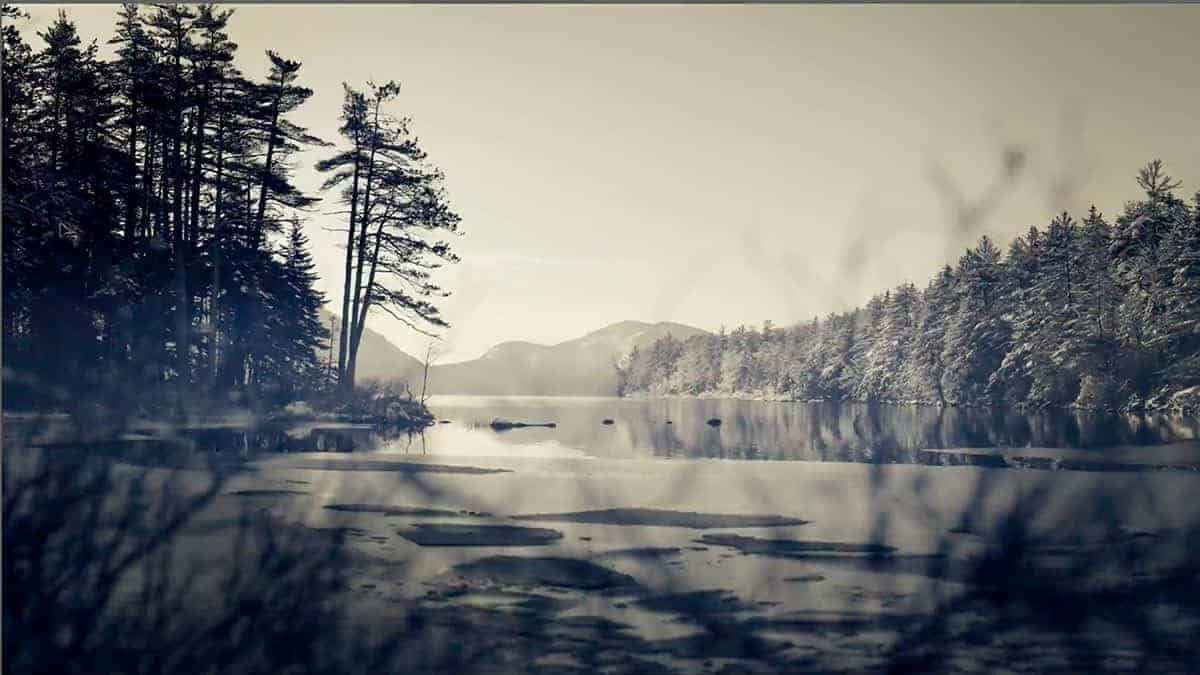
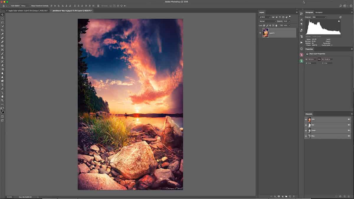
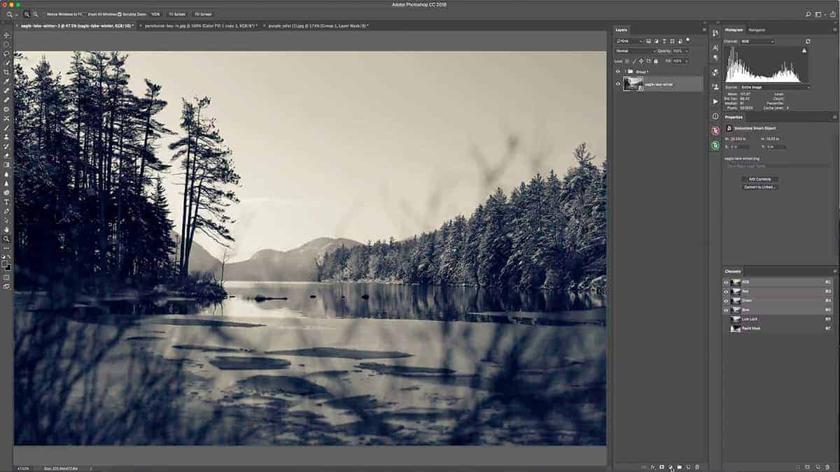
Let’s go back to the image of Eagle Lake we’ve been working with in the previous tutorials. I want to first dodge this tree line in order to brighten it up and pull more attention towards the right side of the frame. The bright sky behind the mountain and the dominant tree is drawing attention to the left side, so I want to fix that.
Also, by brightening up this treeline, it will create a bigger tonal gap between these trees and the darker trees on the left side…which will counter-balance each other nicely. 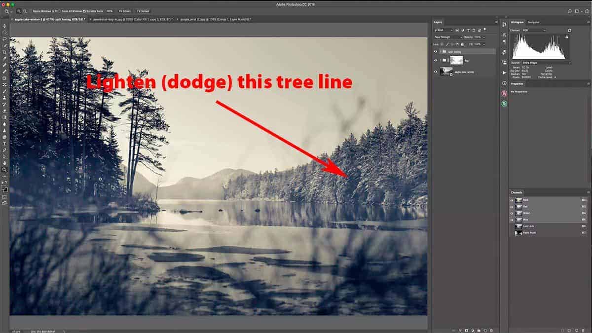
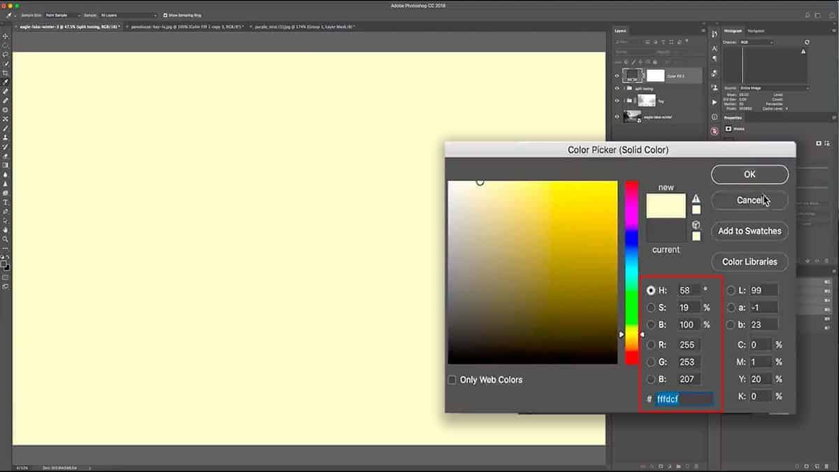
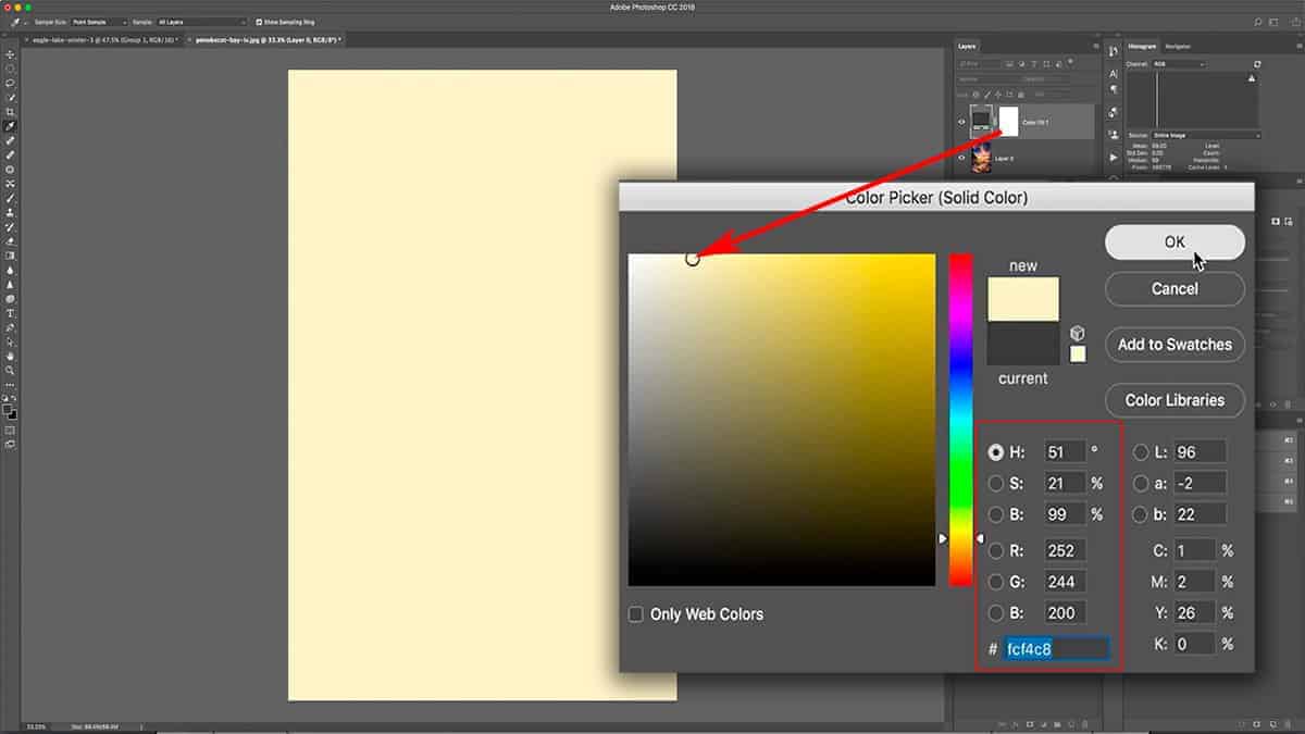
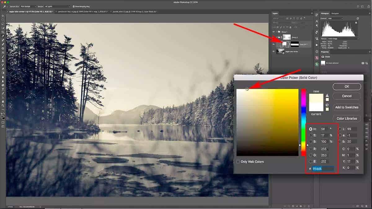
Let’s start by setting up the proper environment for dodging. First, add a new solid color fill layer and sample a light, pale yellow (full brightness and a saturation around 20%)…much like we did in the first lesson where we warmed up the highlights.
Select OK to add this new adjustment layer, and then invert the layer mask to pure black by pressing CMD + I, which will hide this color fill layer entirely.
Also, make sure to set your blend mode to “soft light”, which is what I normally use for dodging.
Grab a big, soft brush (one with 0% hardness) and set your foreground color to white with an opacity around 40% to start.
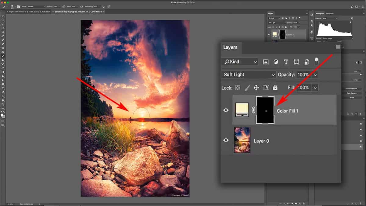
Begin to dodge the treeline by brushing over it, which will gently reveal the color fill layer we just added (but at a much lower opacity). One pass should be enough to dodge this tree line.
Next, reduce your brush opacity down to about 10% so you can fine-tune the dodging and fill in any areas you may have missed.
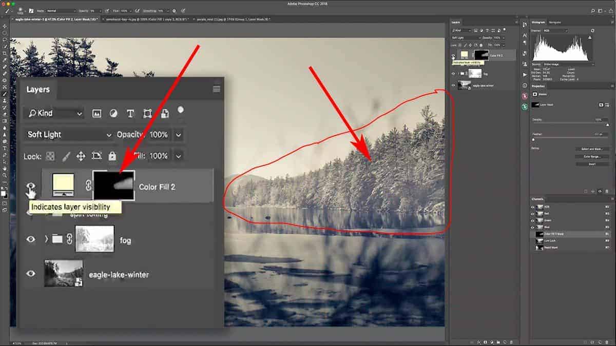
As you can tell, dodging significantly like this can severely wash out your tones and flatten the contrast…and almost looks like you added fog to the treeline. This is even more apparent when you dodge over a highly textured area like this…with lots of sharp detail with bright highlights and deep shadows. You never want to dodge a shadow this dramatically, and this is why.
Luminosity masks can help tremendously here; they make your dodging more effective by allowing you to control which tonal groups your brushwork will effect. By using one of these masks to heavily remove the dodging from the shadows, we can still lighten this area without losing detail, depth, or contrast.
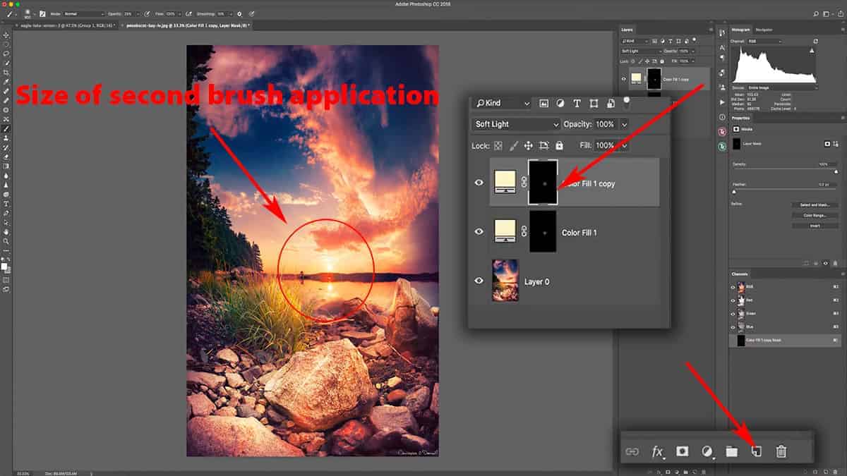
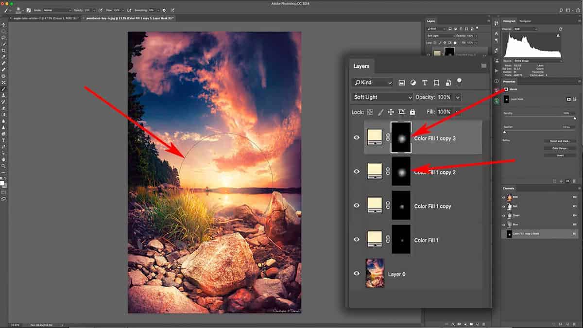
In order to counteract the washed-out appearance of our dodging here, I’ll add a restrictive luminosity mask to remove the dodging just from the shadows.
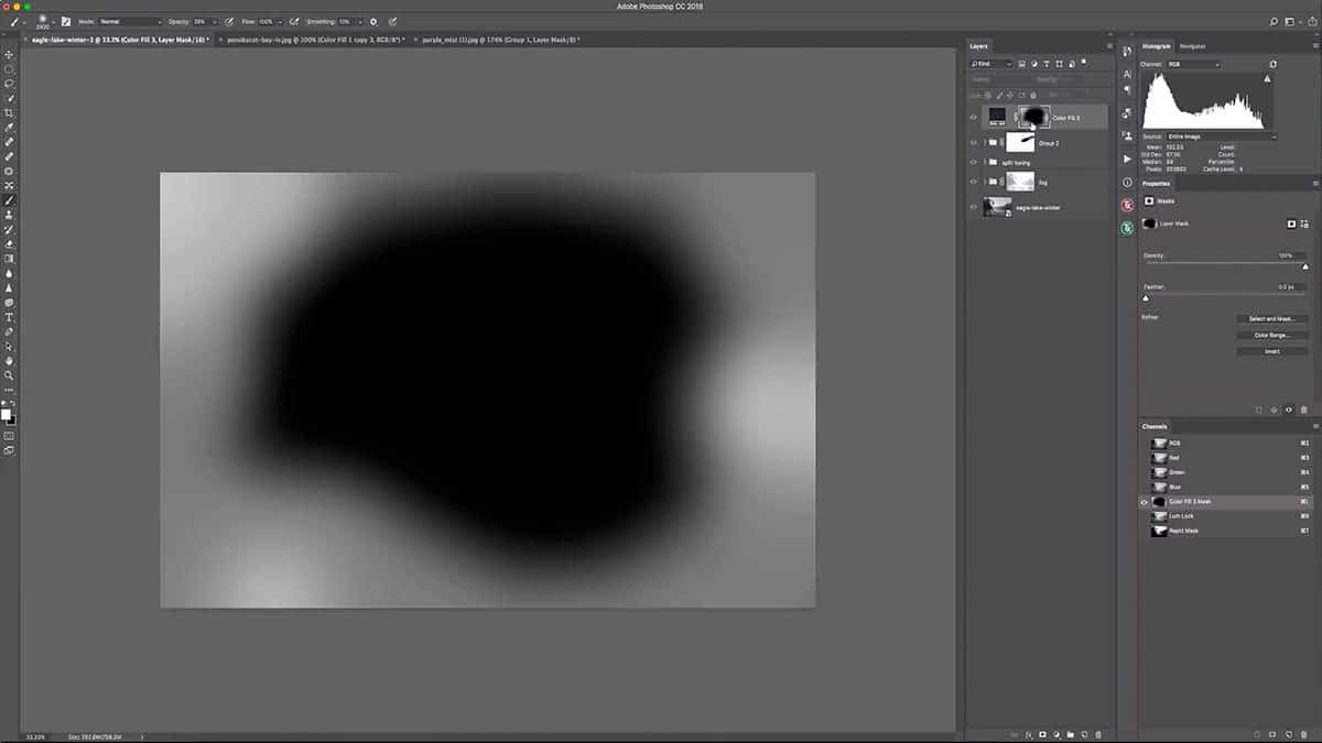
Let’s first turn this solid color fill layer off so I can generate a fresh set of luminosity masks based off of my original image (before we adding the dodging). Next, open up the TK Basic Panel so we can generate our masks.
Note: If you’re unfamiliar with this fantastic (and 100% free) panel for generating luminosity masks, make sure to read all about it on the first tutorial.
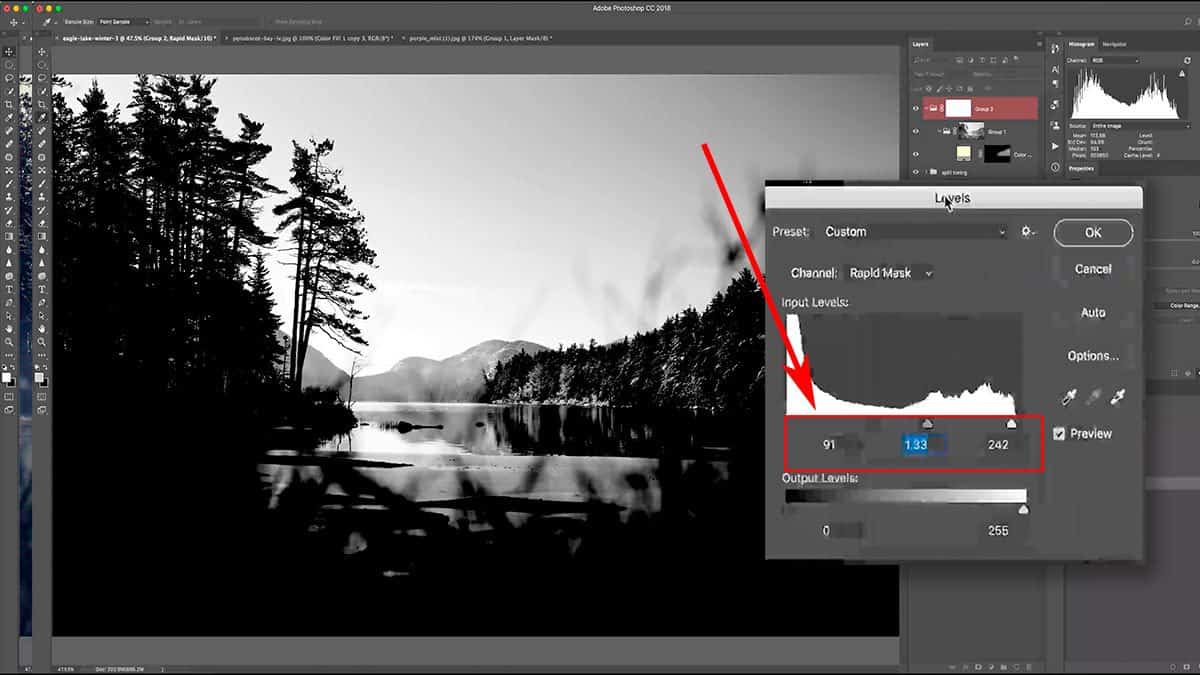
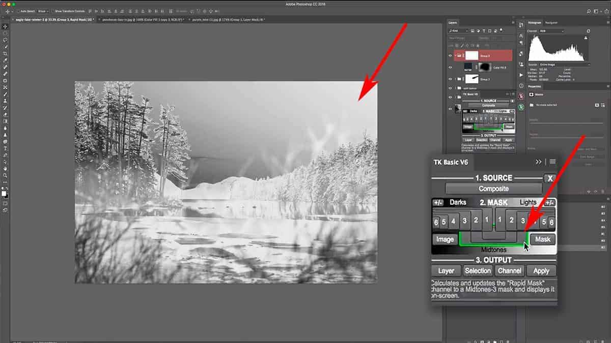
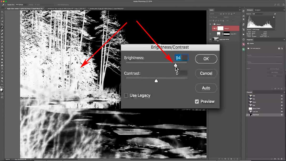
Hit the “composite” button to generate fresh masks, and let’s choose one that selects our highlights nicely while excluding the shadows.
The basic “Lights 1” mask does give us a nice selection of the highlights, but it’s not strong enough. If we zoom in and sample one of the brightest pixels, it is only set at 79% brightness…which means that the strongest selection of this mask is only at 79%. I want a stronger selection for my highlights, so while we are still in the “mask preview” mode, I’m going to refine this mask further in order to strengthen this selection.
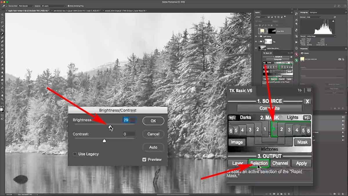
Let’s add some Brightness to this “Lights 1” luminosity mask before we apply it to the dodging layer. Click on Image > Adjustments > Brightness/Contrast and bring up the brightness by about 30 points.
Hit OK, and go back to the TK Basic Panel. Instead of choosing Apply or Layer, I’m going to press Selection which will load the luminosity mask as an empty selection (as seen above) since I first need to move some layers around before creating the mask.
This is a great way to “save” your luminosity mask to the side if you need to first create additional layers before applying it as a mask. Now you can always come back to this panel and access your most-recently created luminosity mask (even if you click off the panel)…but I sometimes find it easier to simply load it as a selection and then rearrange my layers as needed.
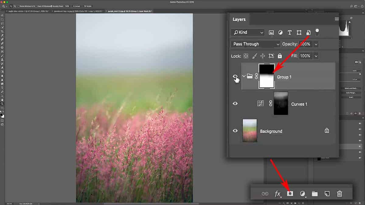
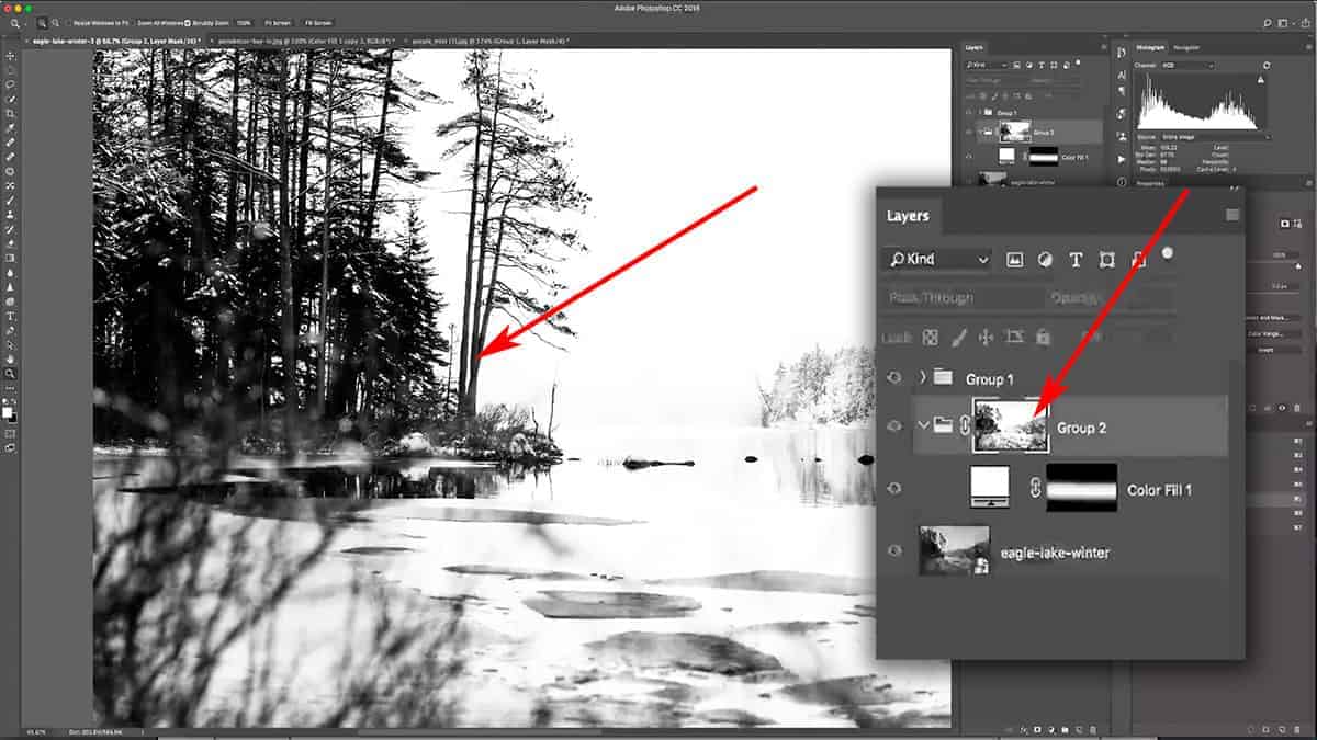
Now that this is loaded as a selection, I can reorganize my layers. Let’s place the solid color fill layer into its own group, then apply a mask to the group itself. Since the luminosity mask is already loaded as a selection, it is automatically applied to the mask as soon as you create it.
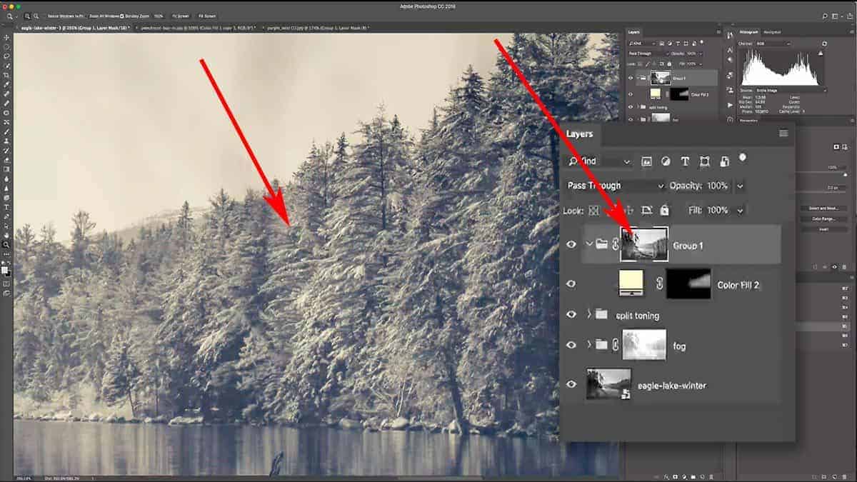
Screenshot is from the free video lesson on luminosity masks, which you can download by clicking here.
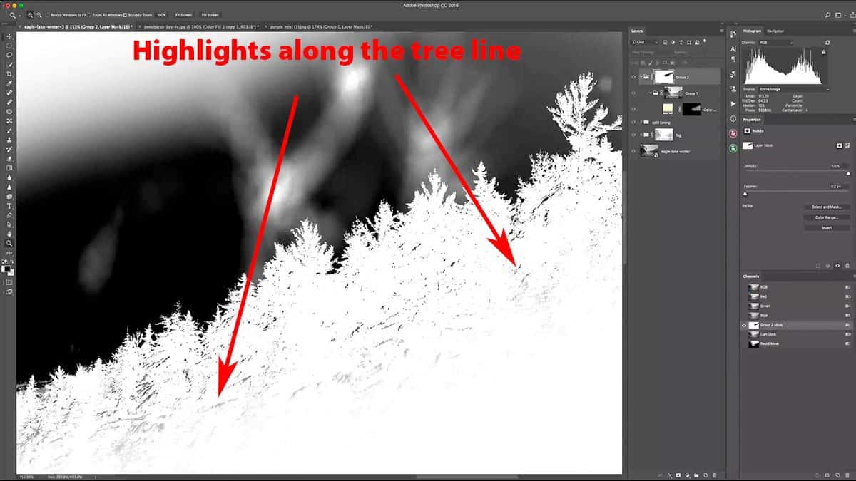
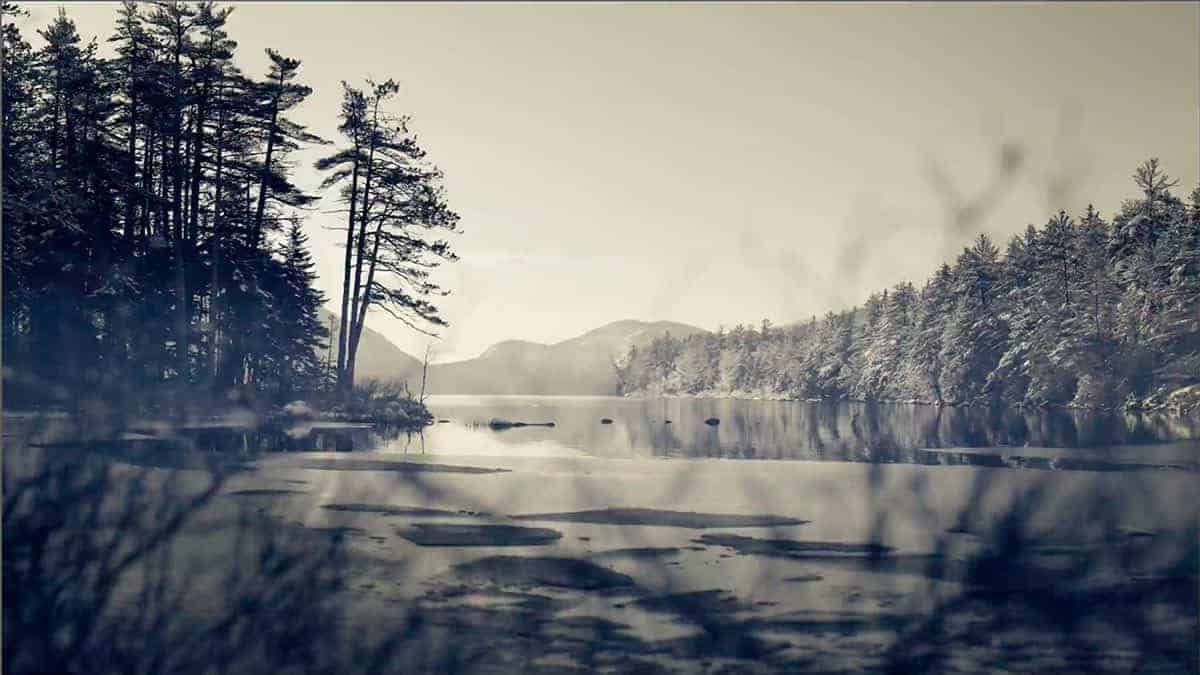
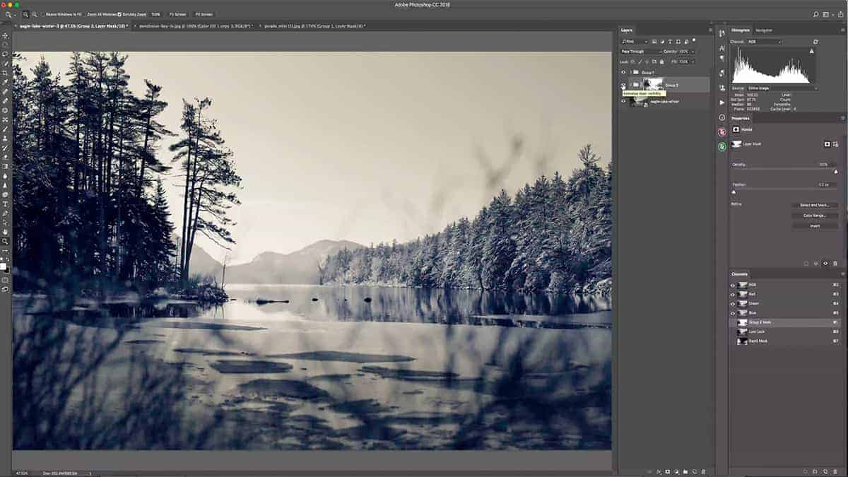
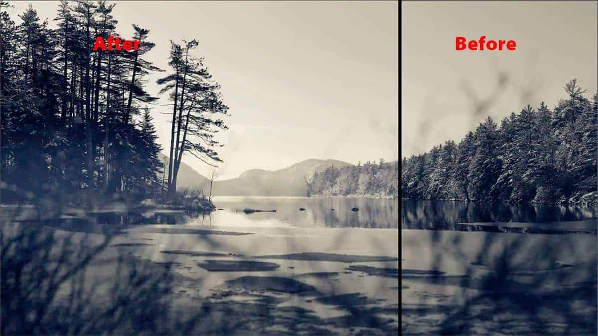
Let’s take a look at that treeline with the luminosity mask in place. We managed to remove the dodging from the shadows entirely, which leaves us with a highly refined result that would otherwise be very difficult to achieve: global dodging that retains contrast and detail. This gives you a cleaner, protected environment to dodge in and only takes a couple of clicks to create.
Depending on your image, you may need to use a Midtone luminosity mask instead of a Lights. If you remember earlier in this tutorial, I sampled one of the brightest pixels and it came in at only 79% brightness…which means that the treeline can take a bit of dodging before I start to blow out detail.
However, if my brightest highlights in the treeline were closer to 100%, dodging would increase the brightness too much and overexpose my highlights. If that was the case, I would have used a Midtone luminosity mask instead…which would remove the dodging from my brightest highlights and darkest shadows simultaneously.
Luminosity Masks for Halo Removal
Another way a luminosity mask can enhance your dodging and burning is by cleaning up the brushwork. As you’ve probably discovered yourself, it can be very difficult and tedious to brush within the lines…especially when dodging and burning since you want this effect to be very feathered and soft. By adding luminosity masks to your workflow, you can simply brush over an area generally and then use a mask to “sculpt” your brushwork to hug the unique content of your image.
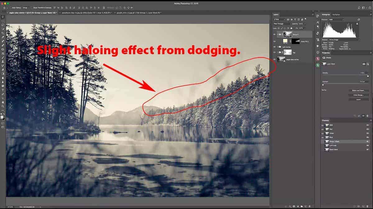
Here I generally brushed over the entire treeline, which also included some sky detail that I don’t want to dodge. This resulted in a slight haloing effect in the sky that needs to be removed. It is a bit difficult to see the halos since my dodging is very light…but in other images, halos can be very apparent depending on how dramatic your adjustments are.
By adding another luminosity mask, I can restrain my dodging to just the tree detail, and have it hug every nook and cranny of those jagged pine trees. In other words, we can use a mask to separate the dodging on the treeline from the dodging on the sky…and then simply hide any dodging that spilled over onto the sky.
Although this sounds a bit complicated, it’s quite easy to do.
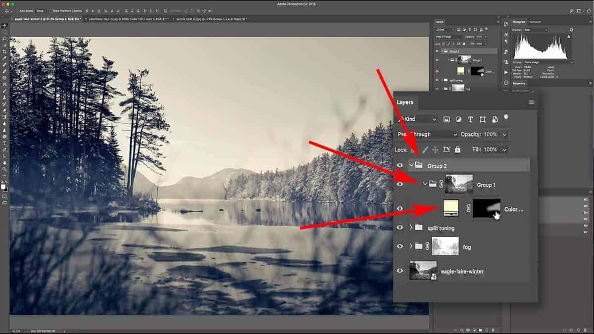
The first step is to place your dodging group into another group, which will allow us to add a luminosity mask to the current group (that contains the solid color dodge layer). In other words, we are taking “masking the mask” a step further by masking a luminosity mask that is controlling the solid color fill layer.
When you add this group to a new group, make sure to also add a new blank layer mask.
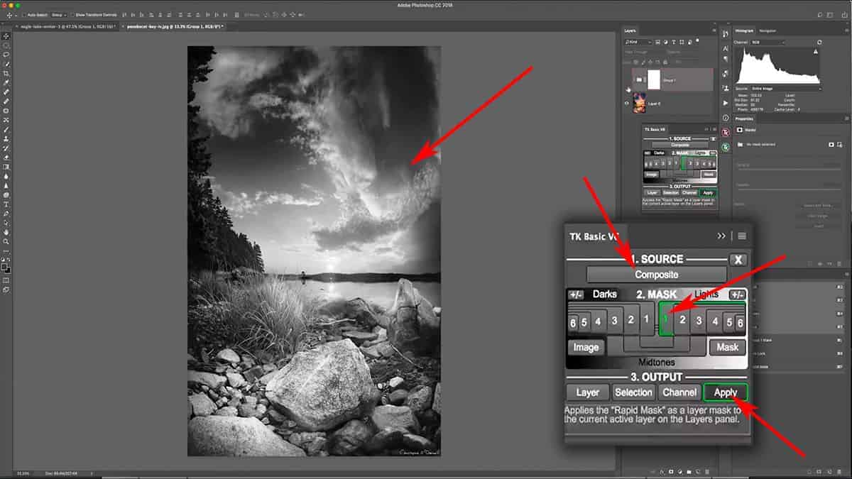
Next, let’s create a luminosity mask that will give us a nice, strong selection for the sky only. This will act as a stencil that will filter the original dodging brushwork that spilled over onto the sky detail.
Let’s open up the TK Basic Panel…and for this, we do not have to generate new luminosity masks since they were already created at the beginning of this tutorial. It’s good practice to continually update your masks so that they reflect the current tonal range of your image, but that is not needed here.
Since we want to isolate the sky from the treeline, let’s cycle through our Lights luminosity masks and choose one that gives us a strong selection between sky and treeline.
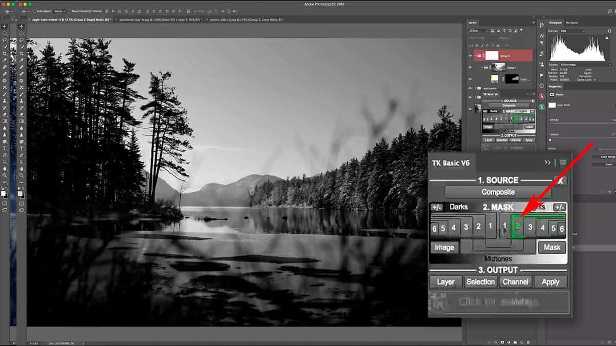
A “Lights 2” mask gives me a solid separation between the sky and the treeline…but we do need to tailor this a bit more so that the treeline is darker and the sky is brighter. Otherwise, we’ll hide some of the dodging from the treeline as well as keeping some of it in the sky. In other words, we need to add some contrast here in order to strengthen the separation even more.
First, let’s brighten up the highlights by going to Image > Adjustments > Brightness/Contrast and increasing the Brightness to about 65 to take care of the sky. Next, go to Image > Adjustments > Levels and let’s add some contrast in order to darken the tree line and create a stronger separation between the sky and trees.
Next, load this mask as a selection by pressing the “Selection” button on the TK Basic Panel, then click on the mask thumbnail for the new group you just created. What we’re going to do here is use our brush tool to paint over the areas we want to remove the dodging from – in this case, the sky area directly above the treeline. Since we are using a luminosity selection, it’s going to control our brushwork and act as a stencil.
This is called “luminosity painting” and allows you to add a luminosity mask only to specific parts of your frame as opposed to the entire image.
Since the only problem area is right above the treeline, this will work well and will help ensure that we don’t inadvertently remove the dodging from the treeline.
Begin to paint over the sky areas with a black brush set at 100% opacity. There’s no need to worry about painting over the treetops since the luminosity selection will prevent the brush from affecting those areas, as seen below.
When you paint over an active selection like this, it works just like a stencil. So while I brushed over this entire area with a soft, black brush set at 100% opacity…it protected the treeline from being painted in black. This gives me the exact result I want: the sky in black and tree line in white, which removes my dodging from the sky (as well as those distracting halos).
This is a highly refined and controlled environment for dodging and burning, which is perfect for a complicated adjustment like this. We have very specific areas that we want to exclude from this dodging (the sky detail and shadows in the treeline), as well as areas we want to dodge (the midtones and highlights of the tree line). Thanks to the versatility of luminosity masks, we were able to isolate these very delicate areas.
[fl_builder_insert_layout slug=”lm-optin”]
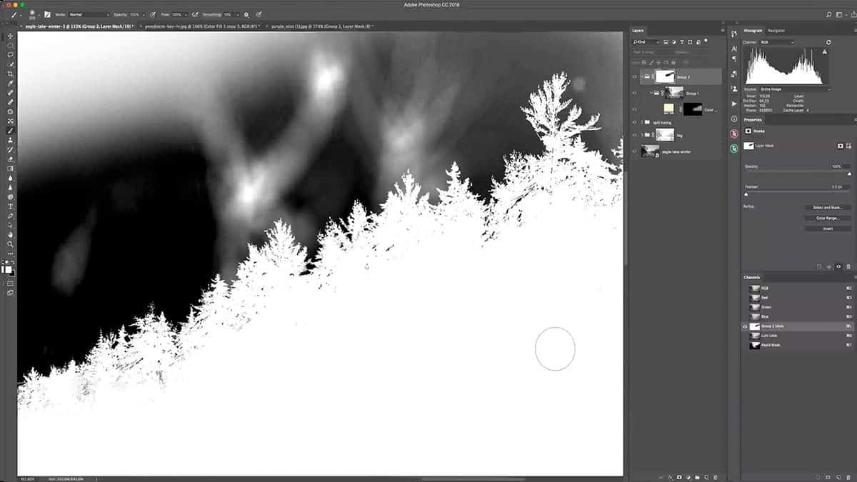
One thing you’ll notice about this luminosity mask is that it picked some of the bright highlights along the treeline, as noted by the small dark specks in the above screenshot. These are areas of snow and reflected highlights on the tree branches. Ideally, I want the entire treeline to be completely white…but Photoshop doesn’t know the difference between a highlight on the tree vs in the sky, so I have to refine this manually.
This is why I wanted to paint the luminosity mask in with my brush tool so that I wouldn’t have too many of these areas to remove.
Correcting this is quite simple. Make sure this luminosity mask is selected and active by clicking on the thumbnail in the layers palette, and take a small white brush set at 100% opacity and manually paint over the treeline to clean this up. You don’t have to worry about painting right up against the treetops (where the sky begins to poke through the branches) since that will not be noticeable.
This is not only a great workflow for dodging and burning, but also for removing any halos that will sometimes creep up when exposure blending.
Luminosity Masks for Burning
The workflow for burning is pretty much the same as dodging, but with different goals and results.
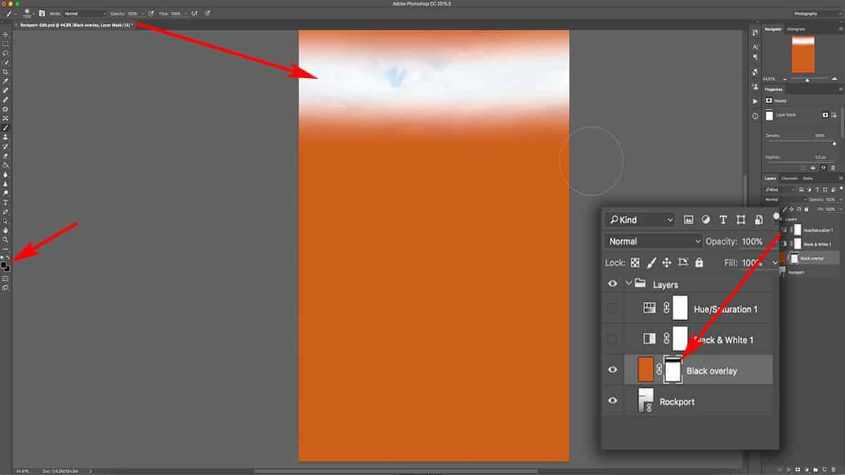
For this image, I’d like to add a very soft vignette in order to push more attention towards the center of the image. I like to achieve that by burning the edges of my frame with the brush tool, which will give a more tailored and natural result…as opposed to using actions or other automated vignette effects.
First, let’s zoom out a bit so we can see the edges of the canvas.
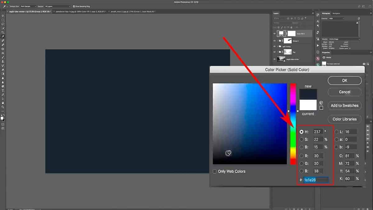
Next, add a solid color fill layer – but this time, select a dark and muted blue. The saturation will still be low (under 25%), but the brightness will be at around 15%. Counterbalancing the pale yellow we used for the dodging with a dark blue for the burning will create some additional depth and interest.
Screenshot is from the free video lesson on luminosity masks, which you can download by clicking here.
Hit OK to create this adjustment layer, then change the blend mode to Overlay (for burning). Next, invert your layer mask so that it’s pure black by pressing CMD + I.
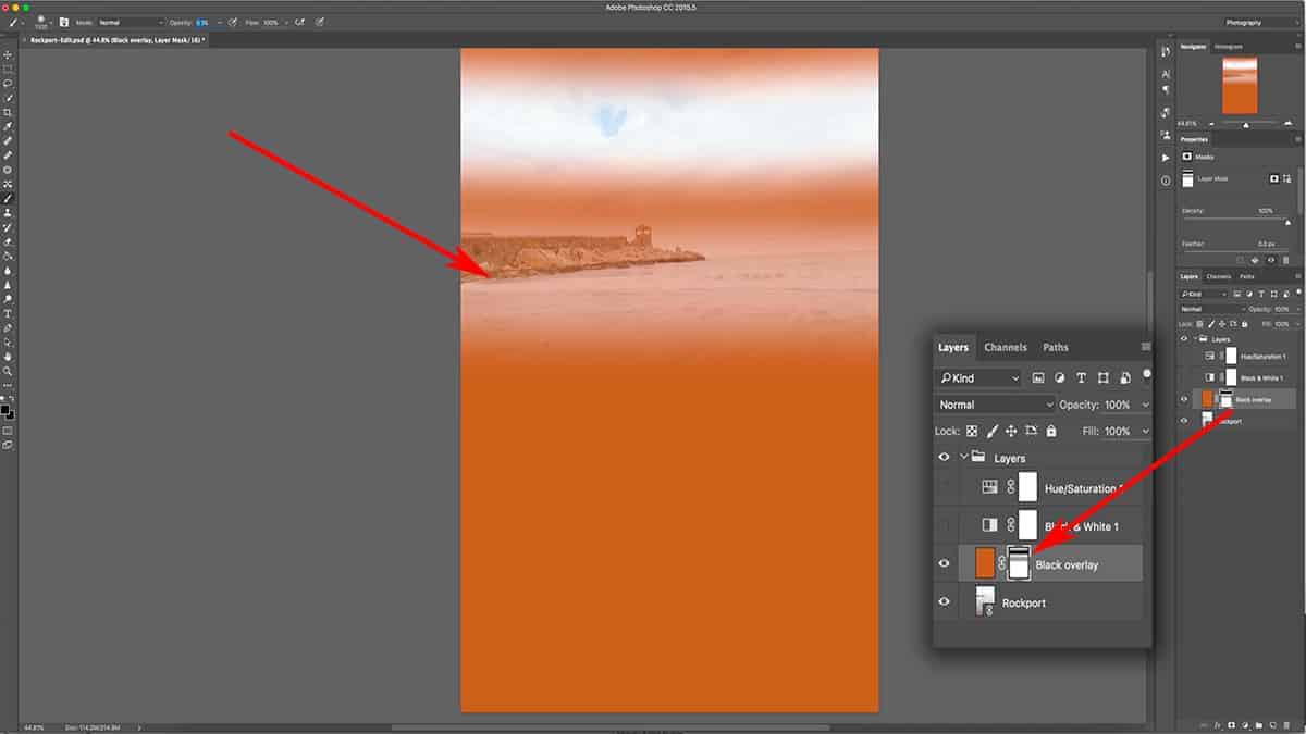
Much like we did with our dodging, let’s grab a soft, white brush set at around 40% opacity to start. Begin to paint around the edges of the frame, paying attention to only burn areas that you want to minimize the most and accentuating the existing light balance.
For example, I burn the bottom left and right corners of this image the most in order to push more attention towards the bottom middle, which is already higher in brightness.
When finished, your layer mask should look something like the screenshot below…where most of the attention is still towards the center of the image, but the brushwork loosely follows the landscape and existing light and shadow.
I find this workflow for a vignette much more successful than simply drawing an oval over the center of an image. Not only is the brushwork 100% customized to the photo, but you can easily remove the vignette from certain parts if you went too heavy. Simply switch your color to black and brush over any area you want to remove the vignette from.
We have our vignette…but as expected the tones are looking rather muddy.
There are two causes for this:
- The burning is crushing our darker shadows. This image already has deep shadows along the edge of the frame (particularly the bottom corners and treeline on the left), and burning those areas starts to crush the shadows and block up important details.
- We are also burning the highlights, specifically along the sky…which is more of a distraction than an enhancement.
In order to remove this vignette from our shadows and highlights simultaneously, I’m going to add a midtone luminosity mask to this burn layer.
The first step to “masking the mask” is to place this vignette layer into its own group. Make sure to keep the group active by clicking on the group thumbnail in the layers palette.
Next, open up your TK Basic Panel and select a midtone luminosity mask (I’m using a “Midtone 3”). With your group still selected in the layers palette, press “Apply” to convert this luminosity selection into a group mask.
This is looking much better, but I can remove this even more from the sky by adding a bit of grey to the luminosity mask. Alt + click on the mask thumbnail to bring it up on the canvas, and go to Image > Adjustments > Brightness/Contrast and bring that down to about -65.
Here’s the final image with both dodging and burning:
I find the resulting vignette to be very successful since it’s not obvious that you added one. Instead, your eyes are gently directed towards the center of the photograph without knowing why.
You can say the same for the entire dodging and burning workflow: the “before” image isn’t that different from the “after” above, but the entire balance of focal points and overall flow of attention has been improved greatly with just a few small adjustments to light and shadow.
I hope you enjoyed this tutorial and found some helpful tips for your own processing in Photoshop. Luminosity masks are especially helpful with dodging and burning since these selections are complementary to any technique that manipulates light.
Don’t forget to download the video and practice files for offline learning.
How Luminosity Masks Enhance Light and Atmosphere
Luminosity masks are a powerful Photoshop technique used to make advanced selections based on the tonal value of an image. This makes it the perfect tool for enhancing the light and atmosphere of a landscape photograph…transforming a lackluster image into an extraordinary work of art that explodes with color, depth, and detail.
In this comprehensive tutorial, we’ll take a deep dive into luminosity masks and explore some “real-world” examples of how this technique can intensify the mood and enhance your colors and tones.
This is where luminosity masks get really exciting because now that you know how they work (if not, make sure to read the first tutorial), you can better visualize what is possible when you incorporate them into your own workflow.
Luminosity masks are best learned when taught visually, so I’ve pulled a comprehensive video lesson from my membership program for you to watch. However, a video is not always the most convenient way to learn, so I’m also including the full written tutorial below.
If you’re pressed on time, make sure to download the video lesson so you can watch around your own schedule. I’m also including any practice files so you can practice right alongside this tutorial. It’s easier to grasp concepts in Photoshop when you actually do it yourself as opposed to simply watching someone else do it for you. Just fill out the form below the video and you’ll be sent a download link.
[fl_builder_insert_layout slug=”lm-optin”]
[fl_builder_insert_layout slug=”luminosity-mask-table-of-contents”]
Creating a Sun Glow with Luminosity Masks
Let’s jump right in with our first technique for enhancing a landscape photograph, and that is adding a sun glow effect. This will amplify the warm and glowy atmosphere of the golden hours and make for a more appealing image….and by adding a luminosity mask, we can control where the glow is visible and eliminate any washed out, hazy tones.
Let’s set up the stage for adding a sun glow.
First, add a solid color fill layer by going down to your adjustment layers and selecting Solid Color…and then sample a nice, pale yellow with the settings seen in the screenshot below.
When you’re selecting a color for a sun glow (or any kind of color dodging work), you want to make sure it’s very light in saturation (under 25%) and set a full brightness. If you choose a color that is overly saturated and/or low in brightness, your results will be muddy and distracting.
Another reason why I’m using a solid color fill layer instead of just filling an empty layer with a color is that if I ever decide to change my color, all I have to do is click on the layer thumbnail here and pick a new color.
Next, change the blend mode to soft light; we’re basically dodging here and that is the blend mode I typically use for my dodging.
Finally, fill the layer mask with black by clicking on the layer mask and pressing CMD + I to invert the color from pure white to pure black.
Now the stage is set for applying a sun glow. Press B to bring up the brush tool and make sure your foreground color is set to white, and at a brush opacity at around 30% to start.
Adjust your brush size so that it’s a little bigger than the sun itself, make sure your layer mask is selected and active, and click once on the sun to slightly reveal the yellow fill layer we just added.
This adjustment should be almost completely unnoticeable so that the sun glow effect is very feathered and seamless, but don’t worry: we’ll make this more apparent in the next steps.
To double up on the strength of this effect, let’s first duplicate this layer and mask by clicking on the layer thumbnail, and dragging it down to the bottom of your layers palette until you’re hovering over the “New Layer” icon, and then release the mouse. A copy of this layer + mask will be created.
Click on the layer mask of the newly copied layer, increase your brush size to about double of what you previously used, center your brush over the sun again, and click once.
What we are doing here is creating a very soft and natural sun glow by duplicating the layer to amplify the strength, while also increasing the brush size each time to taper out the sun glow so you don’t see any hard edges. Using this method, the sun glow is the heaviest around the sun itself and slowly drops off in intensity as we move away from the sun, which is what a sun glow would naturally do.
I’m also choosing to do this on separate color fill layers vs. just one to (1) give me greater control of the effect through independent layers, and (2) not have a ceiling on the strength of this sun glow.
You can repeat this process as many times as you want until you get the desired result. I’m going to do this two more times: duplicate the layer, bring up my brush size, and click once on the layer mask to reveal more of the sun glow.
Screenshot is from the free video lesson on luminosity masks, which you can download by clicking here.
The sun glow above looks adequate, but it’s very hazy and has washed out a lot of great detail along the horizon and in the water. This is because we are essentially dodging over our shadows as well as our highlights. In other words, this sun glow does not take the unique luminosity of our image into consideration and is affecting all tones with the same degree of intensity…so it looks like we simply added a light leak filter.
This is where a luminosity mask comes in handy since we can tell Photoshop to eliminate this sun glow from the deep shadows…and as the value of a pixel gets lighter, so does the strength of the sun glow. This will also remove the sun glow from the horizon line, which will make this effect appear much more natural.
Let’s add these four solid color fill layers into their own group, and then turn off the group’s visibility by clicking on the eye. This is so we can generate luminosity masks based off of the original image, not what it looks like with the sun glow applied. When you generate new luminosity masks, they reflect the tonality of how your image currently appears – including any effects from visible layers. Depending on how you want your mask to look, you may need to turn off the visibility of some layers.
Next, go to your TK Basic Panel and hit Composite to generate a fresh set of luminosity masks.
Note: The TK Basic Panel is a free Photoshop tool used to generate luminosity masks for you. Read more about the panel here.
Cycle through your masks to see which one suits the effect you’re going for. Since I am removing this sun glow from the shadows, I want to choose a Lights luminosity mask which has my shadow areas painted in darker tones. “Lights 1” seems to work well for this adjustment since it gives me a nice, soft selection for my highlights, yet removes the sun glow from the majority of my shadows.
Make sure the group is still selected in the layers palette, and hit Apply to add this luminosity mask directly to the group.
Since the mask is added to the group itself, it will affect all layers inside of that group as if you applied the mask to each individual layer.
Another reason why I am using a group here is that we already have layer masks on each individual layer…so we can not add a luminosity mask to them since you can only add one mask to a layer. By grouping your layer(s) and adding a mask to the group, you can circumvent that restriction and effectively use two (or more) masks on an individual layer. This is known as “masking the mask”.

You can see in the final result above, adding that luminosity mask cut through much of that haze…and gives the image a more natural sun glow that compliments and enhances the atmosphere rather than being a distraction.
Enhancing Texture and Detail with Luminosity Masks
For the next example you see below, I want to enhance the contrast to the foreground flowers, which will give it more texture and help it stand out more from the shallow background. Since I used an 85mm lens, the depth was flattened between the foreground and background, so adding contrast will help to bring that back a bit.
However, I don’t want to add a global increase in contrast since that will darken my shadows, which is something I don’t want to do. Instead, I’ll use a luminosity mask to target just the highlights of my flowers so I can increase the brightness and expand my tonal range without affecting the midtones and shadows.
[fl_builder_insert_layout slug=”lm-optin”]
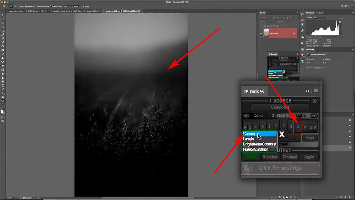
The first step is to generate the luminosity masks, so let’s open up the TK Basic Panel and hit Composite. I’m looking for a mask that will give me a nice selection just for the highlights in the flowers. I’m not concerned with what is going on in other parts of the mask since I will be removing that later; my eyes are focused on the foreground flowers only.
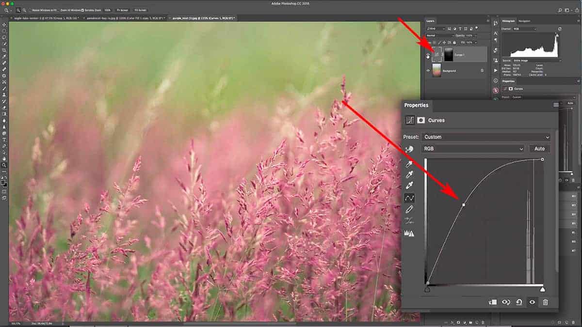
“Lights 3” gives me some nice isolation of the highlights in the flowers, but is leaving out much of the midtones and of course the shadows. This is perfect for the type of adjustment I want to make. Press the Layer button and select Curves to simultaneously add a curves adjustment layer and the “Lights 3” luminosity mask.
Since this luminosity mask is highly restrictive, I can be very dramatic with my tonal shifts here. This is another benefit of luminosity masks….at times, the brightest tone on your mask will be around middle grey, which means you can be heavy-handed with your adjustments and not see much change. This makes it easier to pinpoint exactly how you want your image to look without having to make incremental changes that can be difficult to control.
Since this mask is so dark, I can bring up my curves quite a ways…which brightens the highlights to a very a small degree.
However, we have a little problem here. This curves adjustment layer is also affecting my sky, which is something I don’t want.
To fix this, we’ll “mask the mask” by adding this layer to its own group and masking out the sky. We could simply paint black over the sky areas of the luminosity mask itself, but that’s a destructive workflow since it will permanently alter the intricate detail of the mask.
Add the entire layer to a group, click on the group thumbnail, and then add a new blank mask by pressing the “Add Layer Mask” icon.
I could add another luminosity mask to the group itself in order to remove this adjustment from the sky, but that’s not necessary since this is fairly simple to isolate. The sky is very out of focus and soft, so there’s no sharp detail that I need to follow. Instead, I’ll take a big, soft brush loaded with pure black, bring my opacity up to 100% by pressing 0, and paint over the sky detail.
By first adding this curves adjustment to a group, and then manually painting back onto the group mask to remove this effect from the sky…we were able to preserve the original luminosity mask. This also makes it very easy to reverse any brushwork here by simply switching to white and re-painting into the group mask.
At this point, we’ve only used luminosity masks “straight out of the box”. We’ve applied them directly to layers exactly how they were generated from the panel. However, what happens when the mask is not a perfect fit for the adjustment that you want to make? For example, what if we need to create a mask that is in between a “Lights 1” and a “Lights 2”?
In order to take luminosity masks a step further, you can alter the mask itself by adding contrast to create a stronger selection. Inversely, you can blur the mask in order to soften the selection and feather out the edges even more. This is a very powerful feature that gives you an incredible amount of control over your mask, and I can’t wait to show you how this works.
Refining a Luminosity Mask
Let’s jump back to the image of Eagle Lake that we used in the first tutorial. What we’re going to do here is add some fog to the foreground, but only to the areas that it would naturally appear. Specifically, the fog will be much less visible in the immediate foreground than it will in the background. This will help to retain depth and make the fog appear more natural.
Screenshot is from the free video lesson on luminosity masks, which you can download by clicking here.
Th first step is to add a solid color fill layer…so let’s add that by going down to your adjustment layers and selecting solid color. For this effect, I’m just going to use pure white and press OK. Next, click on the layer mask and press CMD + I to invert it to pure black and hide the solid color layer.

Next, select your brush tool by pressing B and make sure your foreground color is set to white. Set your opacity to 100% by pressing 0, then take a big, soft brush and paint a line across the horizon. Reduce the opacity of the color fill layer to around 30%, or at low enough to where the fog appears more natural.
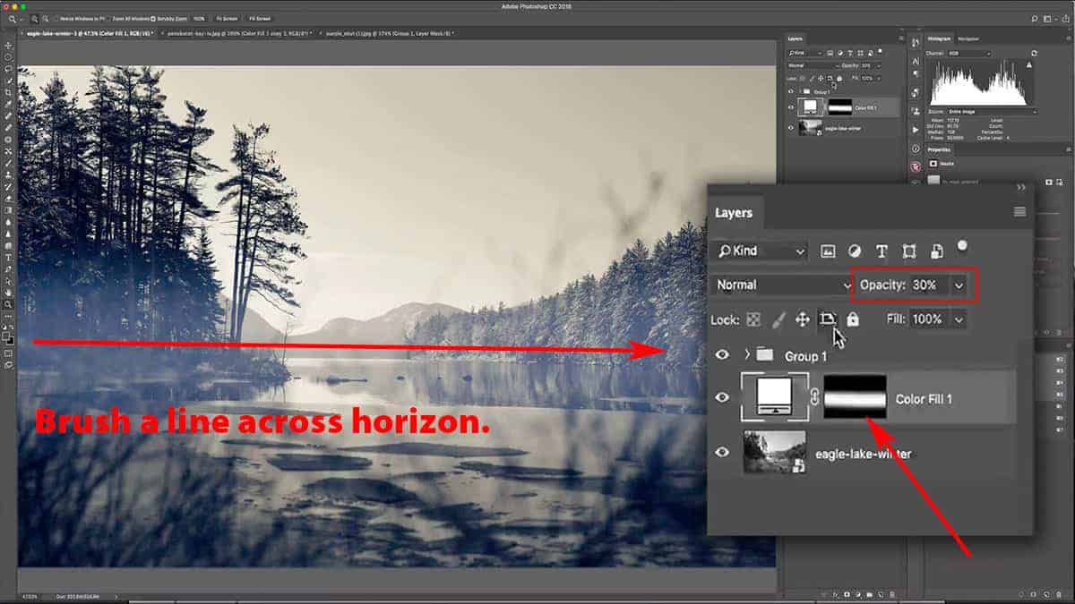
This is looking better, but as you can tell we need to remove this fog from some of the shadow areas in order to bring back some depth and dimension…specifically, the middle-ground trees on the left-hand side of the frame. That is easily done by adding a luminosity mask.
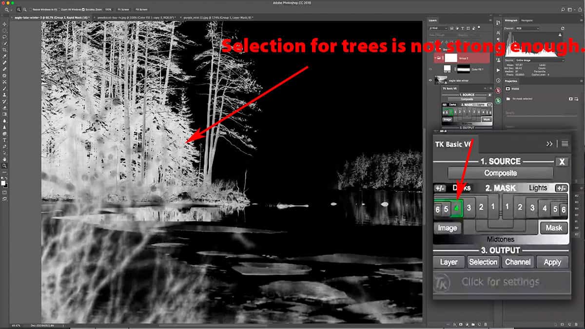
Add this color fill layer to a group and turn the group off temporarily so we can generate some fresh luminosity masks. Open up the TK Basic Panel, click Composite, and select a Darks mask that will give you a nice selection for the shadows.
A “Darks 3” luminosity mask picks up too much of the background, but a “Darks 4” has a weak selection for the foreground trees…so neither one are truly suitable for targeting only the shadows.
Oftentimes, a luminosity mask will need slight adjustments in order to target the exact areas you want. For example, the luminosity selection may not be strong enough, which will hide your adjustment too much. In other words, those greyish pixels need to be brightened and pushed more towards pure white…which will make your adjustment more visible.
Other times, your luminosity selection may select areas you don’t want to adjust since a luminosity mask is based on your entire image. For example: let’s say you want to create a luminosity mask for the highlights in the foreground. However, this mask is also selecting the highlights in the sky, which you do not want to adjust. In this instance, you would need to control the mask somehow.
You can always “mask the mask” by first adding your layer + luminosity mask to a group, and then adding a mask to the group itself and paint with a black brush to remove the adjustment from areas you do not want. However, this doesn’t always work since you are hand painting with the brush tool and could inadvertently “paint outside the lines” of your desired selection.
This situation is a good example of when you need to manually tailor a luminosity mask in order to get the exact match you want. Since this panel only shows us a mask “preview”, we can alter it directly before applying it to a layer or group.
Let’s take our “Darks 4” mask (which is easier to refine since it already has the background excluded from the selection) and go up to Image > Adjustments > Brightness/Contrast. Increase the Brightness slider to around 90-95 in order to brighten up the whites and create a stronger selection for our fog removal. When finished, press OK.
So now we have the best of both worlds: a nice, strong selection for our shadow areas and without any of the background being selected.
SIDE NOTE: You’re not restricted to Brightness/Contrast in order to alter the appearance of a luminosity mask. There are other options available under Image > Adjustments, such as curves or levels. We’ll explore more of these in later tutorials, but feel free to experiment with the type of adjustment to get the results you want.
At this point, our luminosity mask has not been applied yet…so make sure to click on the group thumbnail in the layers palette, and go back to the panel and hit Apply to see the result.
Obviously, this is not the result we were expecting…that’s because we skipped an important step.
Right now, our luminosity mask has the shadows painted in white and the highlights painted in black since this mask was created to isolate (or select) our shadows. However, in order to hide the fog from the shadow areas, we want the opposite mask. In other words, our shadows should be black to hide the fog, and the highlights should be white to reveal the fog.
This happens quite often and is a simple fix. Click on the luminosity mask thumbnail and press CMD + I to invert the mask.
At this point, you may be thinking: why didn’t we just use a Lights luminosity mask which already has our shadows in black and highlights in white?
This seems like an obvious choice, but the results are not always what we want. Sometimes, other tones can creep their way into the selection which leaves you with more refining work to do after the mask has been applied. It’s always better to create a luminosity mask based on what you want to isolate, and then invert the mask if necessary.
Since I wanted to isolate my shadows from the selection, I used a Darks luminosity mask and then inverted.
Here’s the final result:
Screenshot is from the free video lesson on luminosity masks, which you can download by clicking here.
By adding the luminosity mask, we managed to cut through the fog quite a lot and created a natural gradient from front to back.
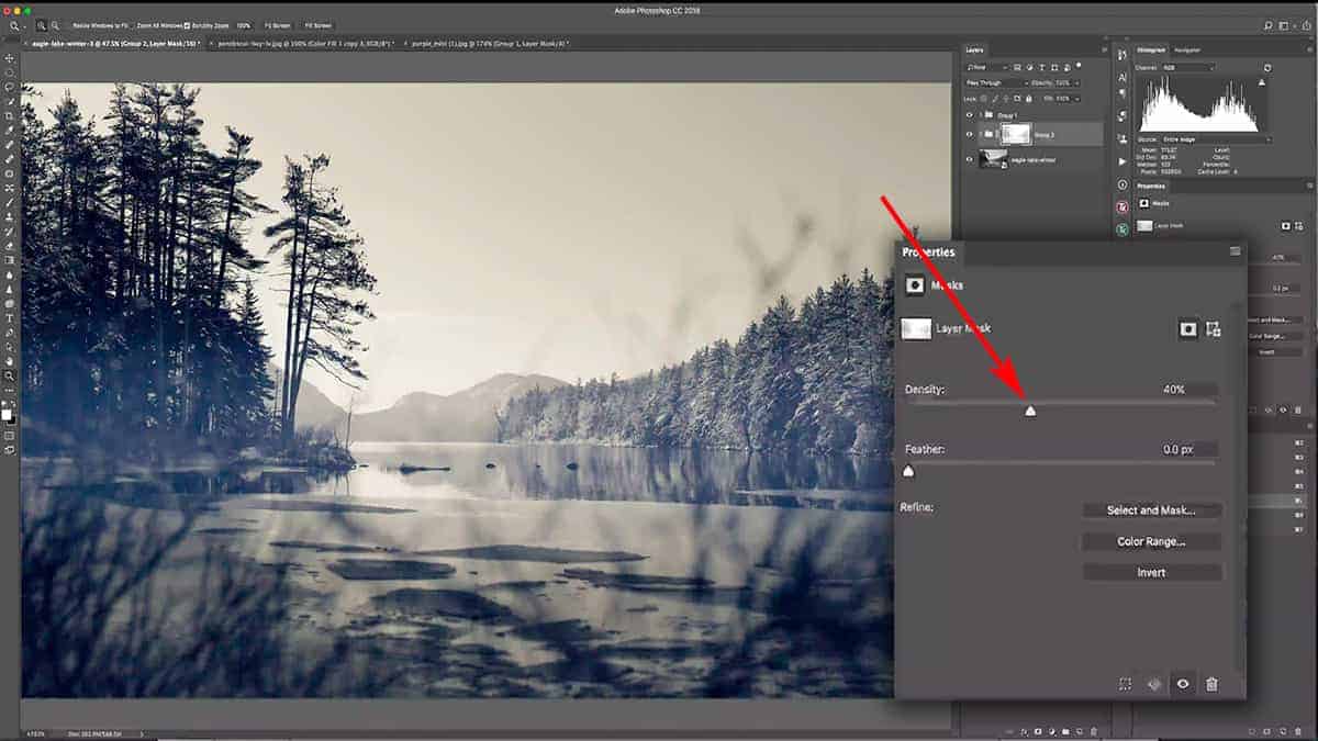
Now if the strength of this luminosity mask is too strong (in other words, if too much of the fog is being removed), you can adjust the opacity of the layer mask itself in order to bring more of that fog back.
Click on the mask thumbnail and go over to the Properties panel. The Density slider can be adjusted to change the mask opacity; reducing the density will reduce the strength of the entire layer mask (but not the layer itself).
Let’s bring the Density down to about 40%, which brings back enough of the fog to keep the image interesting…but since it’s still controlled by the luminosity mask, the fog is applied much less on the shadows which gives the image more depth and interest.
And since this is a non-destructive workflow, you can always come back later and alter the density if needed.
To finalize this fog effect, we can change our color fill layer to better compliment the image. You can see that the color of the fog is slightly shifted towards blue because it’s adopting that blue shift to the shadows we added in the luminosity masking beginner’s tutorial. To counteract this, let’s change the color fill to something warmer than pure white.
Double click on the color fill thumbnail in the layers palette to bring up the color picker…and pick a nice, pale yellow to better match the image. Make sure you’re at full brightness and very low in saturation.
This is why I like using a solid color fill layer since you can always come back and change the color very easily…and you can see the changes live on the image as you choose different colors in the color picker window. This also contributes to the non-destructive workflow we’re trying to preserve.
Here’s the complete before and after, showing the cumulative result of our fog:
I hope you’ve enjoyed this tutorial on different ways you can use a luminosity mask to enhance the light and atmosphere of your image.
One final note: a luminosity mask will not change your image for you. You still have full, 100% manual control over your creative adjustments. The only part that is automated here is the actual creation of these luminosity selections (which you then turn into masks), which allows you to skip over hours of repetitive work to create these selections yourself.
This tutorial barely scratches the surface as to what is possible with luminosity masks. There are many other benefits that you’ll soon discover with my additional tutorials and through your own experimentation as you begin to use these masks in your own workflow.
In your next lesson, I’ll be showing you my full dodging and burning workflow, and specifically how luminosity masks will greatly enhance the quality and clarity.
>>> How to Dodge and Burn with Luminosity Masks <<<
While dodging and burning in Photoshop can be incredibly powerful and yield fantastic results, it can also present some unique problems…particularly the flattening of tones. I’ll show you how I use luminosity masks to overcome this challenge.
Don’t forget to download the video and practice files for offline learning.
Thanks for joining me…and if you have any questions, feel free to leave a comment below for me to answer!
Refining a Layer Mask with the Brush Tool
If you want to understand how to mask layers in Photoshop, then you need to become very friendly with your brush tool. It allows you to draw over the exact areas you want to apply an adjustment to…or rather, the areas where you want that particular layer to be visible or invisible.
It’s a VERY powerful tool, and a crucial part of layer masking…especially for photographers.
And since layer masks are part of a non-destructive workflow, you can always come back and alter your adjustment at any time by simply applying new brushwork to the layer mask.
So for this comprehensive Photoshop tutorial, I’ll be showing you exactly how to use your brush tool to refine a layer mask so that it compliments the unique content of your image. Your ability to dictate where a layer should (and should not) be visible is key to creating a professional, wall-worthy photograph.
Now if you’re a Lightroom user, the brush tool will be familiar as it works a lot like the adjustment brush…specifically how you can change the brush size, opacity, and feathering.
However, in Photoshop the brush tool is not loaded with an actual adjustment like it is in Lightroom. Instead, the layer itself will contain the adjustment, and we use the brush tool in combination with a layer mask to control where the adjustment is applied.
If you prefer to learn visually (which I highly recommend for anything Photoshop), you can download my free video course below. This five-part course also comes with practice files and a helpful PDF cheatsheet, so you can get hands-on with layers right away.
Table of Contents
- Video Lesson: How to Use the Brush Tool with Layer Masks
- Brush Tool Basics
- How to Brush Onto a Layer Mask
- Mask Reversal: How to Erase Your Masking with the Brush Tool
- Adjusting Your Brush Hardness
- Tailoring a Layer Mask
- Using a Gradient on a Layer Mask
Watch the Full Video Lesson Below
The brush tool is best learned when taught visually, so I’ve pulled a comprehensive video lesson from my membership program for you to watch. However, a video is not always the most convenient way to learn, so I’m also including the full written tutorial below.
Brush Tool Basics
To access your brush tool, simply press B or go over to your tools palette and select the brush tool from there. You can tell when the brush tool has been activated as your top menu will present options for customizing your brush tool.
To adjust the size of your brush, press the [ or ] bracket keys to increase and decrease your brush size. You’ll be doing this often so it’s good to familiarize yourself with these keyboard shortcuts.
The size of your brush is labeled by pixel count (i.e. 1200 px), so the area your brush affects is in direct relation to how many pixels your photo contains. This is why I like to just use my bracket keys to “eyeball” the brush size instead of trying to hit a specific number (i.e. 1200 px).
Brush opacity is something you’ll adjust often, so it’s helpful to know the keyboard shortcuts for this as well. At the top menu, you can adjust the opacity slider, but I find it easier to enter the opacity level with my keyboard. Much like in Lightroom, if you enter the number 1 your opacity will change to 10%, 2 for 20%, and so on. Pressing 0 will revert back to 100% opacity.
If you want a specific opacity level, press the numbers very quickly. For example, if you want to use a brush at 27% opacity, press 2 and 7 quickly…otherwise, it will change to 20% and then 70%.
The color of your brush is controlled by the foreground color swatch in your tools palette. Since we’re working with masks, your swatch should always be in greyscale…which means this swatch should be loaded with white, black, or a shade of grey.
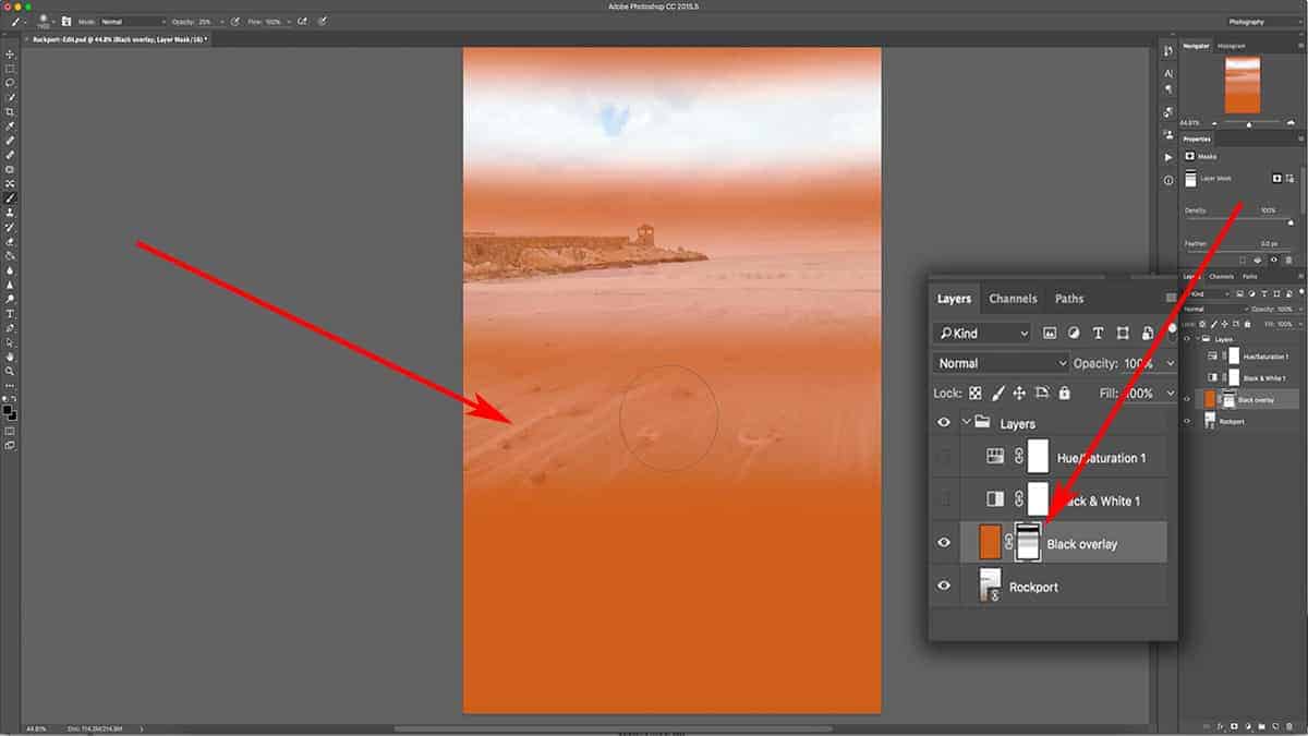
Brushing onto a Layer Mask
First, press B to activate your brush tool and set your opacity to 100% by pressing 0. Then, make sure the layer mask is filled with 100% white and applied to the orange fill layer we created in the previous tutorial on layer masks.
Select the mask by clicking on the mask thumbnail, then make sure your foreground color is set to black by pressing D as in Default. This will set your foreground color to black and background color to white.
Click and drag your mouse across the top of your image once, which will brush a strip of black onto your layer mask. This will render the area transparent so you can see the photo underneath.
Since we are using a layer mask, this “hole” we created with the brush tool is temporary; we can always revisit this mask and add more black, white, or grey to it to change the transparency…or delete the layer mask altogether in order to bring back the orange fill layer in full.
Let’s do that right now. Change the opacity of your brush tool to 50% by pressing 5, and do the same thing again: click and drag your brush tool across the photo (making sure the layer mask is still selected).
The overall effect is still the same: we’re changing the transparency of the top layer so we can see more of the layer(s) underneath, but since we are using 50% opacity and not pure black, we are only removing 50% of the orange fill layer.
Let’s do this one more time, but with 25% opacity. Press “2” and “5” quickly to set your brush opacity to 25%, and click and drag across the bottom of the photo, making sure you are painting onto the layer mask.
Again, the effect is still apparent, but at a much lower opacity; we can now see more of the orange fill layer than the photo layer underneath since we are painting 25% grey on the layer mask. This shade of grey is 25% darker than pure white….which translates to only 25% of the underlying layer being visible.
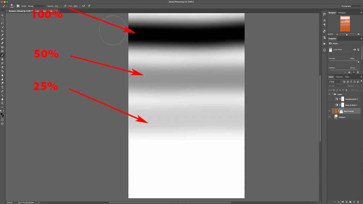
Now let’s take a look at the layer mask so we can better visualize how this all works. The first line we drew is 100% black, the second line is 50% grey (or 50% transparent) and finally, the third line is 25% grey (which makes our layer only 25% transparent).
So in order to adjust the opacity of your layer, you need to adjust the opacity of your brush tool. Since it’s loaded with 100% black, changing the opacity of that black will control what shade of grey is painted onto your layer mask. Applying a brush stroke with 50% opacity is identical to choosing 50% grey in your color picker tool.
You could use your color picker tool to choose a shade of grey and apply that at full brush opacity, but that’s a convoluted way to paint onto a mask. It’s much easier to simply change the opacity of a brush loaded with pure black.
Reversing Parts of a Layer Mask
So far, we’ve only discussed how to add black and grey to a layer mask in order to change the transparency of a layer. We’ve also discussed how to remove a layer mask as a whole. But how do we reverse our masking for only specific parts of a layer mask? In other words, how do we shine a light back onto areas we’ve made transparent; to reverse what we just did and make that orange layer more visible again?
All you need to do is add white (or light) back to this layer mask with a white brush. This is one of the best traits of layer mask…being able to switch back and forth from adding black and white until you find the right balance between your layers. You’ll be using this a lot, especially with landscape photography.
First, let’s load the brush with white by pressing X, which will switch your foreground and background colors. You may need to press D first to load your foreground/background swatches with black and white, and then press X to switch them. Make sure your opacity is back to 100% by pressing 0.
Make sure your layer mask is selected, and then draw a white line straight down the canvas.
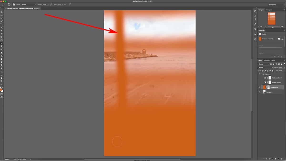
Since the opposite of black is white, adding white to an existing layer mask is just like using the eraser tool; it’s reversing any masking you applied, but only to the areas you are brushing…which makes it very easy to correct any sloppy brushwork.
If you look at the actual layer again, you can see that the orange has been brought back at 100% opacity by adding this strip of white.
Since we are working with 100% white, our previous masking was removed in full, as seen above. However, what happens if we use a white brush at a lower opacity to remove our masking?
Let’s demonstrate this so you can visualize how a lower opacity effects an existing mask. Bring up the layer mask by alt + clicking on the mask thumbnail in the layers palette, and adjust the opacity of our brush tool down to 50%.
Once again, brush downwards on the layer mask, making sure to cross over the black and grey horizontal lines that we created in the previous step.
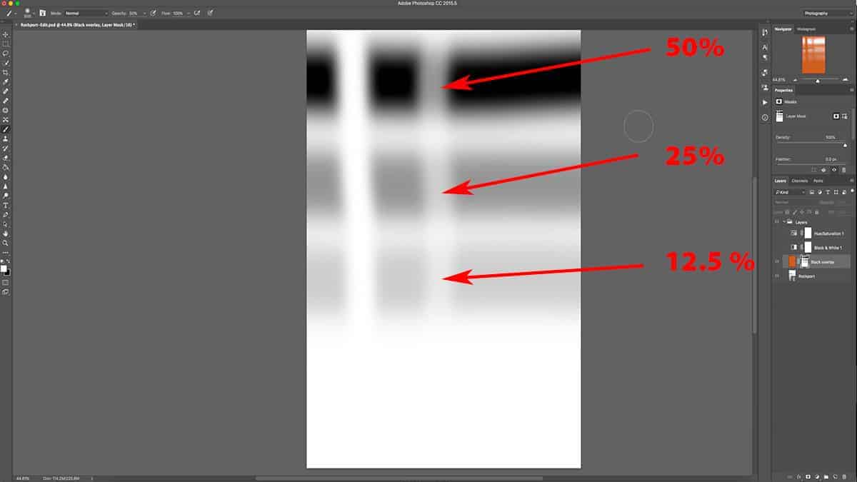
The opacity of your brush directly correlates to strength. Since we are using a white brush set at 50% opacity, we are only working with 50% strength….which means we are only subtracting 50% of whatever we are brushing over.
The first horizontal black line was applied at full opacity. When we cross over this area with a white brush set at 50% opacity (or strength), it leaves us with 50% transparency.
The second horizontal black line was applied with 50% opacity. When we cross over that with a white brush set at 50% strength, we are subtracting 50% from the existing 50%…and are left with only 25% transparency.
Finally, when we cross our third black horizontal line which was originally applied at 25% opacity, we are left with 12.5% transparency. In other words, we subtracted 50% from 25%.
If we turn off the layer mask and look at the actual orange fill layer, we can see that the same areas are now visible at 50%, 75%, and 87.5% respectively.
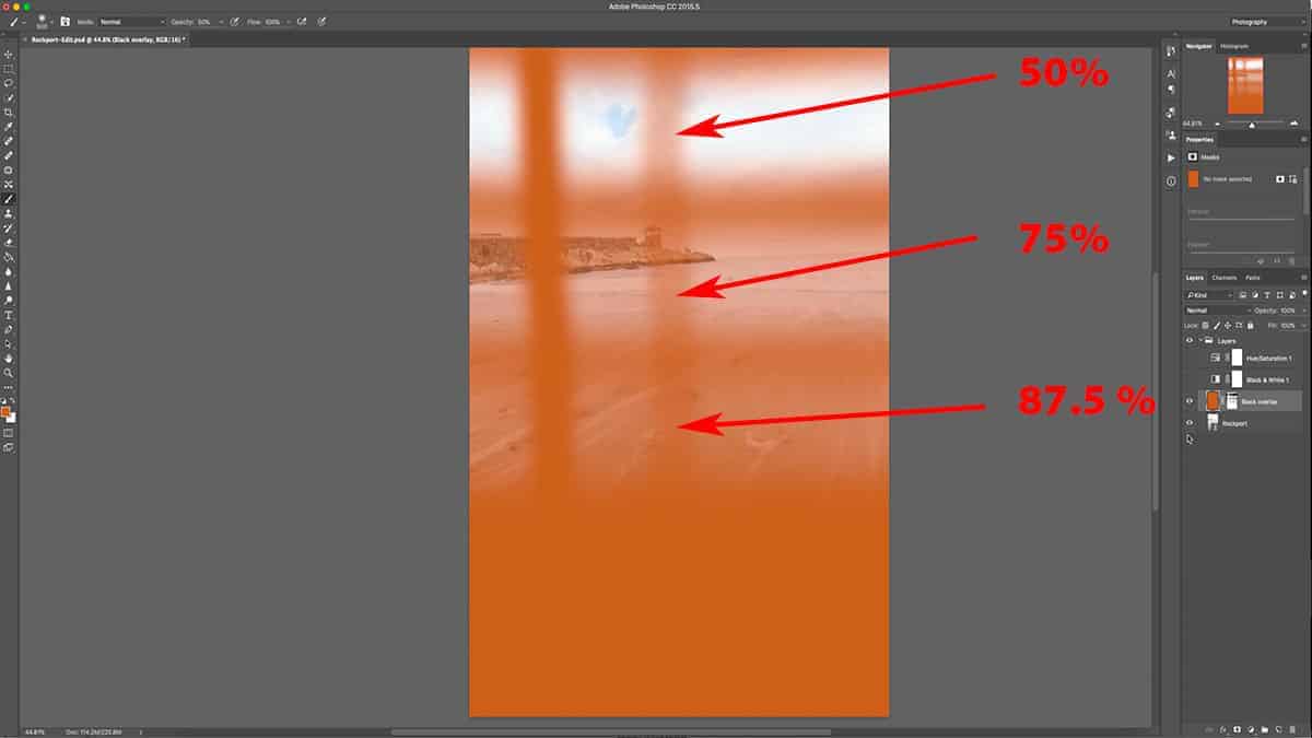
Adjusting your Brush Hardness
When working with layer masks, usually your brush will be very soft and feathered because you are working with 0% hardness…which gives you a nice tapered effect to your masking. It’s much like working with the adjustment brush over in Lightroom, where you adjust the feathering in order to soften your transitions.
However, there could be situations where you would want a harder transition line…for masking out very specific areas.
With the brush tool selected, right-click anywhere on your canvas. A submenu will come up allowing you to increase your brush hardness.
To demonstrate, I’ll adjust my brush hardness to 100% and go back to the mask we’ve been working with. With my foreground color set to black and opacity at 100%, I’m going to drag a line across the canvas. You can see that the edge of my brushwork is very hard and defined, with no tapering at all.
For good measure, I’ll also add a 50% grey line by adjusting my brush opacity down to 50% and drawing another line across my canvas.
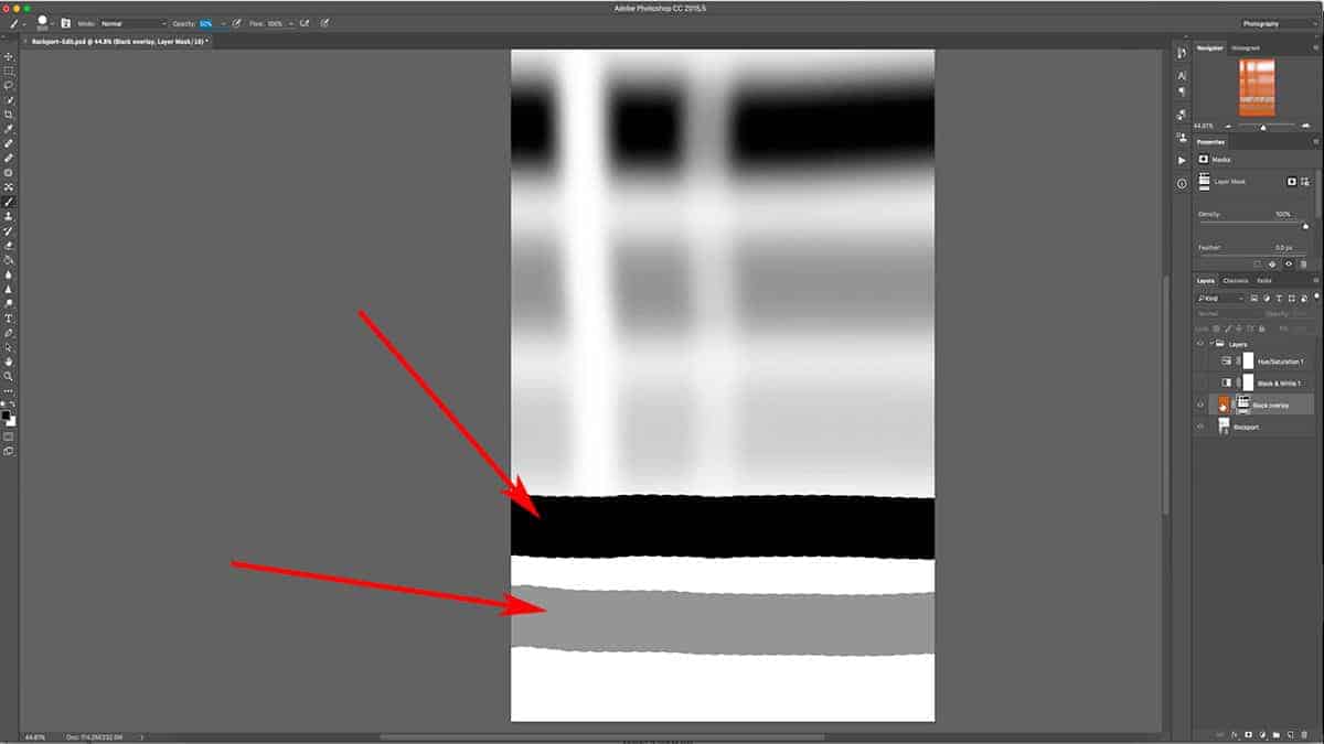
If we turn off the layer mask and take a look at the layer itself, you can see how abrupt and sharp the transition is from the orange fill layer to the photo layer underneath.
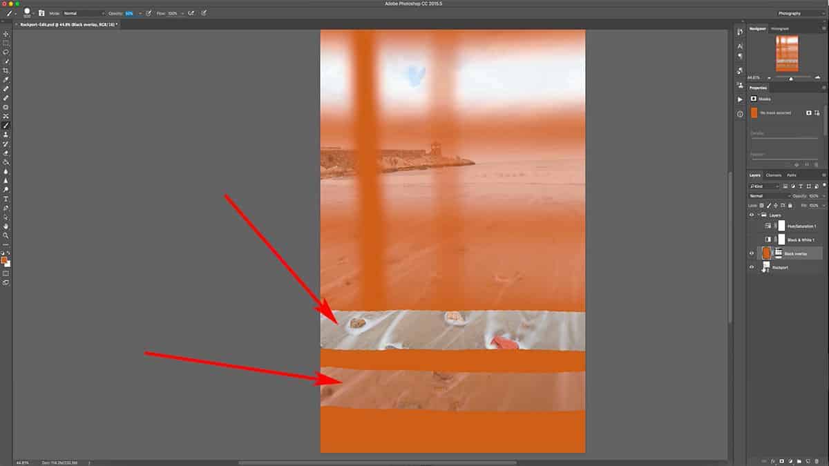
Typically, you wouldn’t use a hardness set at 100% like this for tailoring an adjustment…but it can be useful when working with small and targeted areas.
I’m going to zoom into this turret here and start masking along this very sharp, precise area. You can see that my brushwork hugs the edge of this turret very closely. If I were to use a soft and feathered brush, the edges would spill over onto the sky.
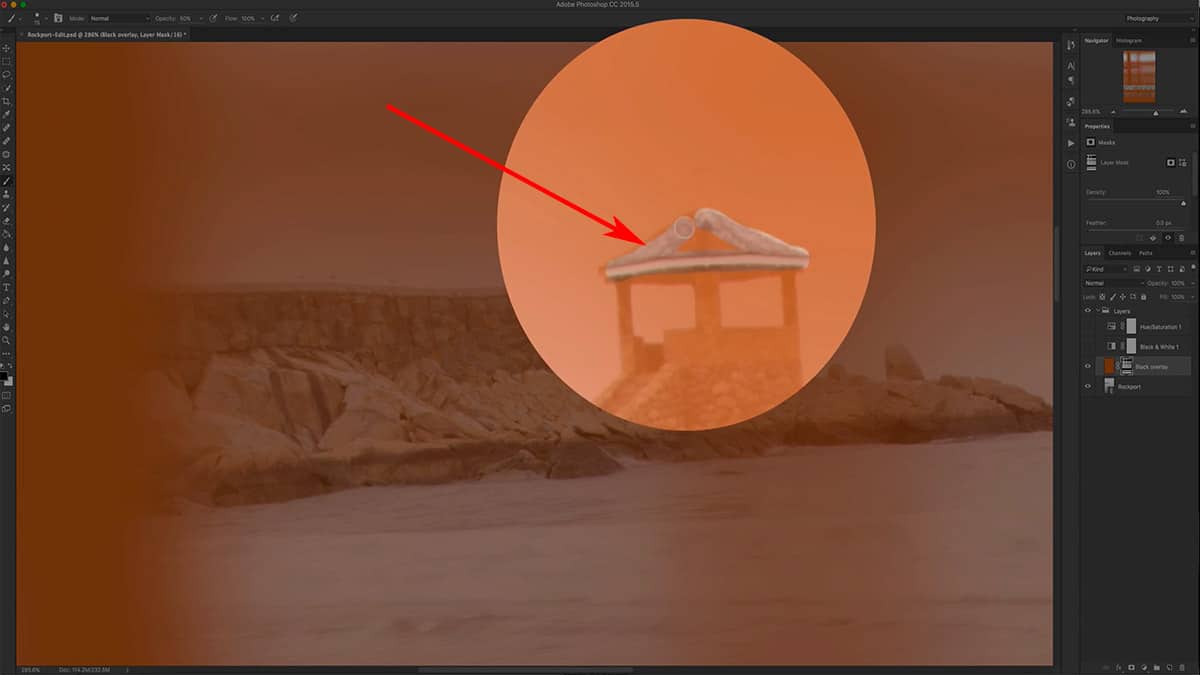
With this precise targeting I can make adjustments just to this turret and not to the background sky or other parts of my image.
By adjusting your brush size, opacity, color (either black or white), and hardness…you have the ability to tailor a layer mask with a very high degree of accuracy and strength.
Tailoring a Layer Mask
Now it’s time to move out of our practice area and do a “real world” example of how photographers use layer masks to tailor an adjustment.
First, let’s temporarily hide this orange fill layer that we’ve been working with my clicking once on the eye to make it invisible.
Next, let’s bring back the hue and saturation adjustment layer we added in the last tutorial. If you don’t have that, simply add your own and increase the saturation to 40%.
As I mentioned before, this saturation bump looks good for most of the image except for the red rock in the foreground; it’s a bit too heavy and distracting. To fix this, I’m going to mask out the rock by using my brush tool, which will ease up on the opacity – or the strength – of this saturation increase just around this area…while the rest of the image will retain the same saturation bump.
I could go in and brush over this area with a black brush set at 100% opacity, but that would remove the saturation completely. Instead, I just want to ease up on its effect.
To achieve this, I’m going to use a low opacity brush which will remove only some of the saturation. Not only will this look more natural than removing it completely, but it will give me more control over the saturation removal. If I’m not removing enough of the saturation with one brush stroke, I can simply brush over the area again and build up my brushwork until I get the result I want.
Press B to activate the brush tool, and make sure your foreground color is set to black and your hardness at 0%. Then, set your opacity to 20% by pressing 2, and simply brush over the red rock once (making sure you are brushing onto the layer mask for the saturation adjustment layer).
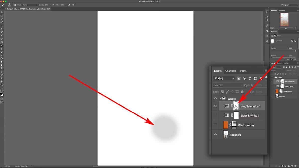
This is just one application of my brush, and the results already look better. I’ve scaled back on the saturation and brought back some detail in the rock that was blown out by the oversaturation.
However, the rock is still a bit too saturated. Select the layer mask again and brush over this area once more to build up your brushwork and remove more saturation.
To see a quick before and after of what this layer mask did to our image, simply shift + click the layer mask thumbnail to temporarily disable it.
Using a Gradient on a Layer Mask
Tailoring a layer mask is not just limited to your brush tool. You can use any Photoshop tool that creates a selection or allows you to paint a color.
A popular tool for layer masking is the gradient tool, which you can use to create a very soft and gradual transition between pure black and pure white.
The feathering effect of a gradient is softer than what can be achieved with your brush tool, so I will sometimes use this to blend exposures together. The results look much like a GND filter, but with more control.
First, let’s delete our current layer mask so we are looking at the orange fill layer at full opacity…and then add a fresh layer mask.
Next, select the gradient tool in your tools palette. It’s usually hidden underneath the paint bucket tool, so if it’s not visible you may need to right-click on the paint bucket to bring it up.
Once you select the gradient tool, you’ll notice that the top menu will change to gradient-specific options. These allow you to customize how your gradient will look…but for most situations, you’ll want to keep these settings to how they appear in the screenshot below.
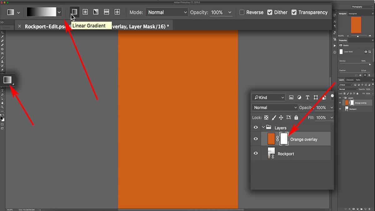
To add a gradient to your layer mask, first make sure your mask is selected…and then click and drag to stretch out a line in any direction across your canvas. For this image, I dragged a horizontal line from the first point to the second point in the screenshot below.
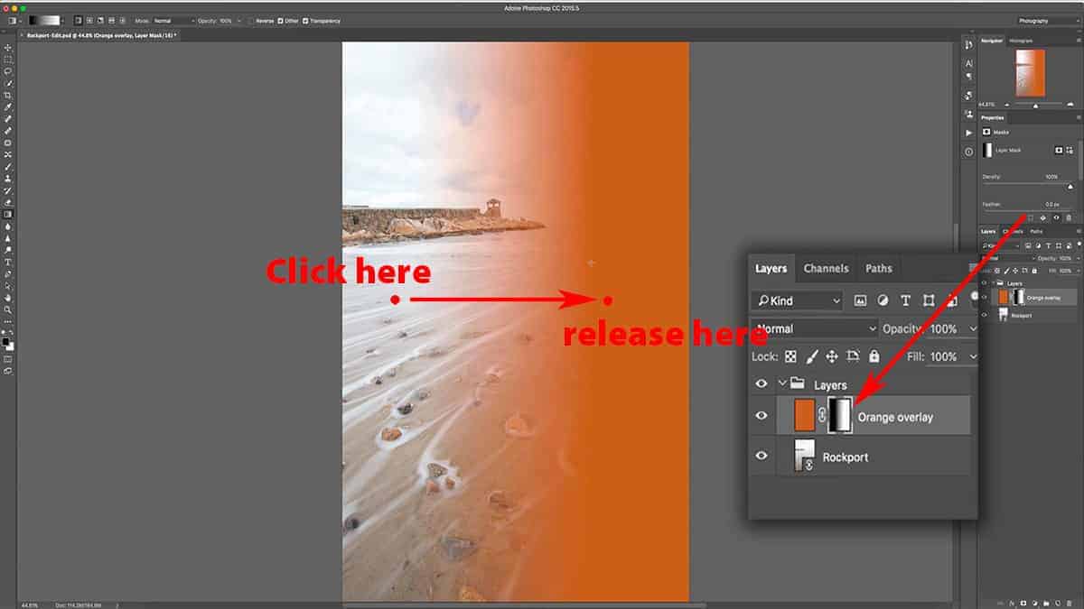
The line you draw will dictate how wide the transition zone is between black and white, and will move in the direction you draw. The longer the line, the larger (and more feathered) your transition zone will be.
If you want to ensure that your gradient stays level, hold down the shift key which will keep your line completely horizontal or vertical. If you try to draw a diagonal gradient, it will restrict your line to a 45-degree angle.
For this image, I dragged my line horizontally from left to right…which means that everything before the first point in the screenshot above (where I clicked) will be pure black, everything after the second point (where I released the mouse) will be pure white, and the area between these two points will become a gradient of black slowly transitioning into white.
Since the gradient was applied directly to a layer mask, this made the orange fill layer slowly transition from being completely hidden to 100% visible.
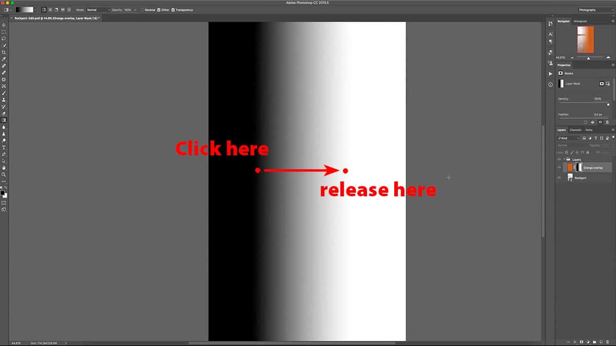
You can see that the gradient is very smooth and evenly distributed, which would be very difficult to create with your brush tool. A gradient mask is perfect for any situation which requires very feathered and gradual masking, such as when you’re trying to mimic a GND filter.
If you make a mistake drawing your gradient, you don’t have to delete your layer mask to start again. Simply drag out a new gradient and Photoshop will automatically override and replace your existing gradient with the new one.
The settings used here will create a gradient that starts as black and ends as white, and moves in the direction you draw your line. If you want to reverse the direction of the gradient, simply tick the “Reverse” box located in your top menu which will invert the gradient to instead transition from white to black.
The brush tool and gradients barely scratch the surface as to what is possible with layer masks. Depending on your desired result, there are much more efficient tools for tailoring a layer mask…so make sure to explore alternative methods for drawing onto your mask (such as the marquee tools).
In landscape photography, luminosity masks are often used to instantly create layer masks that are completely tailored to the tonal value of your image…which allows for you to make adjustments to very targeted areas (for example, just the highlights in your clouds or reflections in the water). These are advanced selections which can be quite complicated to create, but there are free tools available that automate this process for you.