Five Steps to Dramatic Black & White Landscapes in Lightroom
Five Steps to Dramatic Black & White Landscapes in Lightroom
Here’s an in-depth tutorial that I’ve been wanting to create for quite some time…my complete, step-by-step Lightroom workflow for processing black and white landscapes. I love to help other photographers achieve their creative goals, which is why I’ve spent some extra time to make sure this guide is super helpful and easy to follow.
NOTE: You can achieve the same exact result in Photoshop using ACR…same tools, just in different places than Lightroom.
Many photographers find black and white format to be a bit of a challenge to master in Lightroom, and understandably so. When you convert your image to black and white, the results are usually lackluster and disappointing: flat, uninteresting tones which elicit a low-impact, boring reaction (like in the before image below).

Just like when you process a color image, some specialized Lightroom techniques are required when working in black and white format. A bottleneck in your workflow develops when you don’t know which techniques to perform, or how to use the Lightroom tools to create the image you want.
Not to worry! I’m here to demystify the black and white workflow (it’s actually pretty simple). All you need is a little direction, and this tutorial is packed with my best Lightroom tips and tricks for creating extraordinary, wall-worthy black and white landscape photographs.
I’m going to roll out the blueprints and walk you through my entire black and white workflow step-by-step, so you can better understand how easy and fun it is to create in Lightroom.
What you need to get started
In order to follow along with this tutorial, only some very basic knowledge of Lightroom is needed. I walk you through how to perform each technique step-by-step, so if you can open Lightroom, import a photo, and switch to the Develop module….you’re good to go 🙂
Now let’s get to the tutorial! Whether you prefer to watch or read, I’ve got you covered below.
STEP 1: Basic Adjustments
Note: Remember, if you want to use the example image yourself and follow along with this tutorial step-by-step, download the practice pack by clicking here.
This first step you want to do is to convert your image to black and white format. There are several ways to go about this in Lightroom, but I prefer to select the “Black & White” icon in the Treatment heading, right under the word “Basic” in the panel.
Next, I want to even out my exposure a bit by performing some initial slider shifts. I typically do not adjust my entire exposure (via the exposure slider) unless the entire image is grossly under or overexposed. Instead, I make more targeted tonal adjustments with the Whites & Blacks, and Shadows & Highlights.
HIGHLIGHTS -79
SHADOWS +20
WHITES -32
BLACKS +20
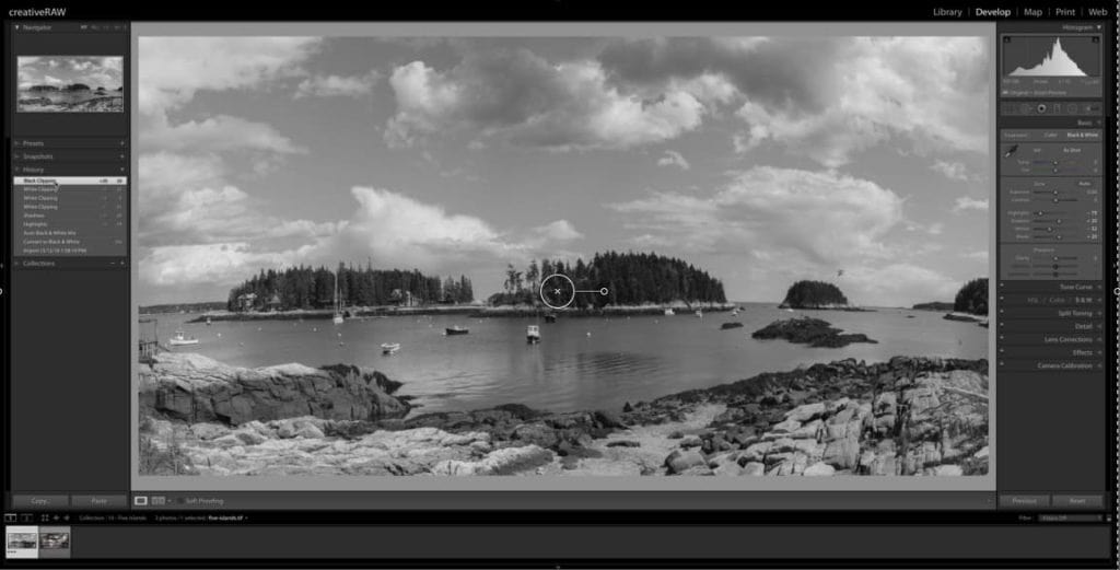
STEP 2: Enhance the sky with the Black & White Mixer.
I love using the Black and White Mixer panel (click on the word “B&W”under the HSL/Color/B&W panel) as this is where you can greatly control your highlights and shadows. The sliders here allow you to isolate specific color channels and adjust their luminosity (or tonality) with great control…which is extremely powerful for a black and white image.
What I want to do here is bring down the blues quite dramatically to darken these tones, which will make the sky really stand out from the white clouds. Select the target adjustment tool and hover over the sky so your blue slider is highlighted in the panel. Then, click and drag your mouse down all the way to – 100.
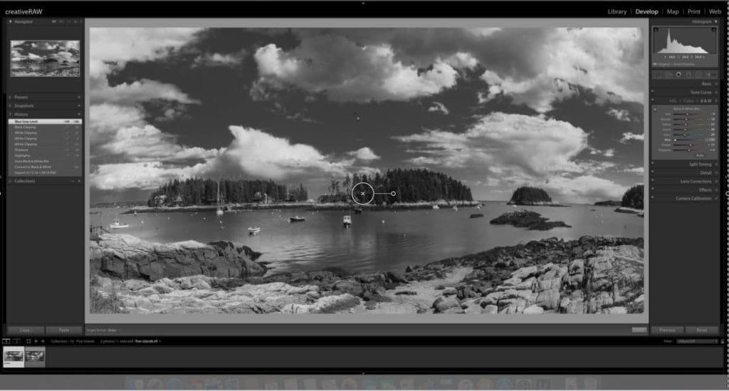
With just this one adjustment in the Black & White Mixer, I’ve already made a dramatic difference to the tonal range…the sky is so much more interesting now!
STEP 3: Add texture to the water.
The next step here calls for the adjustment brush, which will allow me to enhance the texture of just the water. To me, it looks a bit flat and uninteresting in its current state…which definitely was not the case in person.
Select a brush size that is big enough to cover the water, but small enough to get into the crevices of the coastline (11), and set Feathering at 50 and Flow at 100.
Begin to paint the water (turn on your overlay so you can see exactly where you are painting). For this adjustment, you don’t have to worry about “coloring outside of the lines” too much, but try to make a conscious effort to keep your painting contained. We’re not aiming for perfection here, just the general idea.
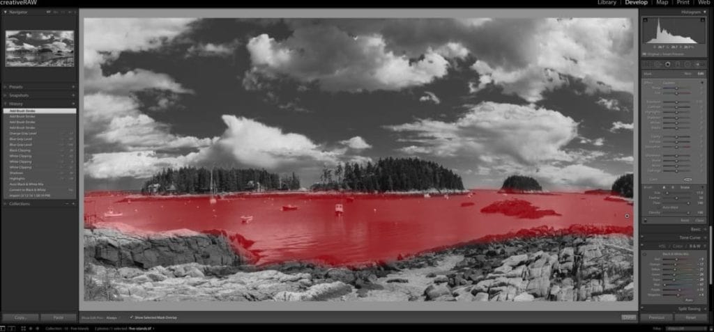
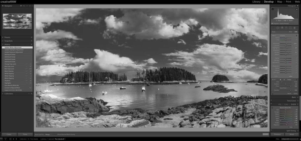
After you’re done painting, go over to your adjustment brush panel and make the following shifts to your sliders:
EXPOSURE: +0.41
HIGHLIGHTS: +24
WHITES +52
Your practice image should look something like the screenshot below…much more interest than that boring midtone grey.
STEP 4: Creating a custom vignette
Here’s one of my most favorite steps in my photo processing workflow: adding a vignette that is 100% custom to the image.
This powerful technique can dramatically alter the atmosphere and overall impact of your landscape, especially in black and white format….giving you great control over the flow and balance of your composition. For this image, I’m going to first add a global post-crop vignette in the Effects panel…but I’m not going to stop there.
To further customize this effect and greatly enhance the light and shadow balance, I’ll then selectively add a few radial filters to emphasize the stronger focal points.
This is the best way to apply a vignette in Lightroom that is not distracting and overbearing, but rather gently redirects the focus exactly where you want it to be. These subtle shifts can make an extraordinary difference in your processing success, and can truly be the difference between a snap shot and a work of art.
For a better visual of this process, make sure to watch the tutorial video above or download the practice pack below and watch offline (which also includes the practice image so you can process along with me).
Click here to download the Practice Pack
Let’s go over to the Effects panel and jump down to Post-Crop Vignetting. Select Highlight Priority as your vignette style, then enter the following values:
AMOUNT: -47
MIDPOINT: 0
ROUNDNESS: +20
FEATHER: 69
HIGHLIGHTS: 83
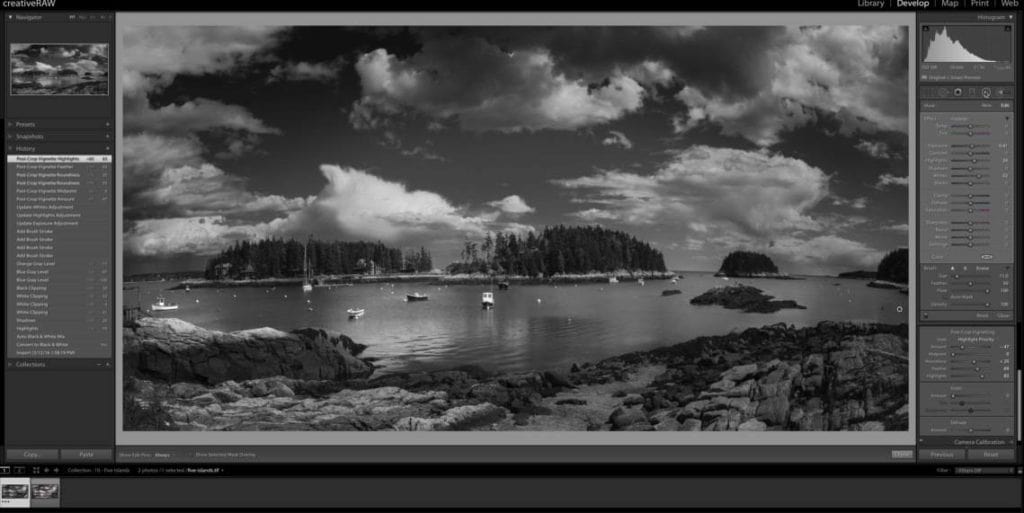
Now, this is looking much more dramatic and moody, but I’ve lost some important detail in certain focal points. You can see that the center of the photo was also affected by this heavy vignette, which is a common side effect of the global post-crop vignette tool.
Not to worry! To counteract this, I’ll add some radial filters to make these important areas pop again.
Let’s go over to the radial filter tool and click + drag a big oval over the center of my photo. Make sure that “invert mask” is selected, and feathering is up to 100. The goal here is to brighten up the center focal points (the cluster of boats, islands, and a bit of the foreground rock) which will redirect the focus back to center.
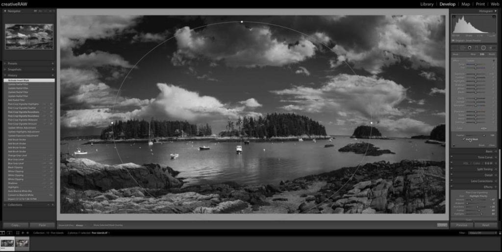
Your radial filter should look something like the image above. Once you’ve got your radial filter placed, make the following adjustments in the radial filter panel:
EXPOSURE: +0.44
SHADOWS: +30
WHITES: +42
These targeted adjustments allow me to brighten up the image without losing all that great contrast and tonal range. Your image will look so much better when you fine tune these sliders to the unique tonal values of the affected area (for this case, inside of the radial filter) as opposed to just pumping up the exposure alone.
Now another area which is bothering me a bit is the dark clouds in the top portion of the frame; I find it to be too distracting. Instead of adjusting the post-crop vignette we added earlier (which would affect the entire frame and change areas I like), I’m going to isolate these clouds by adding a targeted radial filter.
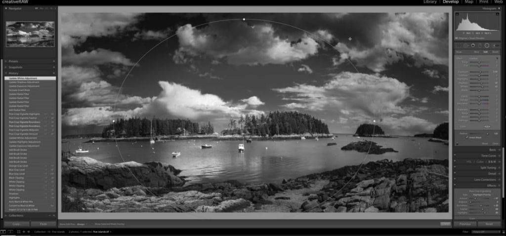
Select New in the radial filter panel and click + drag to create an oval shape just over these clouds, and increase the overall exposure by 1.29 stops.
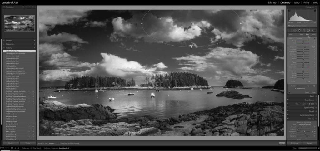
And finally, I’m going to add one more radial filter to the bottom of my frame. The post-crop vignette was a little too heavy here and I lost all that interesting rock texture, so I want to reverse that. However, I don’t want the entire bottom of my frame to be affected, so I will taper this radial filter by making sure that feathering is set to 100.
Click + drag a very shallow and wide radial filter, covering most of the rocks. Since feathering is set to 100, the effect will be very light towards the edges of the radial filter, but heavy in the middle….soft and subtle.
Make sure invert mask is selected so you are affecting the inside of this filter and not the outside, and make the following adjustments in the radial filter panel:
EXPOSURE: +0.53
HIGHLIGHTS: +42
WHITES: +38
BLACKS: -15
STEP 5: Add the finishing touches.
As I do with most of my black and white images, I add a very subtle glaze with the split toning panel, which ties the entire image together nicely. Subtly is the key here, because a little goes a very long way when working in black and white format.
Let’s open up the split toning panel and make the following adjustments:
HUE: 37
SATURATION: 13
BALANCE: +22
SHADOWS: 236
SATURATION: 5
Now to finalize this photo, let’s go up to the Basic panel again and increase the clarity to +24.
I like adjusting the global clarity as a finishing touch because I don’t want it to influence my processing choices. Clarity is quite powerful, so it’s better to apply it lightly at the end instead of heavy at the start.
Now when you add clarity, it can decrease the overall exposure…so let’s fix that by increasing the exposure by 0.30 stops.
There you have it! Let’s take another look at the before and after to see how dramatic this change is.
We’ve managed to take an average landscape scene taken in unflattering noontime light, and transform it into a high-impact, dramatic black and white photograph.
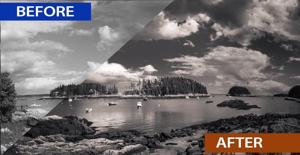
Now if you downloaded the practice image, you can see this change for yourself by toggling the backslash key (\). As a true start-to-finish comparison, let’s show the color image and final black and white side-by-side.
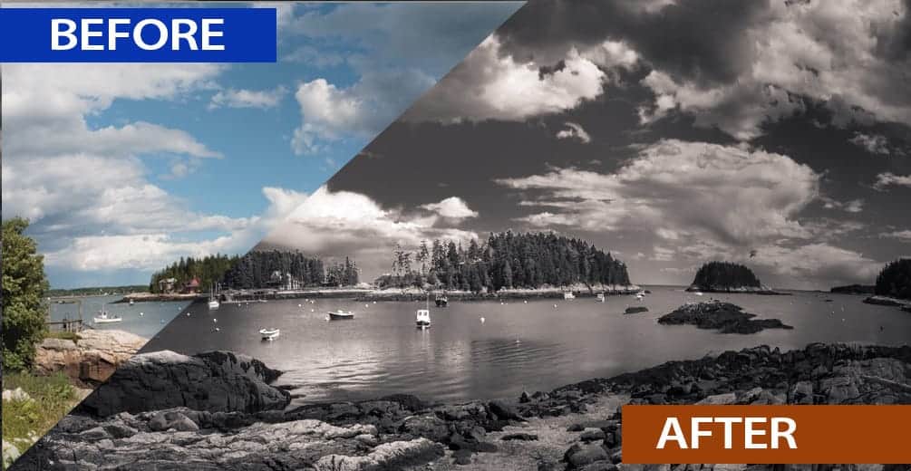
Processing black and white landscapes can seem a little intimidating in Lightroom…but really it’s quite simple and straightforward once you learn the tools.
I hope that by explaining my Lightroom workflow, you were able to pick up a few helpful tips and tricks to make your processing a bit more fun 🙂
One more tip before you go: The reason why this image is so successful is because I completely customized my processing techniques to the content of the photograph itself. This is very important!
In other words…the radial filters and fine-tune basic adjustments were 100% tailor made to the tonal range and detail of this particular image. The shadows in the clouds, the texture in the rocks, my focal points…all of these details were taken into consideration when I was deciding which techniques I wanted to perform, and exactly how I wanted to adjust my sliders.
This is the key difference between knowledgable processing and blindly slapping on presets and filters. I could have taken the shortcut here and just pumped up my contrast and clarity for that instant wow factor. It takes about 10 seconds to do:
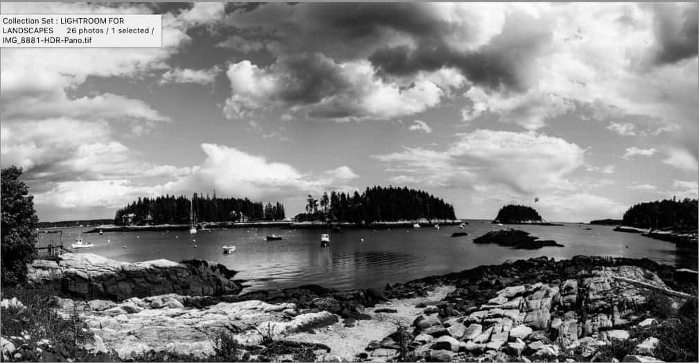
However, this strategy very rarely gives you a truly remarkable image. Upon closer look, you can see that this technique has produced some large areas of lost detail in both the shadows and highlights.
These areas of blown out highlights and crushed shadows have not only damaged the photo, but have inadvertently become our focal points – and not good ones.
More importantly, processing an image like this gives you a very shallow and unfulfilling creative experience in Lightroom. Not fun at all.
Thanks for reading! And make sure to download the practice pack (which includes the image file, tutorial video, and a PDF of this article) so you can try this out for yourself!
