The Complete Guide to the Curves Tool for Landscape Photography
The Complete Guide to the Curves Tool for Landscape Photography
Probably the most requested topic for me to cover, and it’s easy to see why…
It’s one of the most powerful and dynamic tools for adjusting the color and lightness values of your pixels, but many are completely baffled by the controls..so it’s often passed over for more straightforward tools like the tonal sliders or HSL panel.
In a (very) simplified explanation…curves provide a visual and interactive way to adjust your colors and tones. By adjusting the “curve” of the line, you can instantly brighten or darken selective parts of your image in a feathered and natural way, as well as manipulate hue and saturation.
And because the adjustment is soft, your image will not have a pixelated or blotchy appearance that comes from other tonal adjustments.
The more precise you are with your adjustments, the higher the quality…and we all want our detail to look top-notch.
I see many photographers leave a LOT on the table by not incorporating curves into their workflow, so I wanted to put together an easy-to-follow (yet comprehensive) exploration of this fantastic creative tool.
Whether you’re a purist or heavy manipulator, or somewhere else along the creative spectrum…you’ll only wish you learned curves sooner.
So please join me for a comprehensive tour of the curves panel and how it works to change your image.
Below you will find the full video tutorial, followed by the written article.
Table of Contents
| 1:00 | Lesson Overview and Curve Basics |
| 3:55 | Why It’s Called a “Curve” |
| 4:52 | Input vs. Output: What Happens When You Change a Tone |
| 10:22 | How the Curve Creates a Feathered Adjustment |
| 13:24 | Adding Anchor Points to Adjust Smaller Groups of Tones |
| 14:07 | What Happens When the Curve is Too Steep |
| 14:39 | The Target Adjustment Tool |
| 16:26 | Black and White Points: Available Tones vs. Actual Tones |
| 19:21 | Moving Black and White Points Horizontally to Condense the Tonal Environment |
| 22:23 | Moving Black and White Points Vertically to Flatten Contrast |
| 24:02 | Setting Tonal Limits in Lightroom |
| 26:56 | Color Channels and Curves |
| 31:36 | Counterbalancing Color with Curves |
| 33:20 | Additional Tips and Precautions When Using Curves |
| 37:03 | Lesson Summary |
Note: If you’d like to download this video (as well as my other in-depth processing tutorials), sign up for the FREE video course: The Digital Darkroom Foundations.
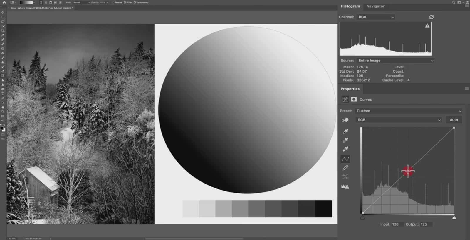
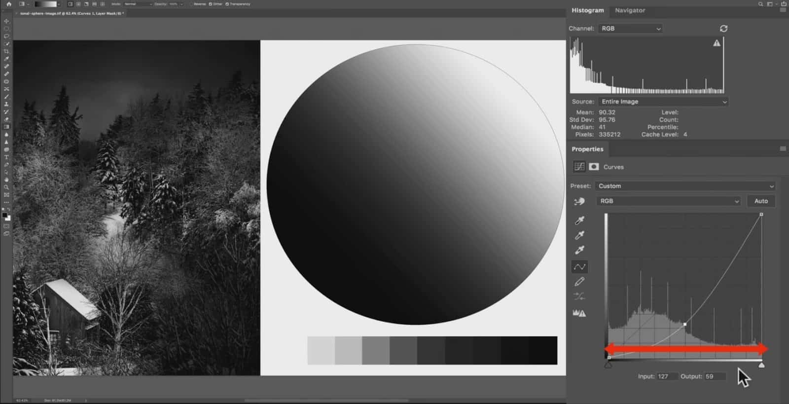
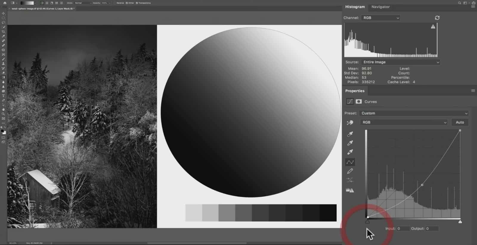
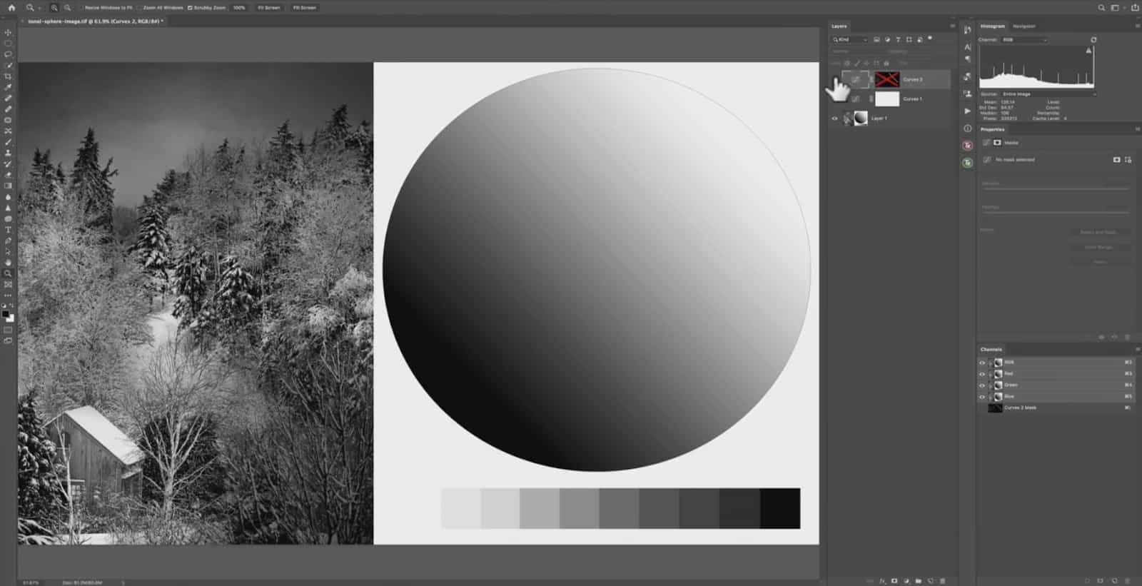
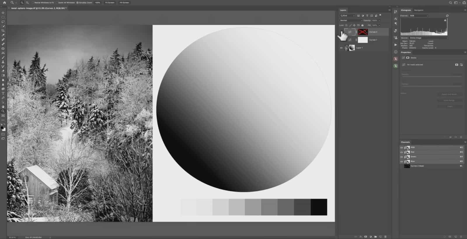
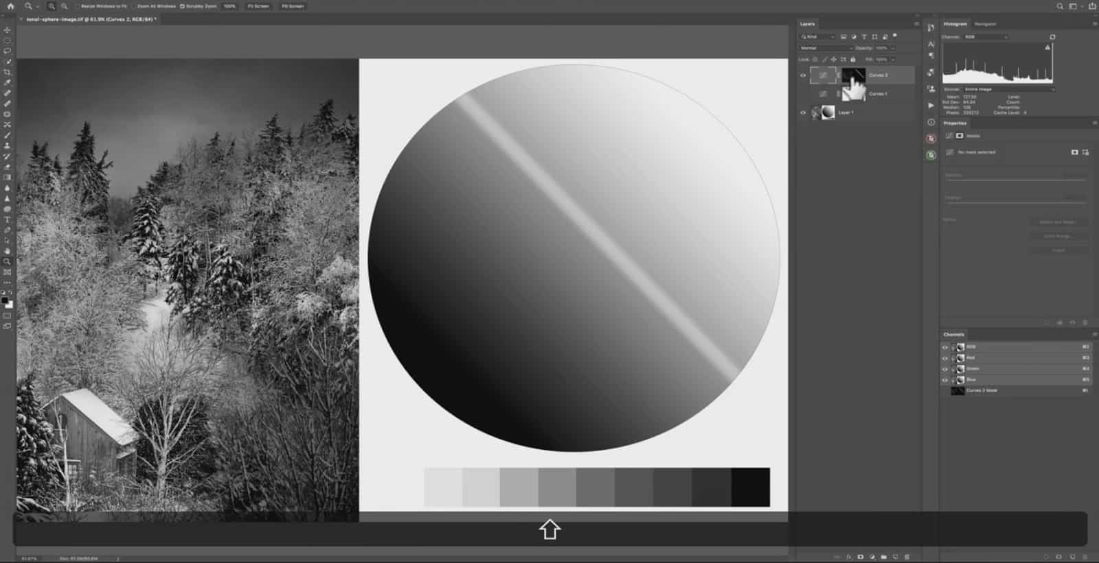
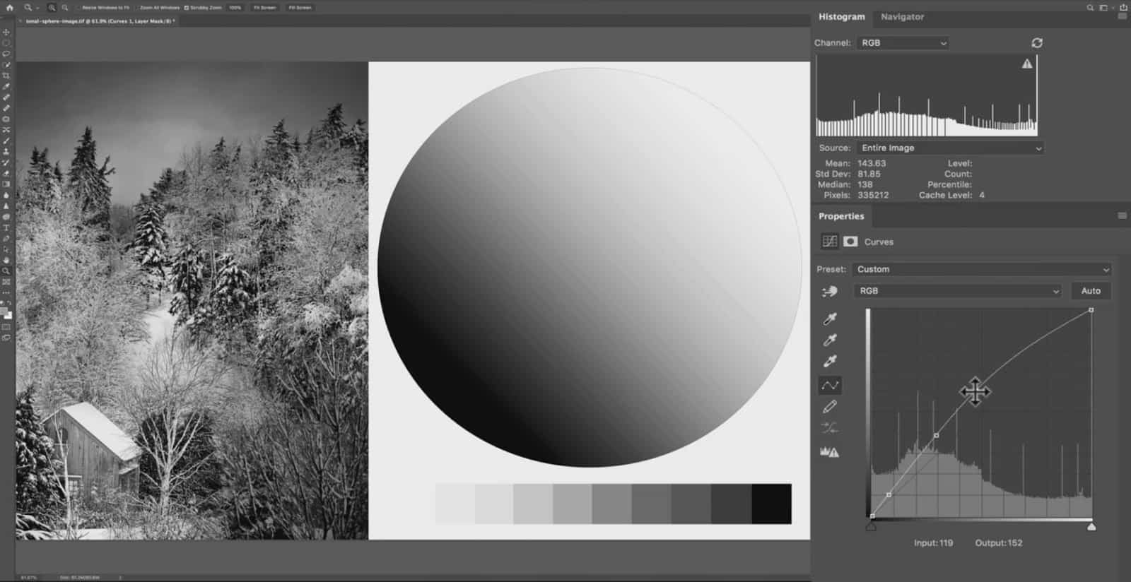
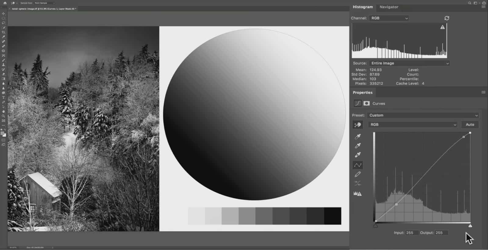
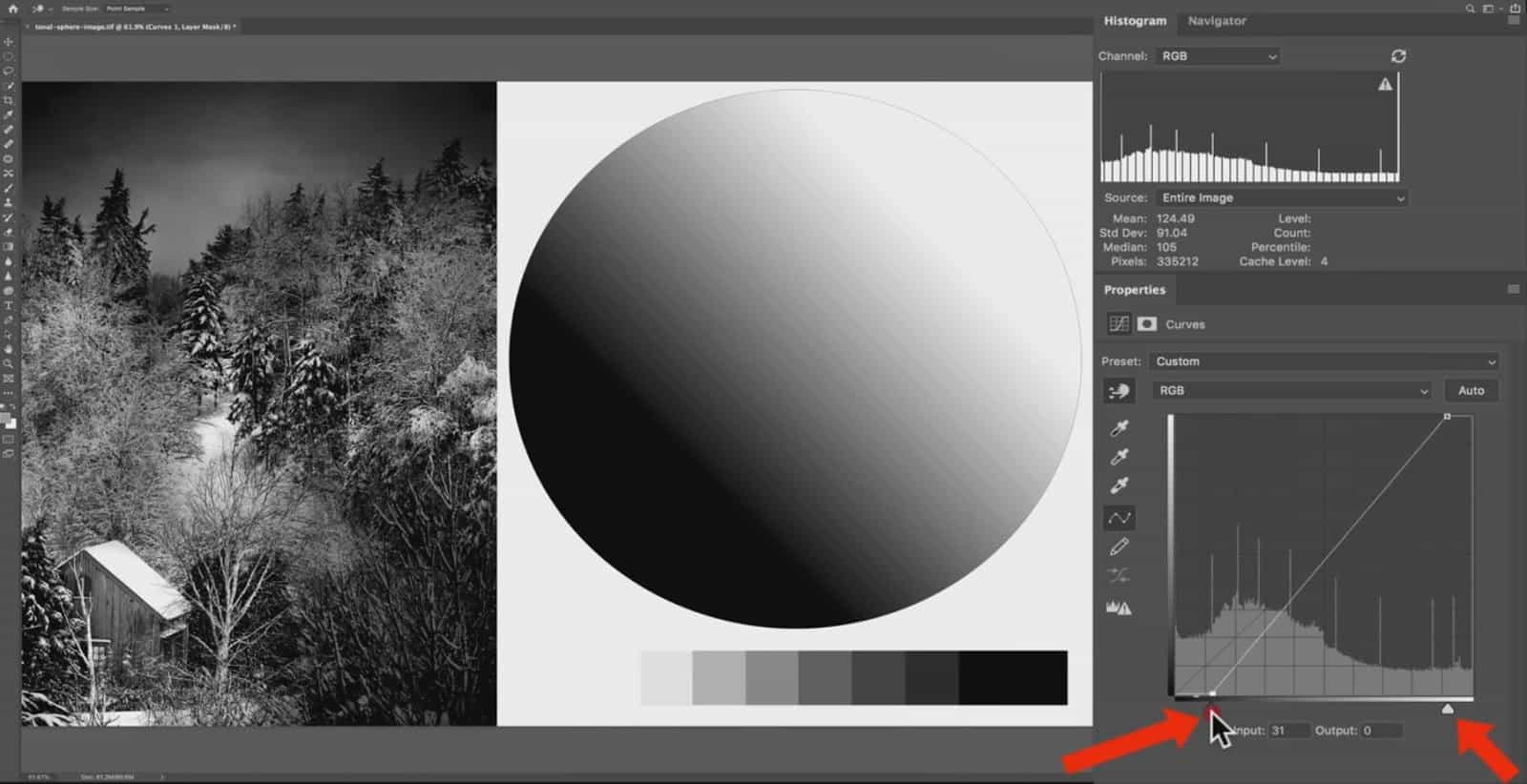
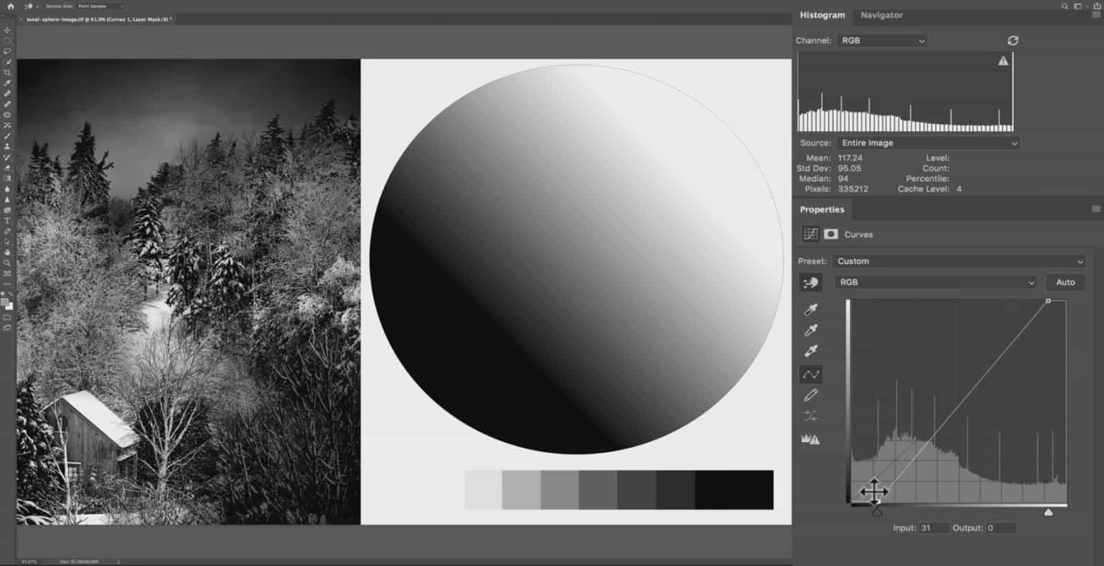
Here we have a black and white image that I’ve put together, along with a tonal sphere and value scale. These will help show the exact changes a curves adjustment makes to specific groups of tones, as those differences can be difficult to identify in the actual photograph.
I’ll be using Photoshop for the majority of this demonstration, but the same rules apply to the point curve over inLightroom.
Inside the curves graph, we have a line going from the bottom left-hand corner to the top right-hand corner. This line is called the baseline, and we can add anchor points to this line by clicking on it (small squares placed on the line itself).
Here I am clicking and holding a new anchor point, and dragging up and down to make a tonal shift.
Or in other words, we are introducing the “curve” to this line in order to make an adjustment to the tones. If I drag the line up to create a curve, the exposure increases….and if I drag the line down to make a negative curve, we are decreasing the exposure. Notice how the imprint of the original baseline is still visible on the curves graph to serve as a reference. We are changing the luminosity of our existing tones.
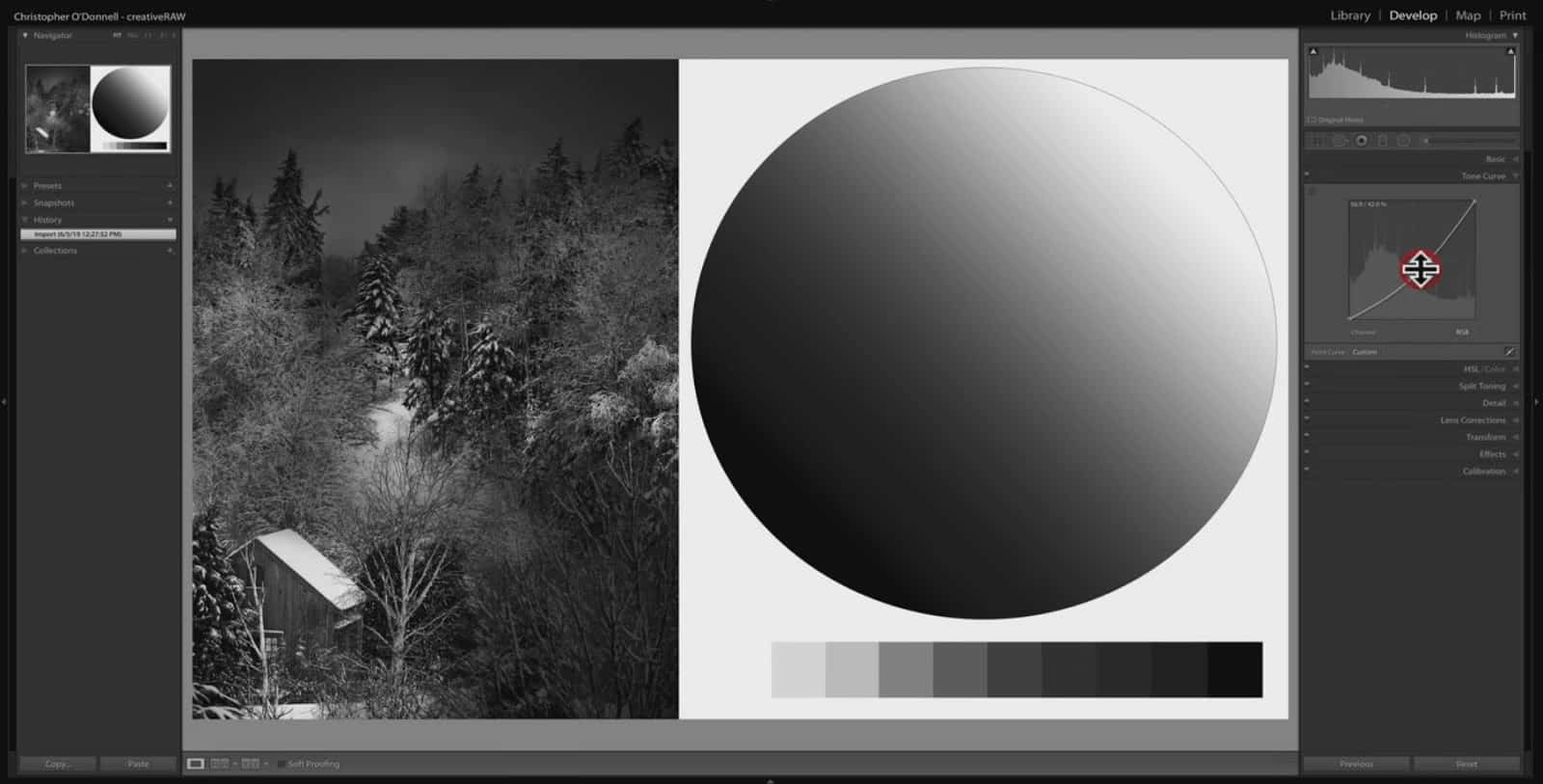
Over Lightroom or ACR, the curves tool works the same way under the “point curve”…which is accessible by opening the tone curve and clicking on the point curve icon in the bottom right corner.
Once the point curve is open, I can click to add a point…and drag it up or drag it down to manipulate the luminosity of our tones in the same manner.
When you add a point and move it up or down, you are changing the lightness of those tones (making them brighter or darker). Now, the real question is…what are the exact tones you are changing and how to control that?
Input vs. Output: What Happens When You Change a Tone
The curves graph here in Photoshop will specifically tell you which tones you are changing by looking at the Input and Output numbers.
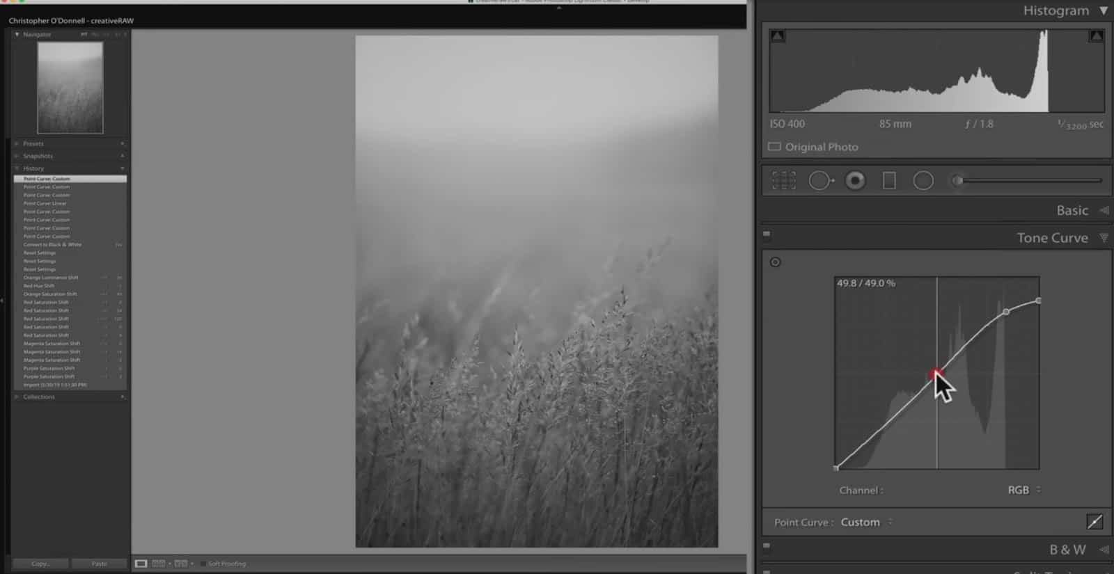
First, let’s add a point to the middle of the baseline, without making any changes or dragging it around.

We see that the Input number comes up as 127…and this is using the pixel value scale, which runs from the number 0 to 255. Zero is pure black and 255 is pure white, and any number between 0 and 255 will be some shade of grey….and 127 is right at middle grey.
This means that we are targeting tones around middle grey for adjustment.
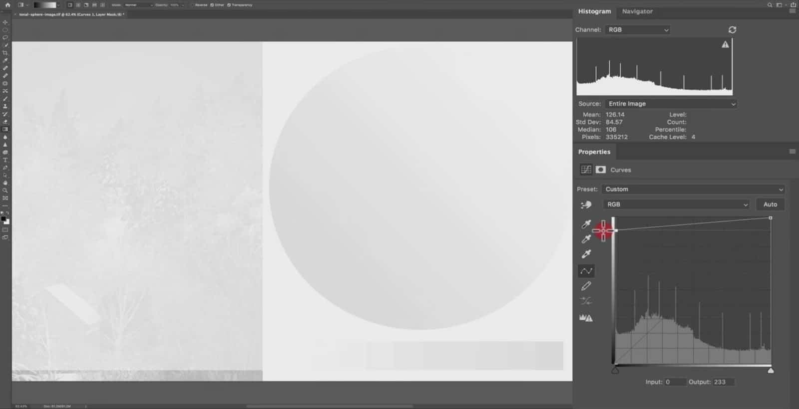
Now, once you drag this point up or down on the curves graph, this value number will change depending on the direction you drag it in. If you bring this point up, the number will be higher than 127….and if you drag it down, it will be lower. This translates to making the tones brighter (higher number approaching 155) or darker (lower number approaching 0).
So if we drag this point up a little bit, the Output number becomes 152 (which is brighter/higher than 127). The Output number for a particular point tells you what the value has changed to.
In other words, we have taken the value 127 (input) and made that particular value in the image brighter by dragging it up to 152 (output).
Watch how the output number will change when you drag the point up or down.
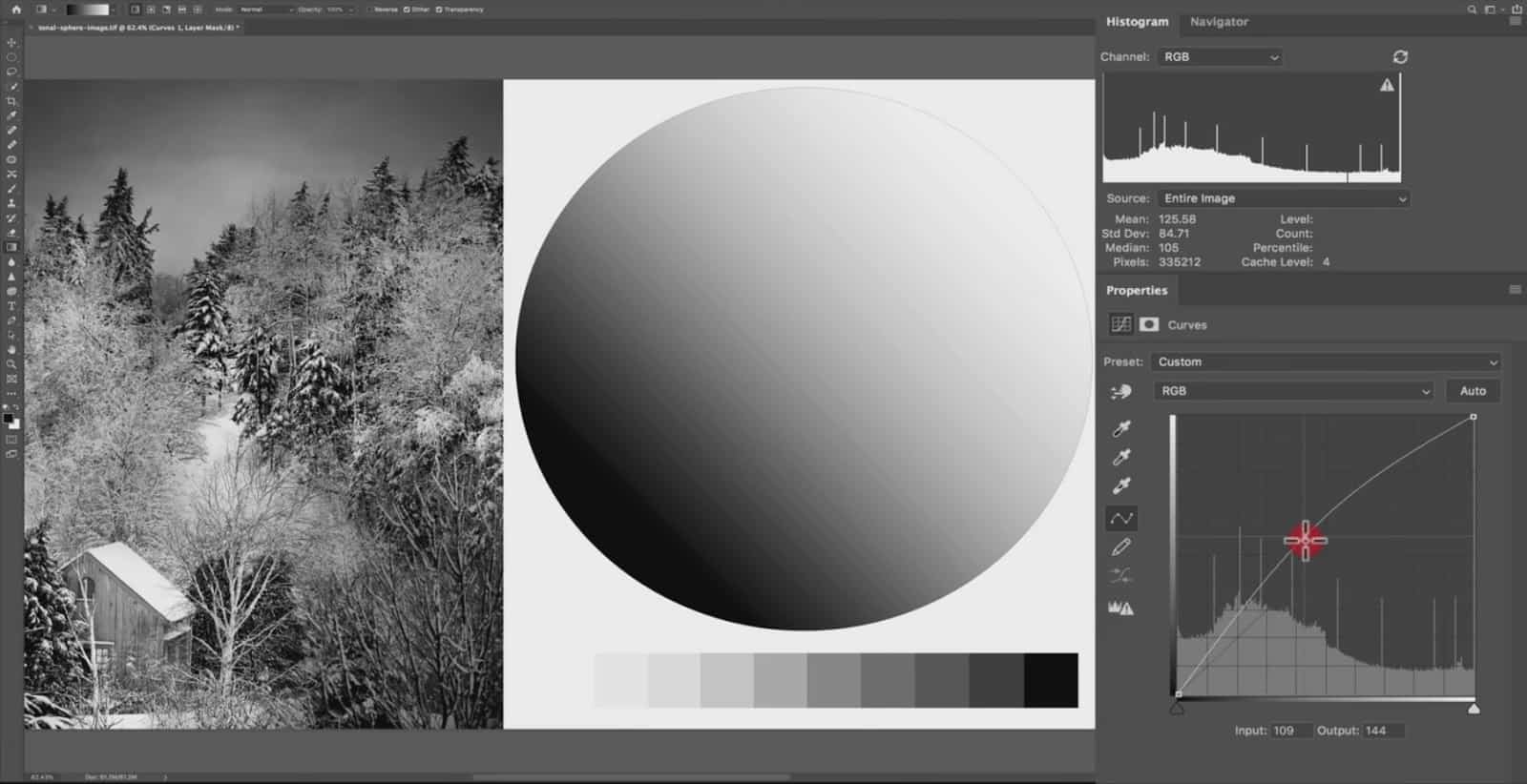
And this works the same way over in Lightroom. The only difference is that instead of dealing with the numbers value scale, we are dealing with the percentage (0% being pure black ,and 100% being pure white).
If I drag this point down, we have taken our values at 52.2% lightness, and made them darker to 33.7% lightness.
Since we are dealing with the lightness level, 100% is going to be the brightest you can go. So, the principle is the same in Lightroom as it is in Photoshop, it’s just that the unit of measurement is different.
Let’s jump back over to Photoshop. The horizontal axis of the graph from from left to right represents the value your pixels currently are…or the Input. It corresponds to the pixel value scale (0 to 155), moving from pure black to pure white from left to right. So when you place an anchor point on the curves line….the more towards the left side you add the point will select brighter tones, and the more towards the right side will select darker tones.
Now the vertical axis represents the value of what those pixels are changed to…or the Output. This axis also goes from pure black (bottom) up to pure white (top).
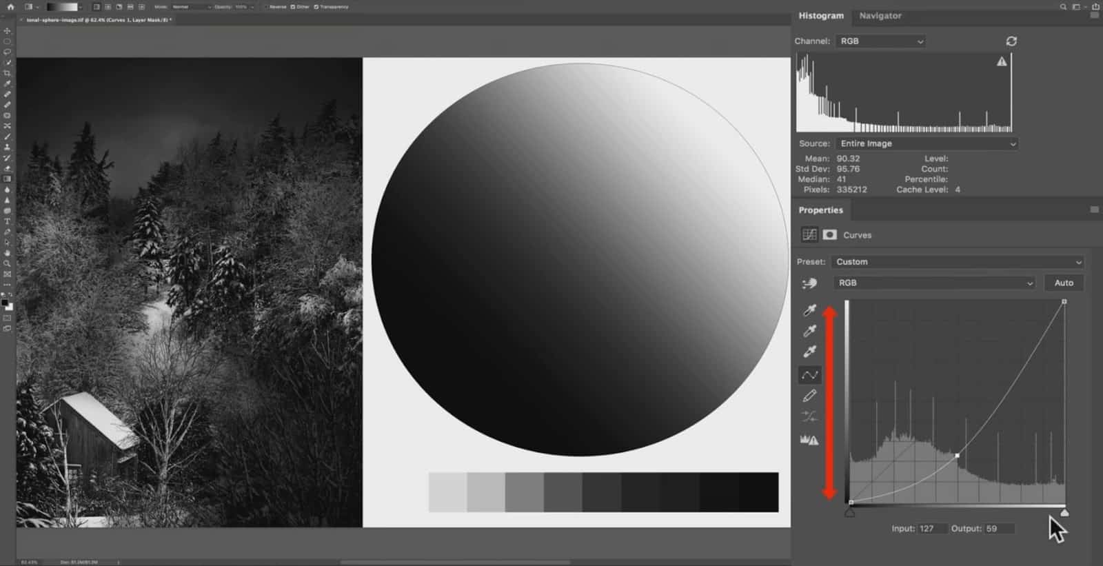
So if you add a point to the right side of the graph, and drag that point down….you are (generally speaking) darkening your shadows.
The histogram in the background shows you the current distribution of your tones for the image. The higher the peak, the more pixels in your image are of the tone.
You can see that the picture below has a lot of darker shadows and midtones…And a pretty even distribution of highlights with a very sharp peak here of pure white.
Now that’s because we have a pure white background and the white in the sphere.
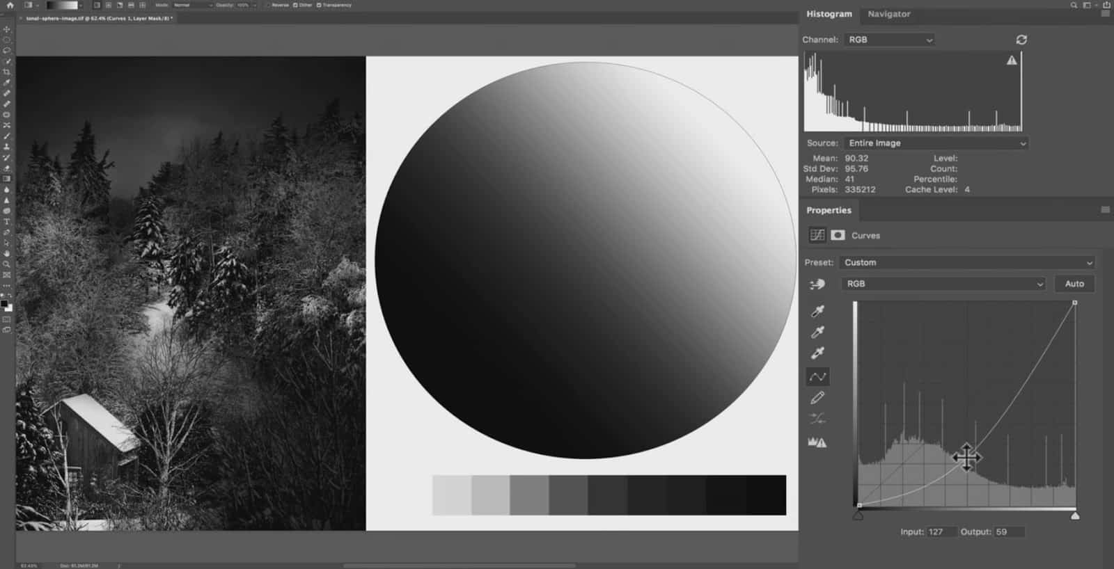
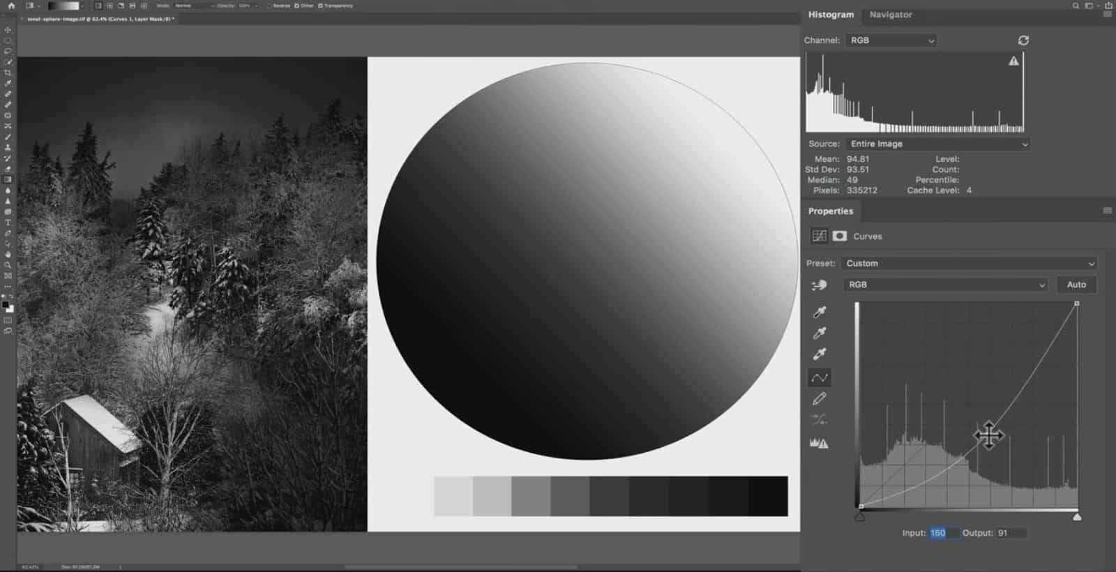
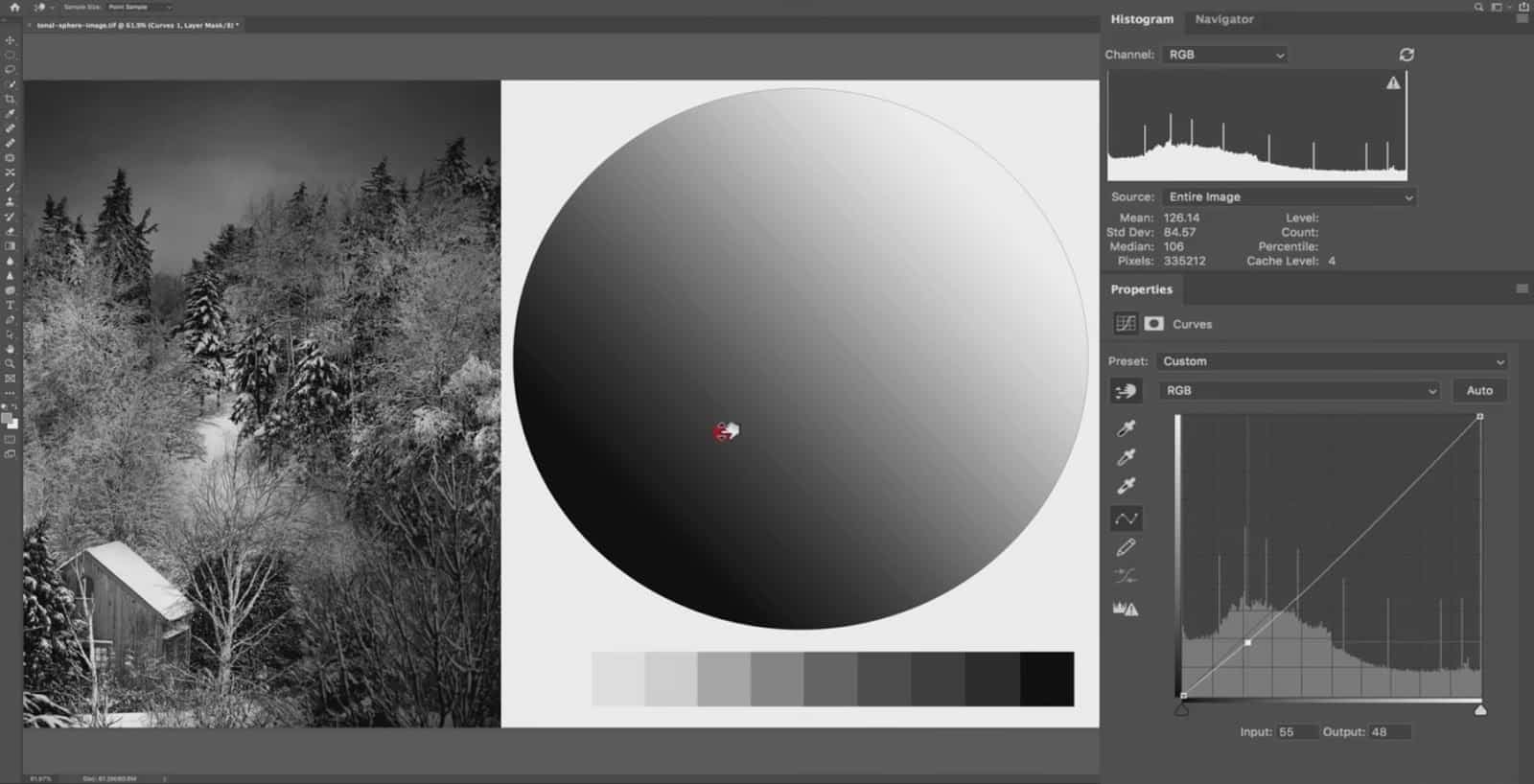
So let’s choose a pure gray point at 127 input and drag this point on the curve line towards the bottom-right. Notice how the image is getting darker since I am telling the curves tool to select darker tones (input 150 vs. 127) and reduce the lightness even more (output 91 vs. 59).
Now once you add a point, you can always come back to that point and change it any way you want. You can also manually enter a number in the Input box…or drag that point to a different input number by dragging it left or right.
This is why your baseline here goes from the bottom left to the top right in an incline as opposed to being completely level.
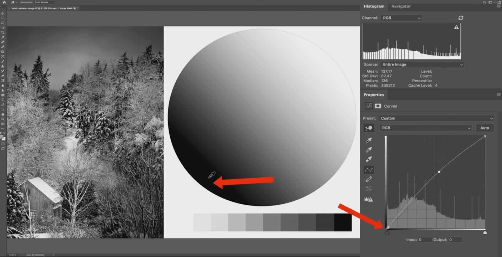
The current value of your tones is represented on the horizontal axis…and the darkest tone possible is going to be in the bottom-left corner at point zero.
You can’t take this point here at the bottom left and drag it down anymore, since you can’t get any darker than pure black.
But you can drag it up to the pure white if you want to.
Your Output (what you change those tones to) can’t go any darker than pure black, so that is why this black point is in the bottom left corner.
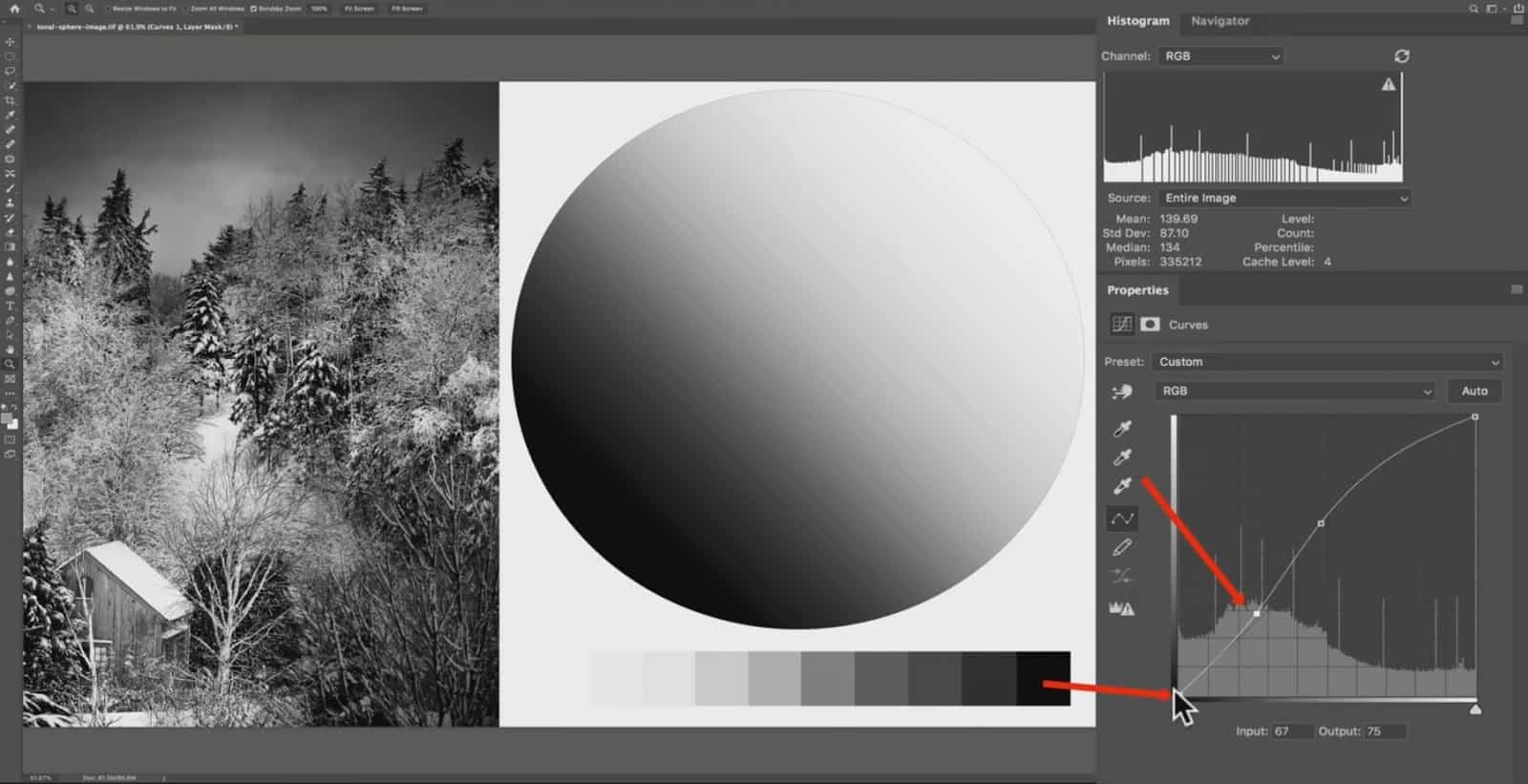
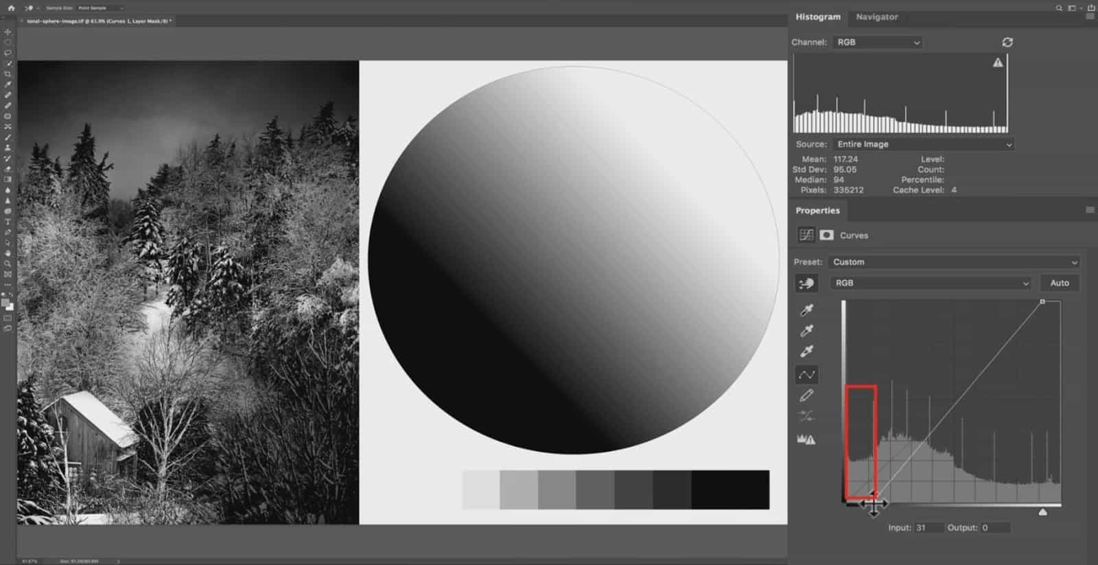
Let’s add a new point here and set it at an Input of 4.
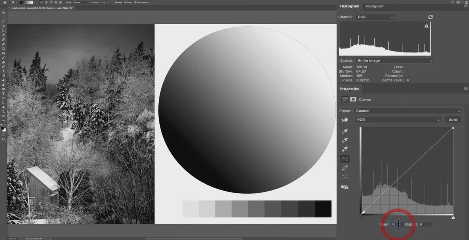
When you add a new point, the input and output will be the same since you haven’t made a change yet (either by manually dragging the line or entering a new value for the output).
Notice that as we move to the right away from pure black, this point is a bit higher vertically…because it’s 4 points brighter than pure black; or rather 4 points brighter than 0.
You can either darken this point by 4 points, or you can drag it up to the very top of the graph to brighten it substantially.
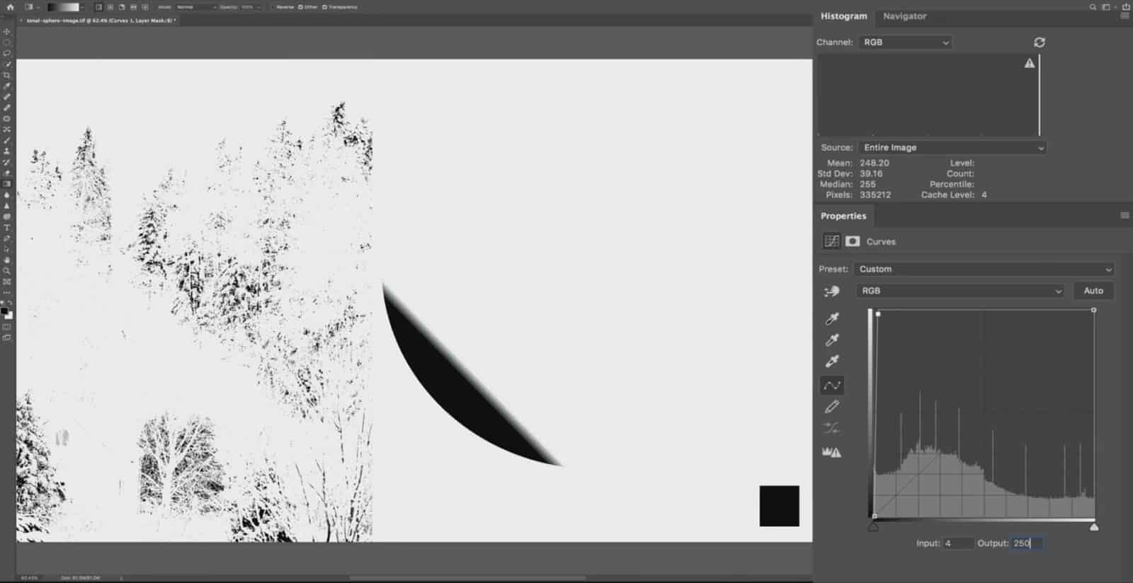
Since this point is so dark, you have much more room to increase the lightness as opposed to reducing it. This disparity will lessen as you approach middle grey, and then reverse as you move towards the highlights (right side of the line).
Once you hit pure white, you cannot drag the point up vertically anymore since you can not have an output higher than pure white (255).
Summary:
The curves tool is used to manipulate tonal groups in a natural-looking way.
The curves graph represents the possible tonal environment, and the histogram in the background represents the tones in your actual image.
In order to change your tones, you would add an anchor point by clicking on the baseline, and dragging up and down vertically to either brighten or darken those specific tones.
The input number represents the selected tone, and the output number represents what that tone was changed to.
How the Curves Tool Creates a Feathered Adjustment
Here’s the real power of the curves tool…being able to easily control how feathered your adjustment is by manipulating the “curve” of your line. This is my preferred tool for processing tones in both Photoshop and Lightroom because the result is more natural…and is especially useful for enhancing the mood and atmosphere of your image.
To demonstrate how the curves tool makes a tapered adjustment , let’s start with a simple increase in brightness by adding a point in the center and dragging it up slightly.
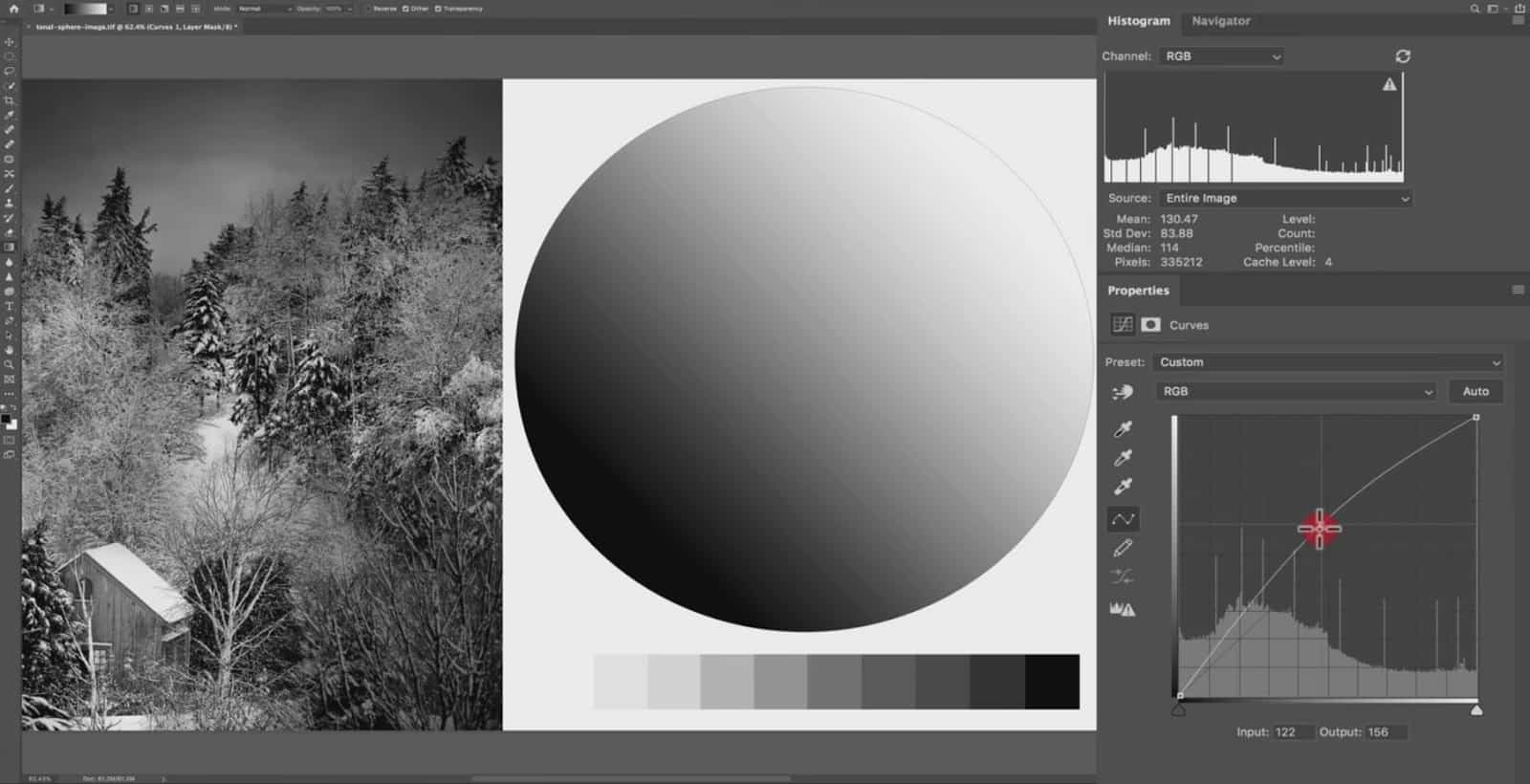
The actual pixels we are moving here are at Input 122 and Output 156. So, I am brightening these pixels up by 34 points. However, notice that the tones around this point have also increased in brightness.
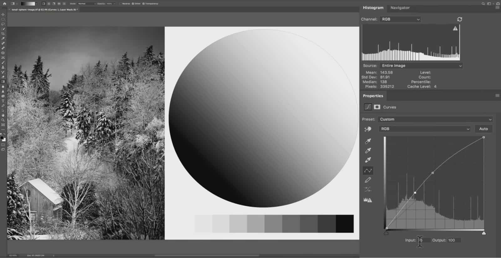
If I add another point to the left of our first adjustment, we have an Input of 75 and an Output of 100. So, that is an increase of 25 in brightness.
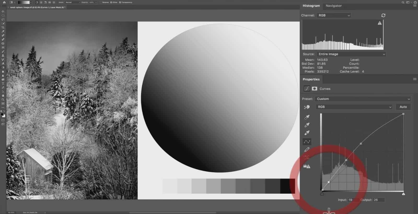
Let’s add another point further down the line. Here we have an Input of 19 and an Output of 26; that’s an increase of 7 points in brightness. So, the further away we get from our first anchor point, the increase in brightness becomes less.
Whenever you make any tonal adjustment (whether with curves or another tool), you almost always need to change the tones surrounding the pixels that you are adjusting. Otherwise, it gives you noisy and pixelated results.
To demonstrate this, I’ll select a narrow band of tones in the circle below.
Now, if I make the same curves adjustment to only the selected tones, see how sharp and pixelated the result is?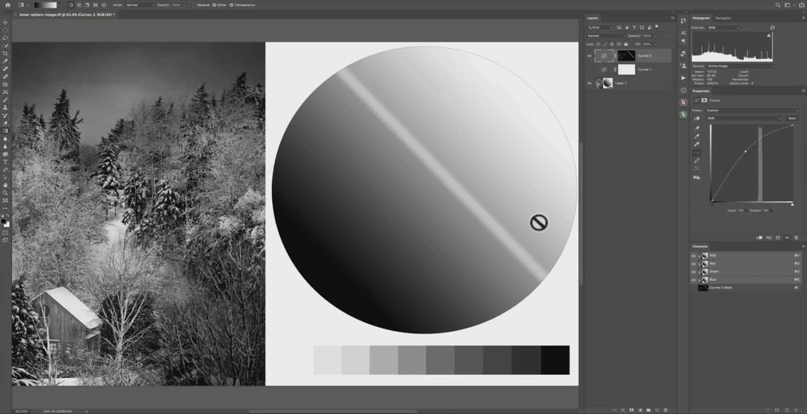
In order to avoid this separation of tones, you need to feather the adjustment out….gradually dropping off in strength the further you move away from the tone you are adjusting (where the point is placed on the curves graph)
Said another way…
A curves adjustment will automatically feather itself to the surrounding tones on a scale in order to keep a natural appearance (And avoid the pixelation seen above).
 Before the curves adjustment
 After the curves adjustment
 The same curves adjustment, but not feathered to surrounding tones.
To bring it all back to my earlier discussion….
Notice how the greatest distance between the curves line and the baseline is at the anchor point we added to the image. And as we travel further away from this point, the distance becomes less…demonstrating a gradual feathering of this adjustment.
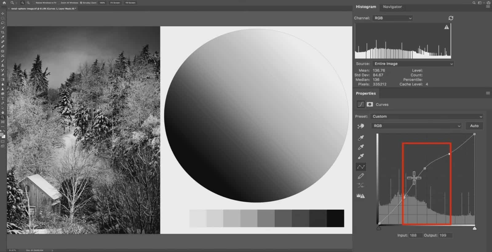
Adding Anchor Points to Adjust Smaller Groups of Tones
When you add a single point to the curves graph and make an adjustment, the feathering zone can be quite large. If we take a look at the image below, this is a rather big adjustment….so almost the entire tonal range is affected to some degree.
What you can do is add additional anchor points to the curves graph in order to restrain the adjustment to specific “ranges” of tones.

If I add an additional point further in the shadows (below) and drag it back down to the baseline, I’m telling Lightroom to remove this adjustment between pure black and this new anchor point. 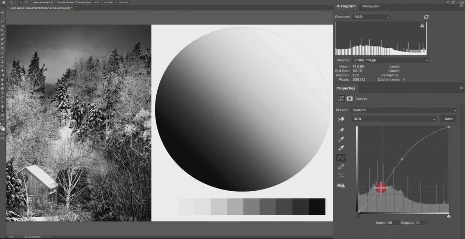
In other words…the zone between these two points now directly mirrors the baseline…which means that this adjustment will not be visible over these deeper shadows (below). By making that curves line steeper and restraining it to only a portion of the tonal range, we’re controlling the breath of the feathering zone.
I’ll also make the same restriction for the highlights by adding another point (below), removing this adjustment from my brightest tones.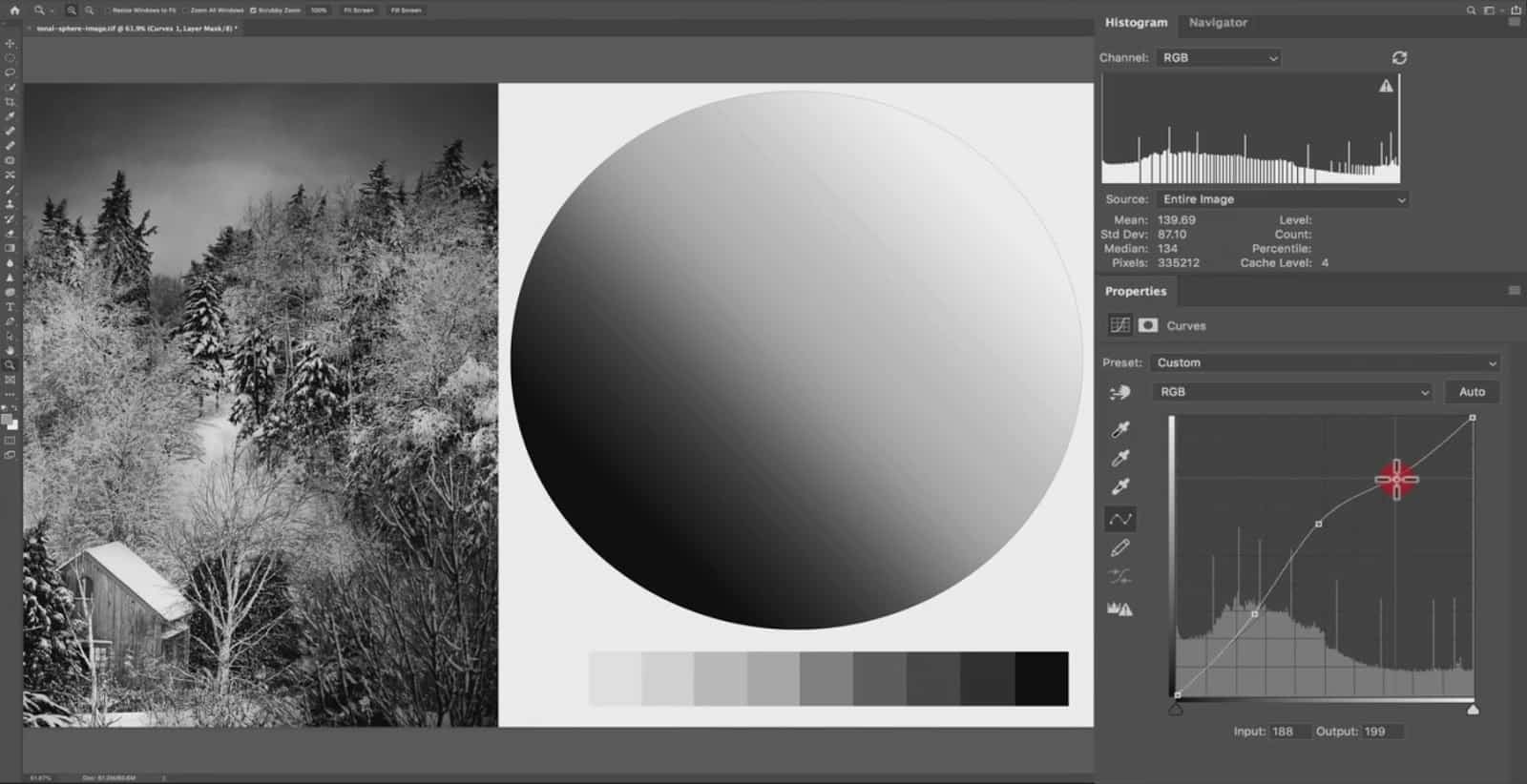
So now, the adjustment has been restricted to just the midtones.
What Happens When the Curve is Too Steep
You do have to be careful when you manipulate a curve like this because if your curve is too steep, it will result in pixelation and artifacts…so you always want to keep an actual curve to your line.
For example, if I go too steep here, the pixelation comes back into the photo.
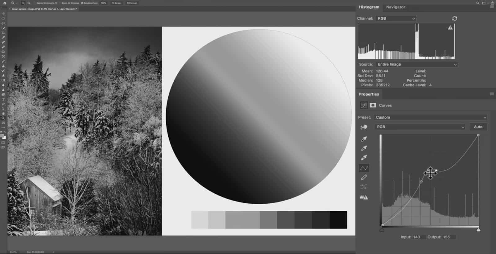
For the most part, you always want to maintain a natural and soft curve, but you can add a little bit of steepness to target a specific range of tones.
The Target Adjustment Tool
The Target Adjustment Tool for curves is a way to sample the tone you want to adjust by clicking on the actual image…instead of trying to guess which tone to adjust by clicking on the curves line.
This simple tool is often underrated, but the value that it can give you is priceless.
Adjusting Highlights and Shadows
To use the target adjustment tool…first, you need to click on this hand right here (the Target Adjustment Tool icon).

Then, click and hold over the tone you wish to adjust…and drag up or down to lighten or darken that tone. You’ll notice that a new anchor point is automatically added to the curves line, and the input will be whatever tone you were hovering over when you clicked on the image.
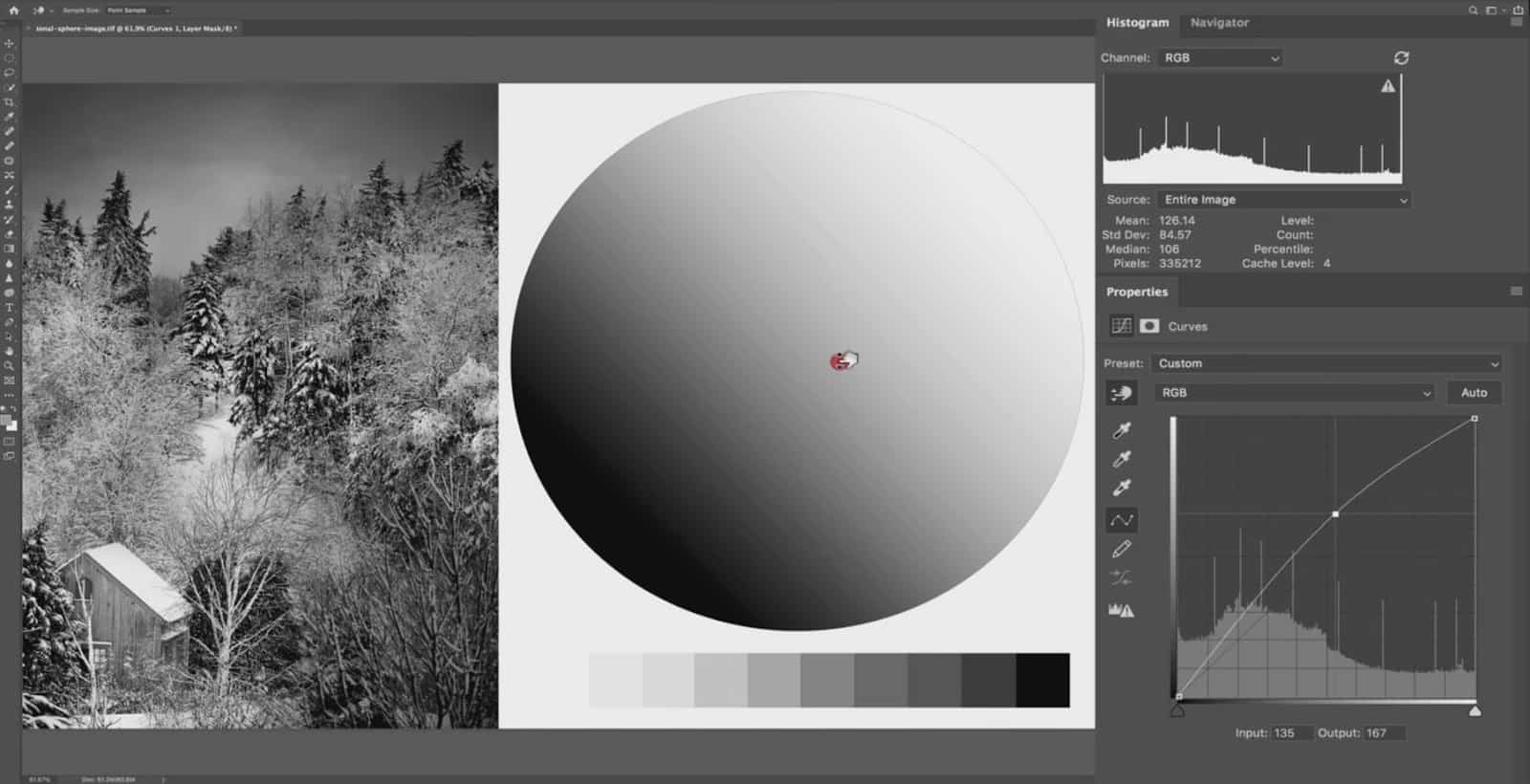
In either Lightroom or Photoshop, a “preview” anchor point will appear on the line as you move your target adjustment tool around the image. This is in live-time, so the point will jump to a different place on the line as you move your mouse around.
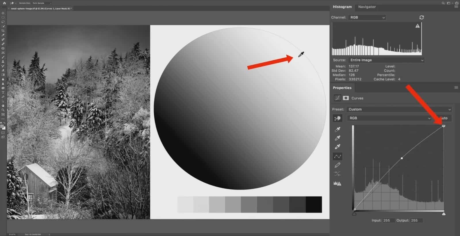
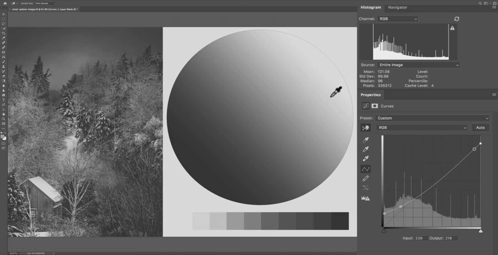
If you notice here, when I hover over the brightest part of the tonal sphere…a new temporary point appears near pure white on the curves graph.
And if I hover over middle grey, that point instantly jumps to that value along the curves line.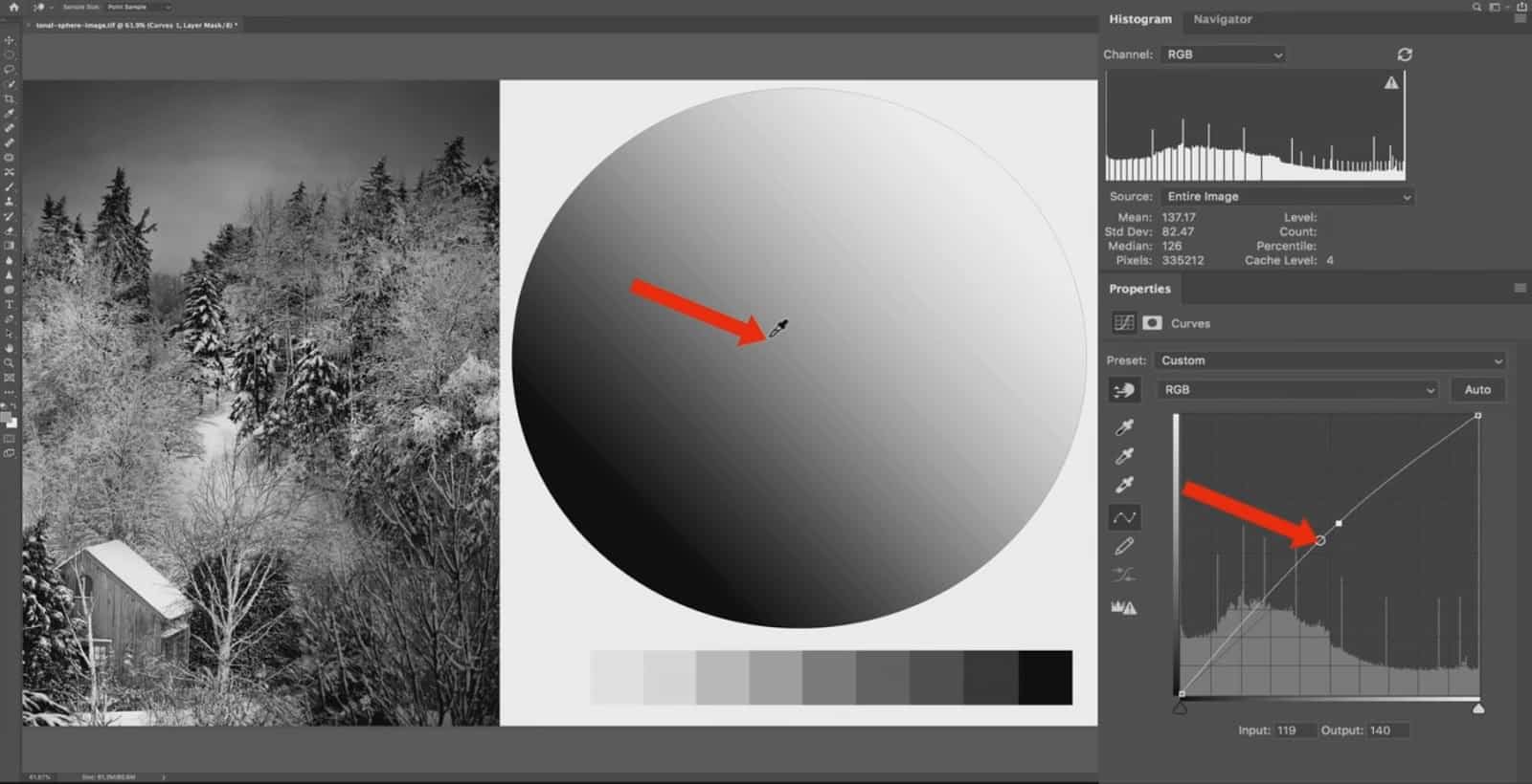
And if I sample the darkest shadows, that point now appears all the way down near the black point on the curves graph. Remember: you have to actually click on the image in order to add this point to the curves line.
So, if you don’t know the exact value number of the area you want to change…you can use your mouse to sample that area. I prefer to use curves this way since I find it easier to work visually and simply click on the area I want to adjust.
And of course, you can come back here to your curves (the actual graph) and manipulate this point even further if you have to after it has been added through the target adjustment tool.
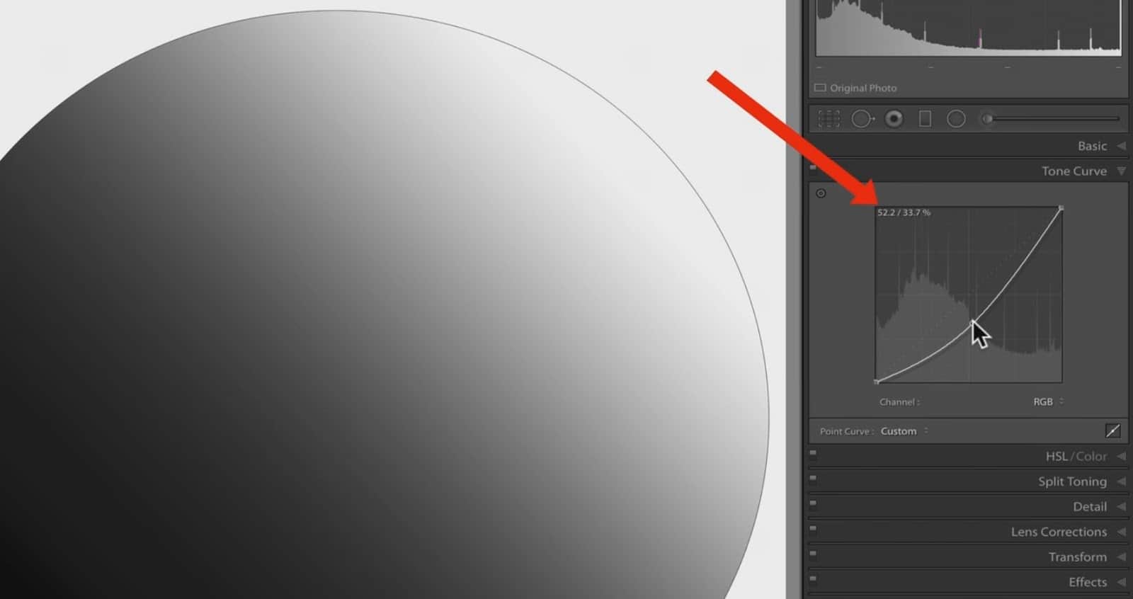
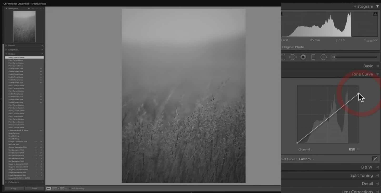
Let’s add a very simple “S” curve with the target adjustment tool to add some contrast. First, I hover over my shadows…then click, hold, and drag down to deepen the shadows.
Then, I’ll repeat the same for the highlights: I hover over the brighter tones…click, hold, and drag upwards to lighten them up a bit.
This is a very light increase of contrast, and is quite standard for landscape photography. And since we have the black and white points “anchoring” the curves line down, it’s helping to not overexpose your highlights even more or underexpose your shadows. Without these points, the added contrast would start to clip detail.
Black and White Points: Available Tones vs. Actual Tones
When using curves in either Lightroom or Photoshop, you are manipulating two environments: the available tones (what you can change your pixels to) and the actual tones (what the pixels currently are).
The easiest way to understand how this works is to picture your black and white points as brackets. Inside of these brackets (or the space between the black and white points) defines the tonal range you are currently working with.
So, the value scale on the horizontal axis (the bottom of the curves tool) represents the available tones that you have (0 all the way up to 255).
By default, the white and black points will be at the very ends of this range…making the complete tonal environment available. However, that doesn’t mean that those tones are actually in your image. In other words, not every available tone is an actual tone.
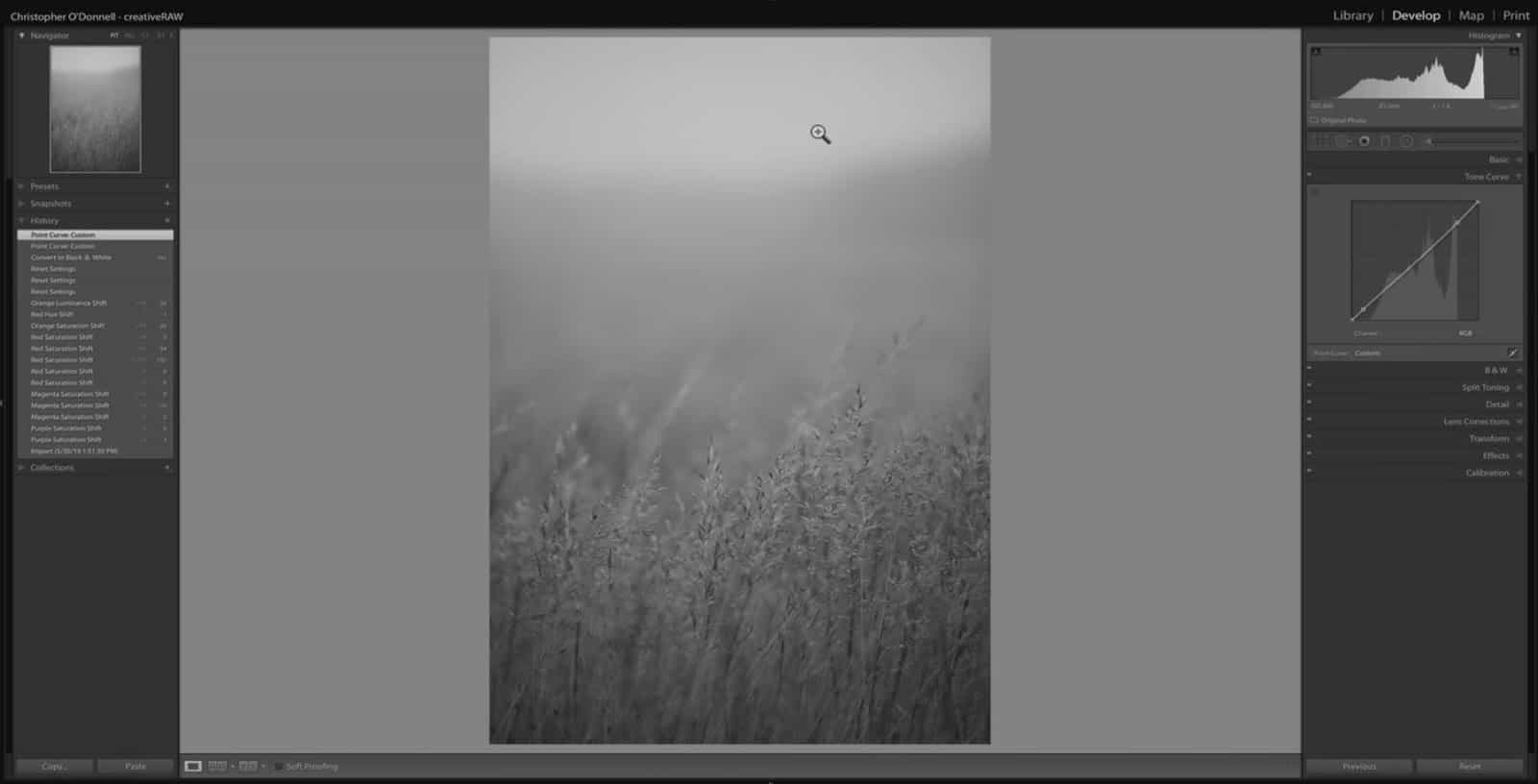
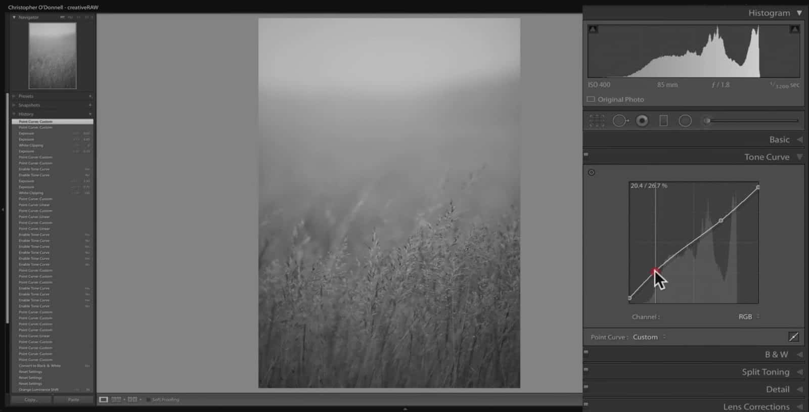
Let’s jump over to Lightroom to see a better example of this comparison. Looknig at the histogram in the background, you can quickly see the full tonal range; where the darkest tones start and the brightest tones end. For the image below, there is a small gap between pure black and the darkest tone in the image at 9% lightness…and an even bigger gap between pure white and the brightest tone at 83.5% lightness.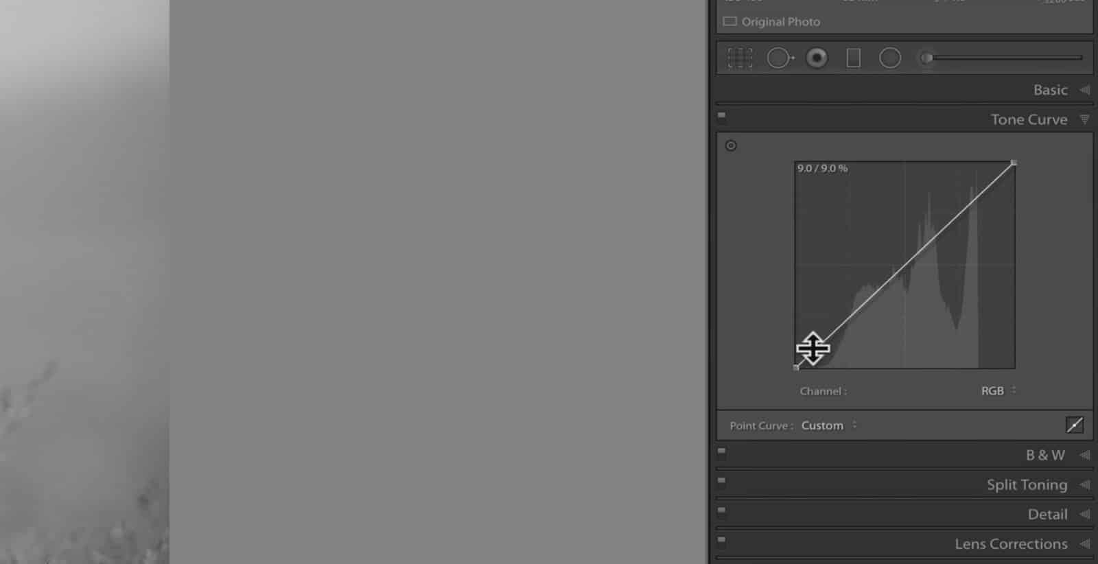
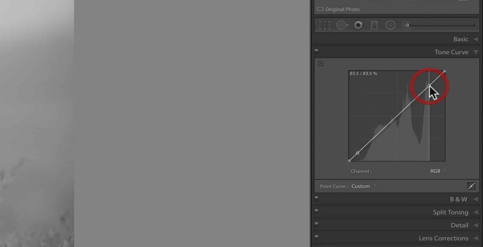
This translates visually on the image. The brightest point of the photo is the sky here, and that is nowhere near being pure white. For this image, there is a difference between the available tones and the actual tones.
Let’s make an adjustment to demonstrate this. First, I’ll bring my white point down a bit vertically, and add a control point so that I am only adjusting the highlights which are outside of my actual tones; that gap between the end of the histogram and the end of the curves graph.
There is almost no difference in the photo before and after this tone curve adjustment, despite making a pretty steep shift in the highlights. This is because the modification we made only affects tones between pure white and the brightest tone in the image (actual vs. available), which is right around 84% lightness.
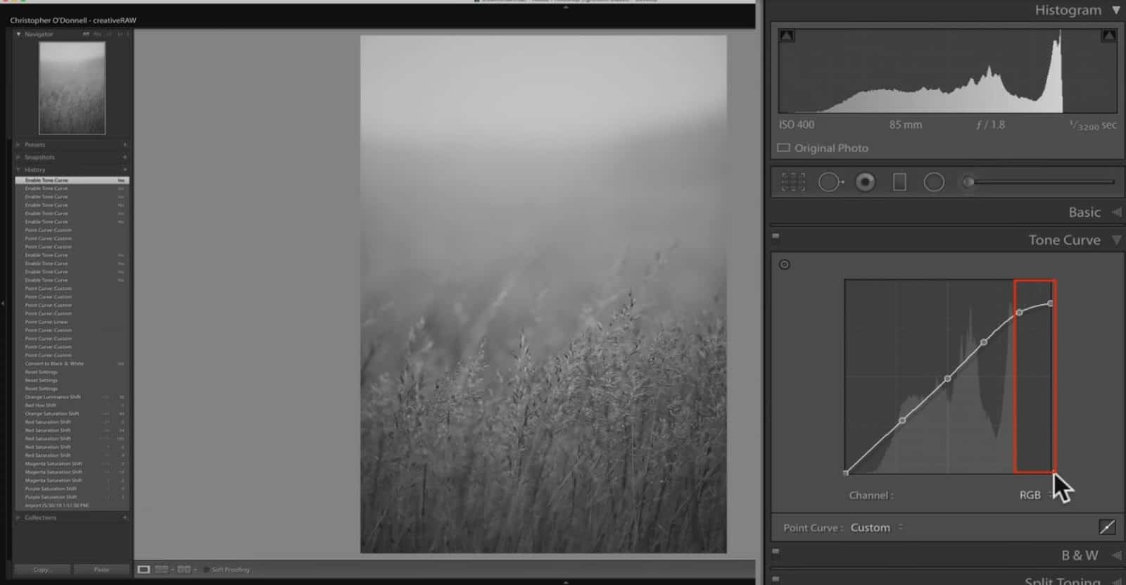
In other words, the only tones that have changed are tones that are not actually in the image. You can see in the image above that the dip in the curves line does not include any data from the histogram. Therefore, the adjustment we made doesn’t change the image since there is no data to adjust.
To summarize: making an adjustment to your curves line will not always change your image. If the adjustment is restricted to tones that are not actually represented, then the curves tool doesn’t have any data to change.
Black and White Points: Adjusting the Tonal Environment with Contrast
So far, we’ve discussed how to add an anchor point to the curves line…and how pulling that up and down vertically will manipulate your tones (make those pixels brighter or darker). However, what happens when we adjust the black and white points at either end of our curves line?
First, let’s make an adjustment…and then we’ll discuss the changes that took place.
If you take either the white point or the black point and move them inwards, you can see that much contrast was added to the image.
This adjustment is basically the same as a levels adjustment…or adding contrast destructively with the contrast slider over in Lightroom. What you’re doing here is recalculating the environment of available tones. In other words…you’re setting the “end caps” of your tonal range and compressing the breadth of available tones so that the transition from light to dark is more abrupt…and this sharper transition gives the appearance of more contrast.
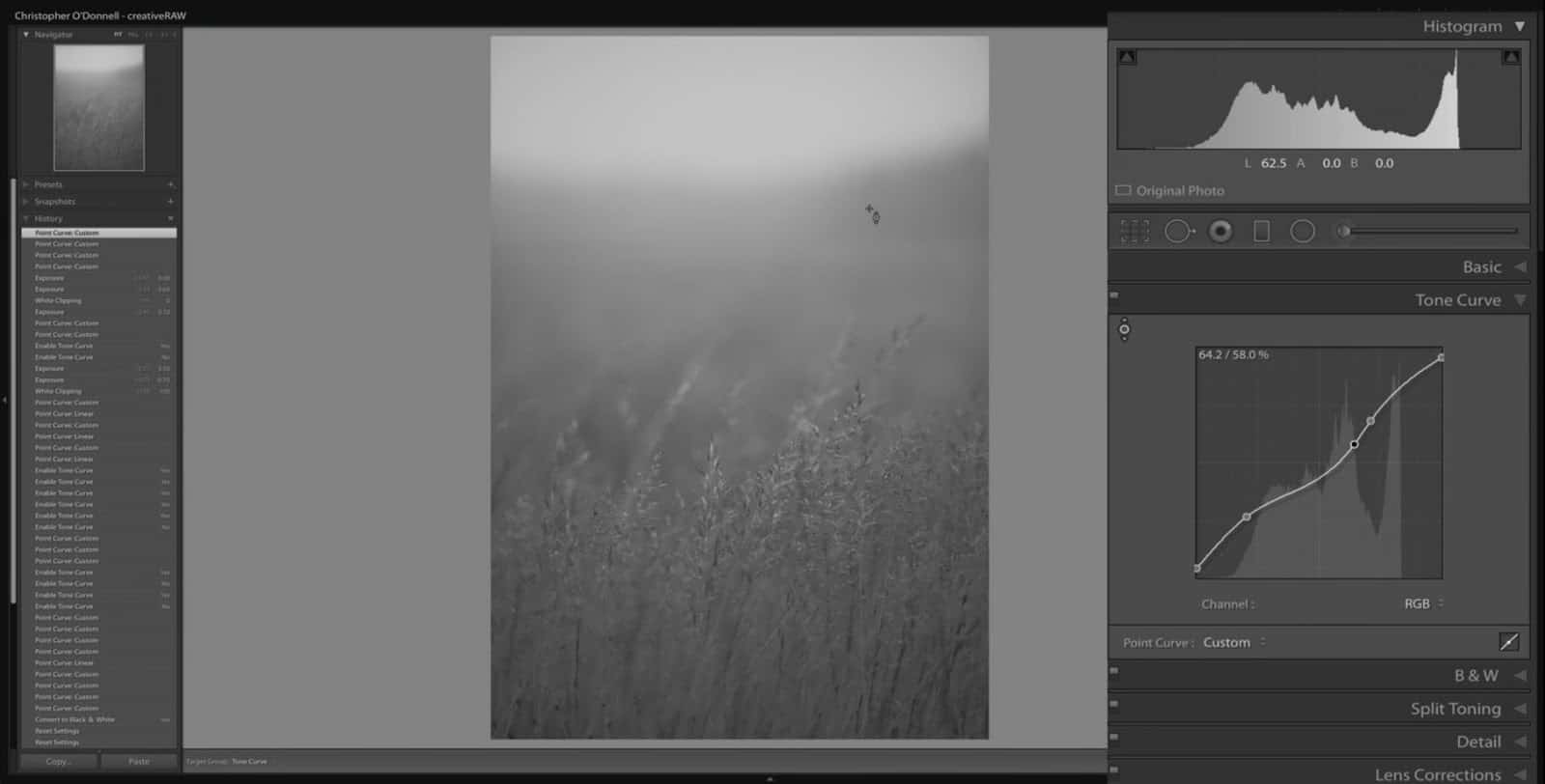
So let’s jump back to Lightroom and make a similar adjustment to the point curve….pushing the white point towards the right and the black point towards the left (condensing the tonal environment that the image is working in).
Now we can see that the brightest tone (pure white) starts at 83.9%, not 100%. So, you are recalculating the environment of available tones by taking the brightest tones in the image and making them brighter.
Said another way…
The brightest tone in this particular image is 83.9% brightness…so it’s not pure white, but getting there. In the example below, I’m pushing the white point down to 83.9% brightness so that it meets the brightest pixels in the image (as seen in the histogram). So I’ve now told Lightroom to take the brightest pixels in the image (83.9%) and make those pure white.
You can see in the example above that the buffer range 83.9% and 100% has now been removed since we recalculated the tonal environment.
If we take a look at the histogram below, you can see that we have this huge gap between the brightest tone in the image, and the brightest tone available (the environment).
However, when I add that curves adjustment….notice how the histogram has changed (below). All those tones get pushed to the right-hand side because we are reducing that gap in the tonal environment. In other words, those tones are not available for use anymore. When you bring your black and white points inwards, you are eliminating values from the environment. You are adding contrast to make the darkest points in your image darker or the brightest whites in your image whiter.

To summarize: the black and white points determine the tonal environment, and the line between those two points (the curve) allow you to adjust the tones within the boundaries of that set environment.
Let’s jump back to Photoshop and take a look at the same image:
Let’s bring the black point in past where the tones start in the histogram (the darkest tones present in the image). We’ll do the same for the white point: bring it in past where the brightest tones for the image start. This will start to damage your photo since you are removing tones that are actually in the image, as opposed to simply removing the gap in the environment (what we did in the previous step).
In other words, we are crushing detail (or the variation of light and shadow) in the image. By limiting the tonal environment, we are cutting off any detail in the image that is outside of the range bracketed by the black and white points (the curve).
Moving Black and White Points Vertically to Flatten Contrast
To summarize: adjusting the black and white points horizontally will increase the contrast of an image…and adjusting the points vertically will decrease the contrast. Both adjustments change the tonal environment that the curve is adjusting.
As we discussed in a previous lesson on setting tonal limits, moving your black and white points along the vertical axis will darken your highlights and brighten your shadows…taking the tones on the extreme ends of the value scale and moving them more towards middle grey. However, this is also affecting other tones of your image (just to a lesser degree).
If I take the black point of this image (below) and move it up vertically on the graph, all the shadows are getting lighter. The biggest adjustment will be with the point you are shifting (here we have an input of 0 and an output of 36), and the effect will taper off as you move further away from this point.
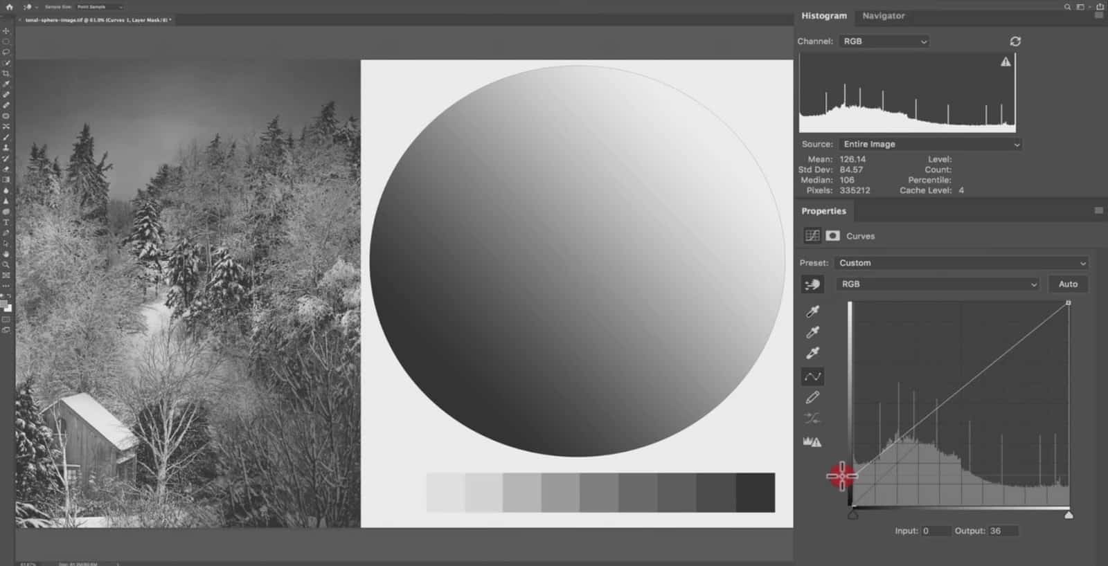
In other words, this adjustment is feathered out along the entire line to prevent pixelation and artifacts. The pure black has gone up to 36 points in brightness…and if we sample point 97, that has only gone up to 120 – a 23 point difference.
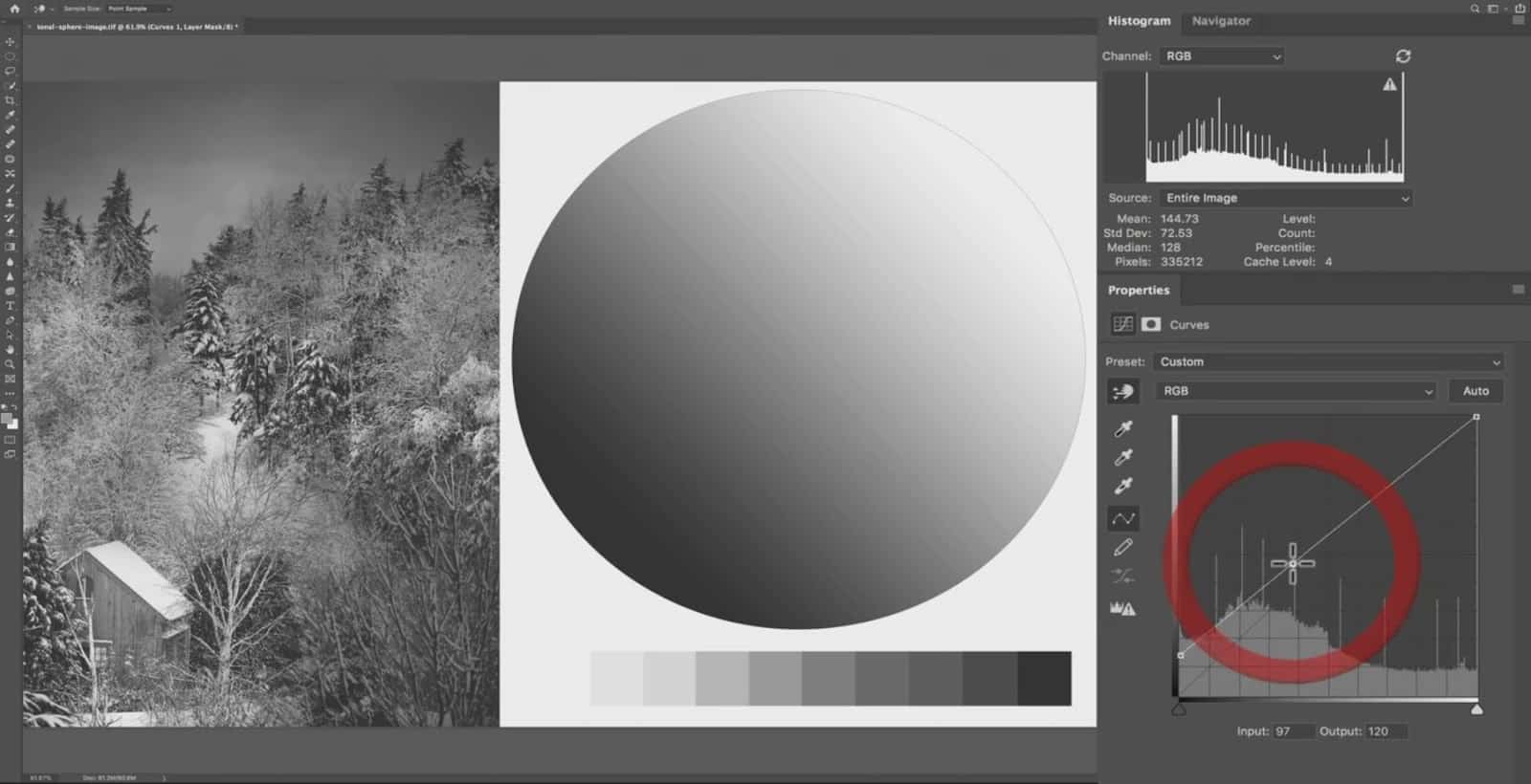
Raising the black point is a very common adjustment to lighten up the shadows and flatten the contrast. However, you would typically add an anchor point to restrain this lightness increase to only the darkest shadows.
If we take point 92 here and bring the curve line back down to 97…we are now primarily adjusting the shadows between 0 and 92 as opposed to the entire tonal range.
This helps to prevent your image from becoming too muddy and low contrast.
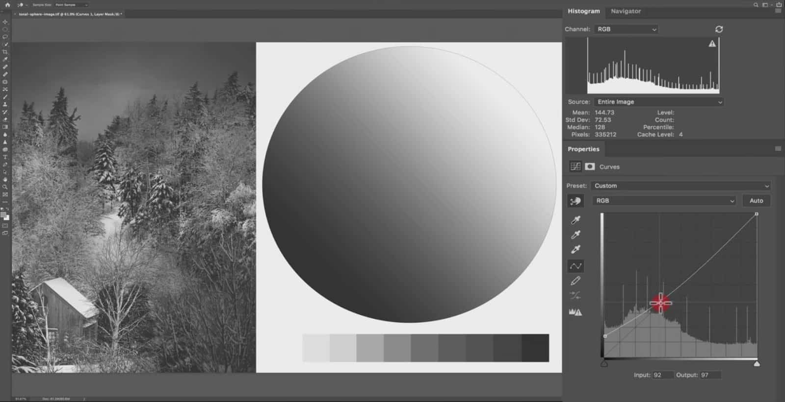
Now let’s make the same adjustment for the highlights by bringing the white point down vertically.
This is an excellent method to use if you have blown out your highlights, or want to scale back on how intense they are. Simply take the white point down.
If we take the black point up to middle gray and the white point down to middle gray, all the detail and variation of tones have been removed.

This is because there is no tonal variation in the image anymore. Any pixel between pure black and middle grey now have the same output, as well as any pixel between middle grey and pure white.
Summary
The black and white points of the curves tool control the tonal environment – or the contrast of an image.
Adjusting these points vertically will reduce contrast while adjusting them horizontally will increase contrast.
Setting Tonal Limits with Curves in Lightroom and Photoshop
Now I’ll show you how to set tonal limits with the curves tool in Lightroom using the histogram…but the same method can also be applied in Photoshop.
We’ve already learned that the space between black and white points in the curves tool will determine the environment of your tones…
And the actual line between these two points – the curve – will adjust the tones within the environment.
Now before we jump too deeply into setting the tonal limits, I want to make sure we are all on the same page as to what exposure is. In the field with your camera, if we increase exposure by one stop, the amount of gathered light would be doubled and affect all tonal groups evenly (highlights, midtones, and shadows). This means that the brightest areas of your image would most likely become over exposed.
However…when you adjust the exposure here in Lightroom, the exposure slider is weighted heavily on the midtones and is a much more delicate adjustment. This is what you would use to set the majority of your tones without having to worry about crushing shadows or clipping highlights.
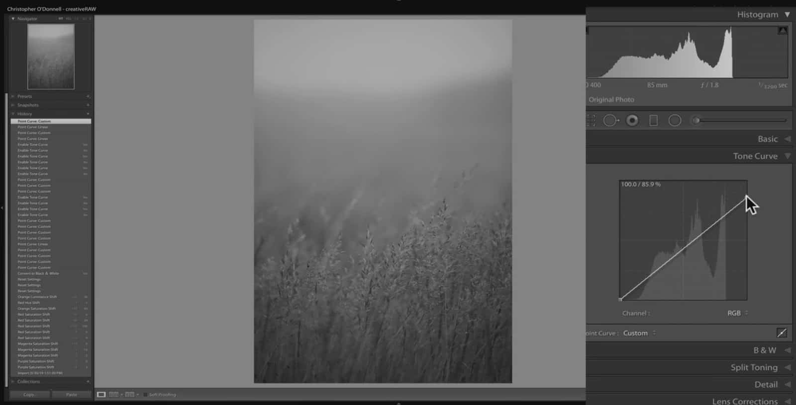
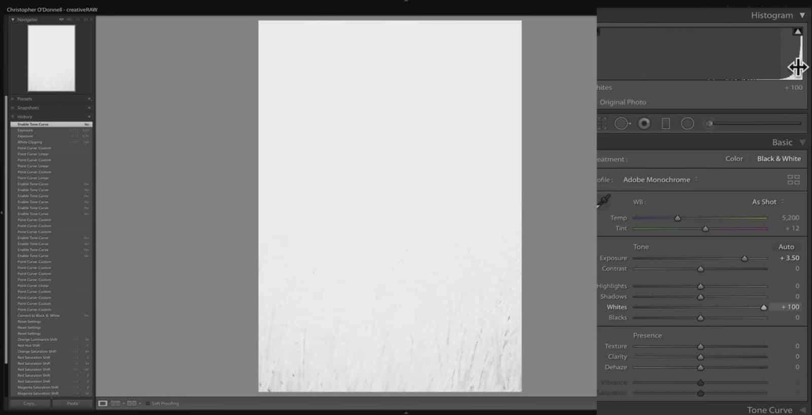
Setting Tonal Limits
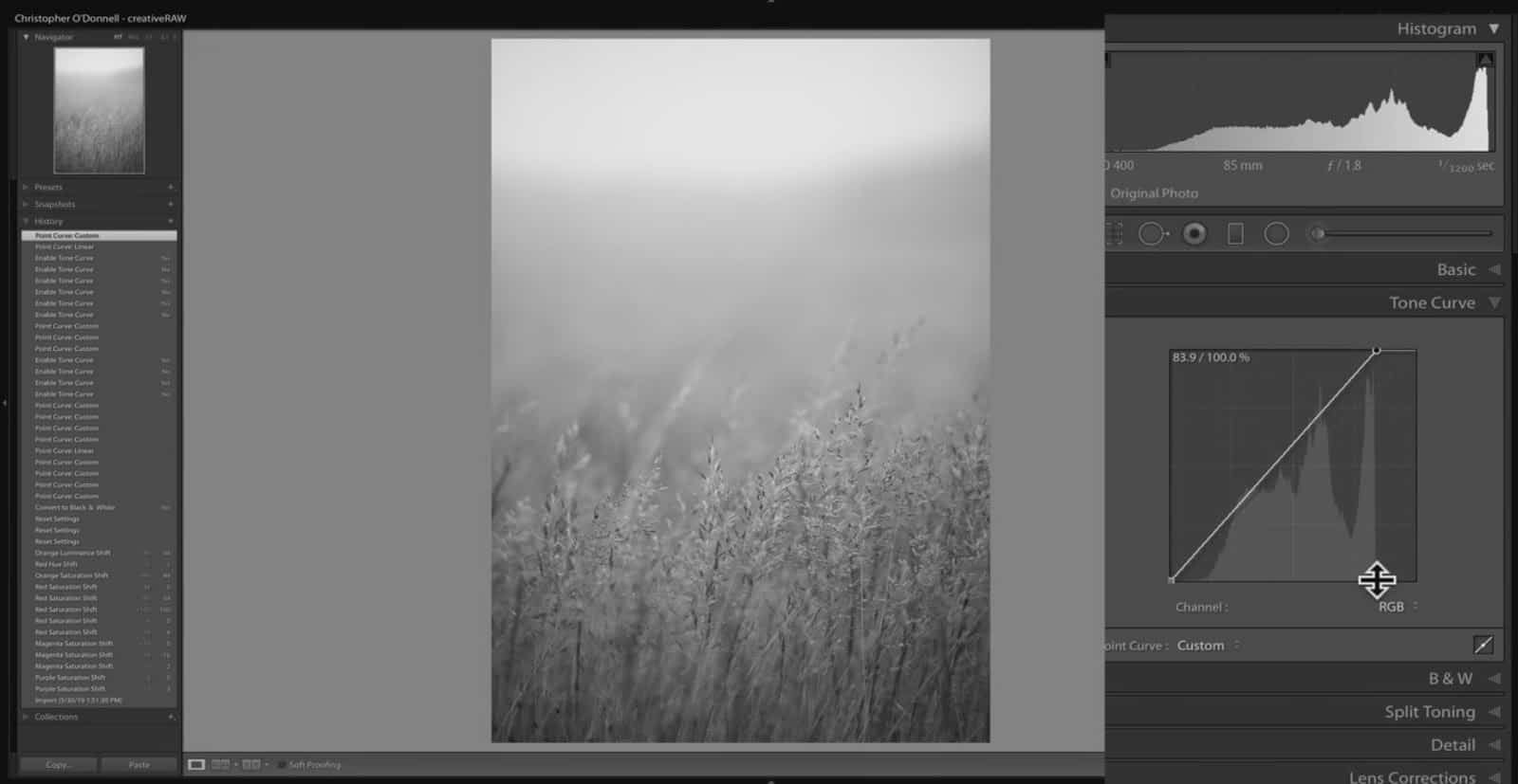
Here is a rather muted image that could use with a bit of added contrast. Take a look at the point curve (located under the Tone curve panel). Let’s take the white point and bring it down vertically:
Making a shift like this to your curves will redefine the environment of your tones….which will change the tones that the tonal sliders in the basic panel adjust.
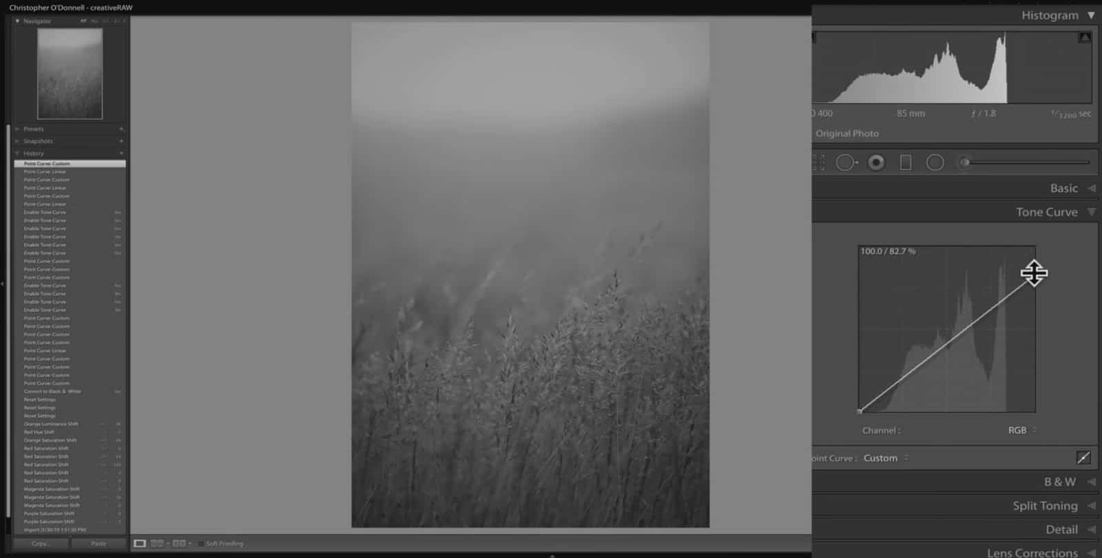
So, by bringing that white point down vertically, I’m telling Lightroom to restrain the tonal environment so that the brightest pixel in my image will never cross 85.9% brightness (as opposed to 100% brightness)….no matter what I do to those tonal sliders.
In other words, the absolute white point is not 100%, it is now down to 85.9% brightness. Any pixel that was above that in brightness has now been brought down, and any pixel you adjust later on will not cross that threshold.
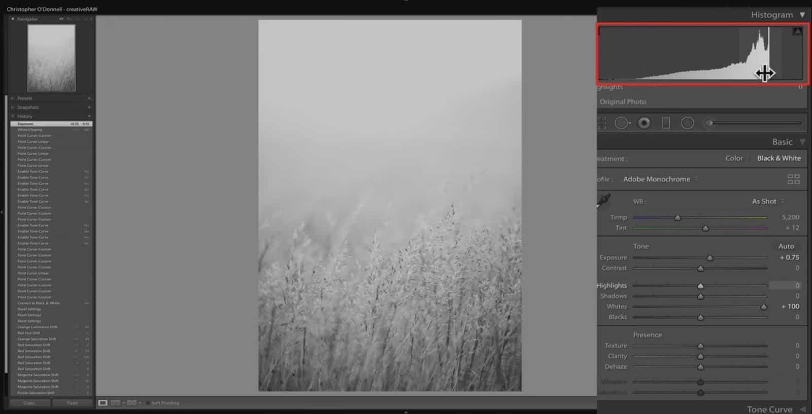
Let’s increase whites to 100 and bring up the exposure to 0.75 (below). See how the tones are now being pushed up against an invisible wall on the histogram? This “wall” is the point we set with curves, at 85.9% brightness.
If you keep increasing the brightness of your tones, more of them will be pushed up against this wall and further remove detail (variation of tones) from the image.
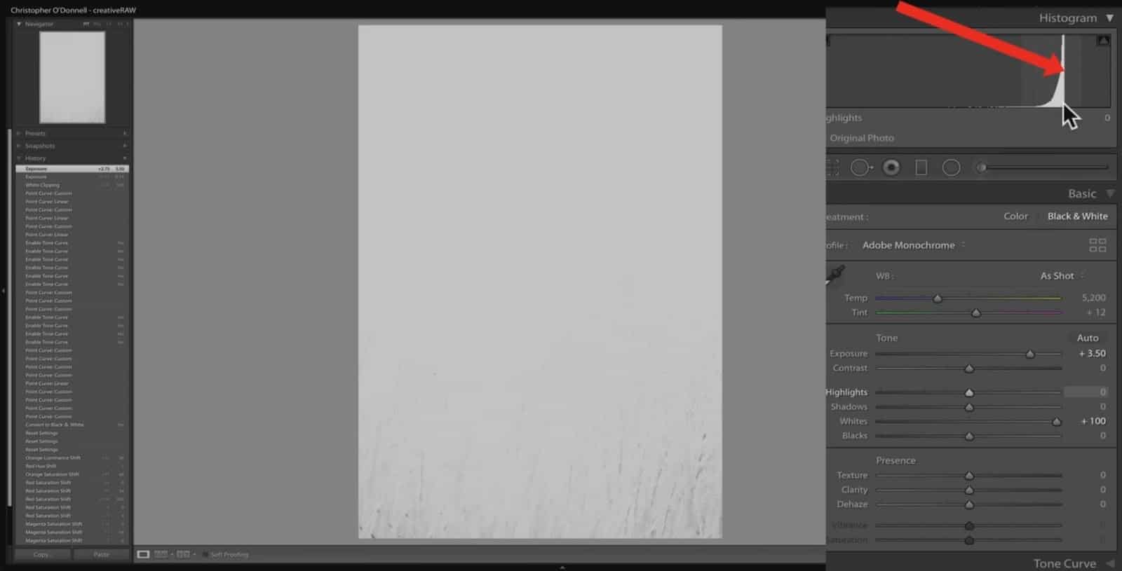
If I take my exposure up all the way to 3.50, crushing all of my detail and pushing all that information towards the right of my histogram, those pixels are now (almost) all set to 85.9% brightness.
So to summarize: the curve panel determines the environment that your tones are in, and the tonal sliders under the basic panel will work within that environment.
This works a lot like setting the color profile, as that determines the environment of your colors…and the HSL panel will adjust those colors within the environment set by the profile.
Notice how if I turn off my tone curve all those pixels get push back up to pure white:
However, when I turn the tone curve back on, those tones are pushed back to the right side of the histogram.
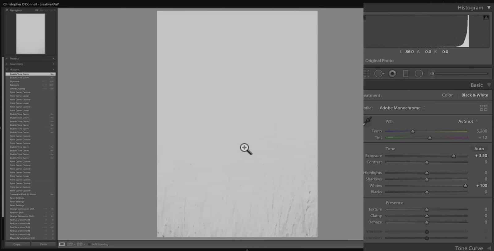
To summarize: any adjustment you make to the exposure will never go above the absolute white point or below the absolute black point that is set with your tone curve.
Over here in Lightroom the tools of the tone curve are basically the same, just a little more basic. You can add actual points to your curve line and drag them around just like over in Photoshop:
We also have the target adjustment tool that can help to add points:
However, many of the advanced features in Photoshop are missing here…such being able to enter actual values for your points (input and output). Of course, all the benefits of adjustment layers, blend modes and layer masks are also missing in Lightroom.
Summary:
You can use the curves tool to set new absolute limits for your white and black points. In other words, you can set new “limits” for your highlights and shadows…so when you make adjustments, your tones will not go past that point.
You do need to be careful as to not make too dramatic of a shift as that will flatten detail. For example, if you bring your white point down from 255 to 200….all of the values between 255 and 200 will now be the same.
Related Products
Related Products
-

Golden Hours eBook
$ 19.00Learn how to capture the extraordinary light of sunrises and sunsets with this free eBook. I'll show you…
Add to cart -

HDR Field Guide
$ 19.00A necessary part of landscape photography is to capture the full dynamic range of the natural light, which…
Add to cart -

Lightroom Cheatsheet
$ 0.00Discover how to work faster and smarter in Lightroom Classic with this simple-to-follow workflow from import to export.…
Add to cart